The First and the Last
Independent periodicals, whose conceptual authors and leaders were designers—a notable sign of the time and cultural landscape of the 1990s and early 2000s—were a striking phenomenon.
These were not always design magazines; their themes were usually broader—it would be more accurate to call them cultural studies publications. Designers were not always the publishers or formal editors, but it was their vision and professional sensibility that defined the character of these journals.
The proliferation of such publications in the 1990s can be explained by several factors:
The return of commercial design, private clients, and consequently, the reassertion of individual authorship among designers in Russia at the turn of the 1980s and 1990s required validation within a culture where print media still played a primary role in information dissemination.
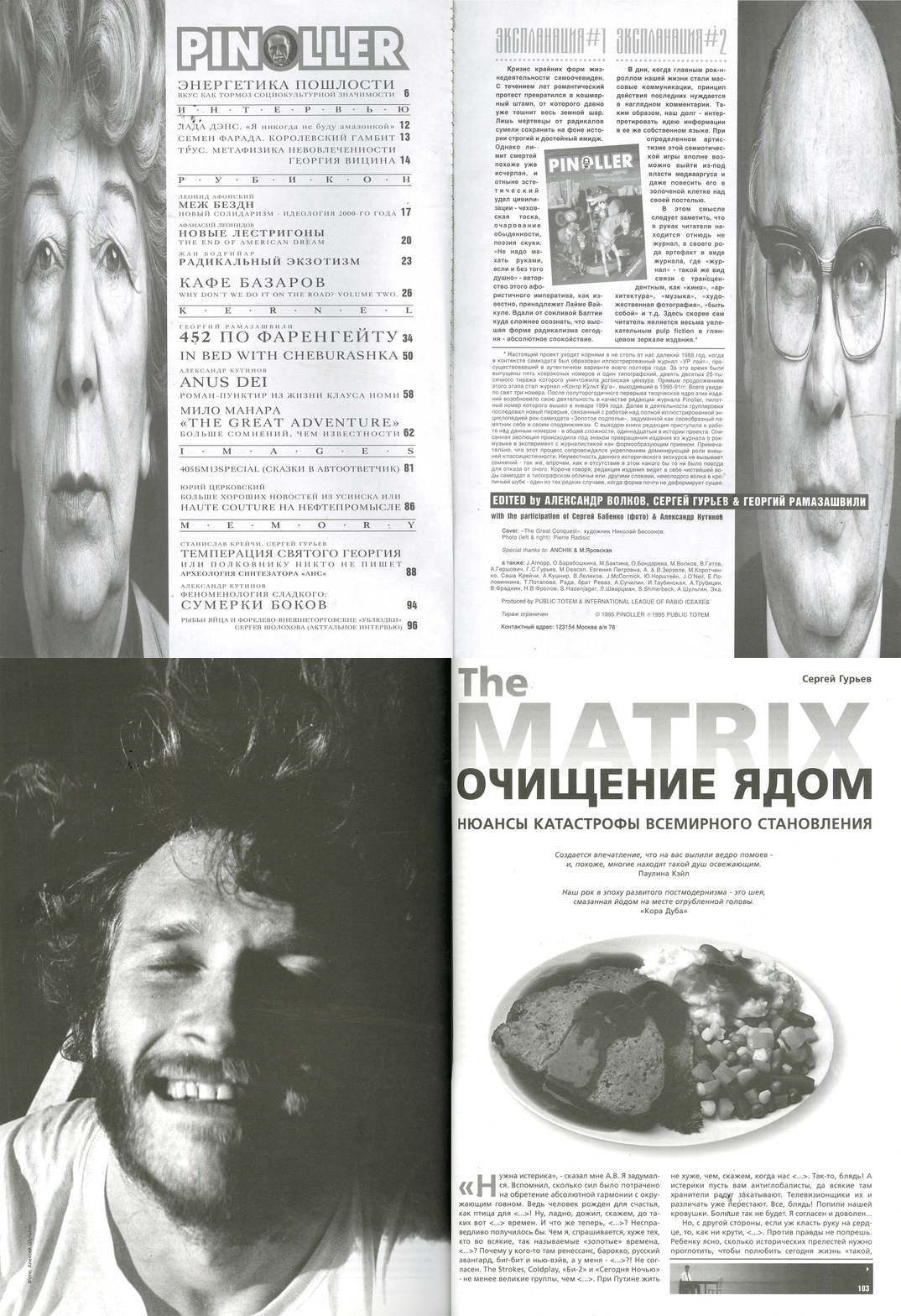
Pinoller magazine spread No. 1(11), pp. 2–3, 1996. KontrKultUra magazine spread No. 5(13), pp. 102–103, 2002.
Modern design in Russia was only beginning to emerge and was struggling to establish itself both in its own perception—by testing ideas and criteria—and as a profession whose influence and significance were rapidly growing.
Perhaps Russian designers were simply eager for the opportunity to exchange information in this format. For decades, many of them had witnessed the magnetic appeal of Western design magazines—and now, their own work and environment could finally become a topic of public conversation.
Furthermore, this was a period when designers already knew what they wanted—how to make the world around them better—were brimming with ideas, while potential clients largely did not yet fully understand what design was or why it was necessary.
Another factor was that most people still had a poor grasp of economics and assumed that publications like these were «personal projects"—even if they were not highly profitable.
However, perhaps the main reason (and it encompasses all the factors listed above) is, in Igor Gurovich’s astute words, that this was a time when «ambitions had not yet left the profession.»
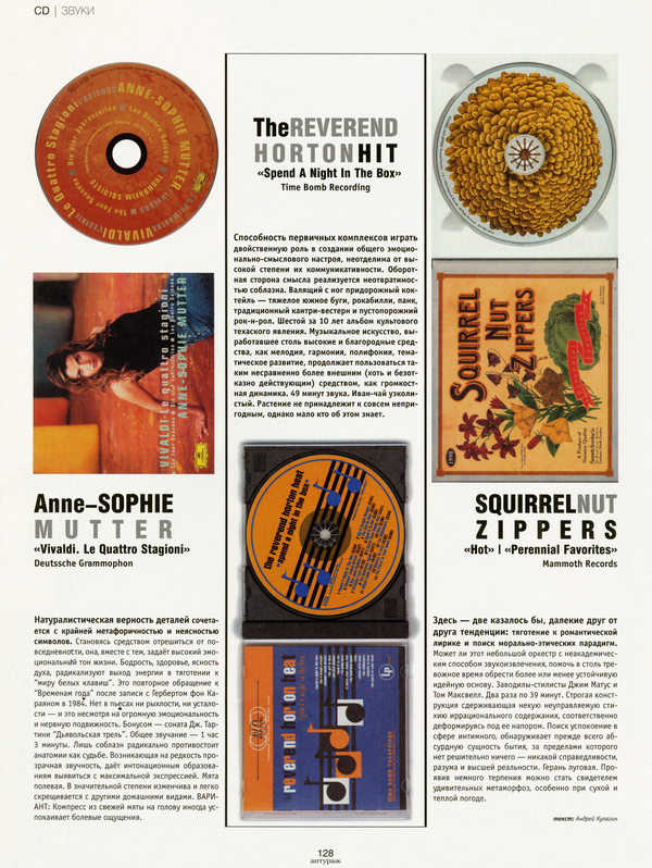
Amadeus Magazine spreads, Issue 7, pp. 50–51, 60–61, 1999
The Role of the Designer
The designer’s role in an auteur magazine differs from their role in any other publication—here, they are not merely an executor of the client’s vision, nor are they limited to exhibiting their individual style (which is often possible under a commission). Instead, they function as the primary creator—a shaper of meaning, an ideologue who offers the audience something akin to a professional (and sometimes broader—artistic, sociocultural, or philosophical) manifesto. Beyond style, it is a mindset, a set of values—that the author-designer espouses personally and offers to society as a framework for understanding what is good and interesting—in design and in life in general.
Camera Obscura Journal, Issue 2, pp. 1–2, 1997
General Characteristics
Designers’ publications very often took on the role of a guide into a world of new objects, images, sensations, and possibilities opening up to the post-Soviet individual. This was less intrusive than standard «glossy» magazines, and the designers approached fostering an audience’s taste with greater altruism—not only telling them what to look at (and what to read, listen to, or wear), but also how. This was driven less by a specific aesthetic and more by an entire worldview.
General, recognizable characteristics of design-concept-based magazines include an emphasis on imagery and typography, deliberate visual dramaturgy, and the structuring of each issue as a cohesive «act"—even when covering a wide variety of topics and design styles; along with this, the layout is often unconventional (though if more traditional, it might be distinguished by its rigorous neatness and purity). Magazines from the 1990s were also characterized by a combination of styles and techniques from previous decades of 20th-century graphic design history.
Magazine spreads from Na Post, pages 16–17, 20–21, and 47–48, 1998
The style and aesthetics of a designer-created magazine almost immediately suggest the publication’s theme and character to the reader—whether it is lighthearted or serious, factual or fictional—demonstrating that visual elements are as expressive as words.
In terms of content, authorial magazines are typically characterized by interdisciplinarity, unexpected juxtapositions and transitions, and a predominance of free-form writing (essays, personal reflections on a wide variety of topics that might seem unrelated to design). Sometimes this can appear to be a sign of indiscriminate scope or amateurism, but in the best examples, it more clearly signals an effort to push the boundaries of the profession, demonstrate its cultural significance, and move toward a form of «total design"—extending beyond mere objects and environment to encompass tastes, interests, lifestyles, and modes of thought.
Spread pages of Nastoy magazine, issue No. 1, pp. 2–3, 12–13, 1998
It is interesting that publications which became a novelty in late 20th-century Russia mirrored aspects of the history of the first illustrated magazines in 17th-century Europe—magazines that arose due to the trend of collecting as a specific form of knowledge. The magazines created by designers in the 1990s were also collections of imagery, cultural metaphors, and physical artifacts that were often conceived of and perceived as objects of collecting.
Another historical parallel is that the very emergence of graphic design as an industry is often linked to the illustrated magazines of the late 19th century, when photography assumed the function of depicting reality «as it is,» and drawing began to create its own reality. Political and satirical magazines, featuring etchings, were highly popular at that time. The 1990s magazines, in contrast, typically employ a more complex language of postmodern irony, and the focus of their intense attention is more often on issues of aesthetics, taste, and attitude toward life than on politics—but, like a century earlier, they became conveyors of a new level of freedom in thought and social relations.
Fakel Magazine Spreads No. 2, pp. 2–3, 22–23, 2002
A story… with a sequel?
Over time, design magazines became increasingly rare until they virtually disappeared. There are several reasons for this. Some are obvious: the mass adoption of the internet, social media, professional online platforms, the abundance and accessibility of visual information online, and the financial difficulties experienced by most publications of this nature.
Perhaps the refinement of the profession’s «boundaries, ” the softening of designers’ public temperament, and a decrease in those specific ambitions—at least the educational ones—also played a role.
Researching magazine design, Olga Rozhnova notes designers' desire „to create a graphic equivalent of the concept of ‘modernity’ within the magazine.“ Therefore, the primary reason independent magazines have lost their former standing is likely the narrowing scope for the free exchange of ideas and the generation of new meanings, and the difficulties in discussing the image of the future—it is clear that this is not an issue confined to the design field, but a much broader one.
Camera Obscura Magazine spreads No. 2, pp. 18–19, 26–27, 1997
Notable Magazines
Among the notable publications are «Amadeus,» «Arbor Mundi,» «Camera Obscura,» «Bourgeoisia,» «Entourage,» «Da! ,» 29, Pinoller, «Contraculture,» «International Journal of Design 1992,» «Na Postu,» «Predmet,» «Ptyuch,» «Fakel,» and WAM.
Fakel Magazine spreads, No. 2, pp. 44–45, 92–93, 2002
Two examples—somewhat similar, yet diametrically opposed. In both cases, the designer’s role and the authors' broad interests are immediately apparent; they aim to engage people with design and unify them around the publication’s theme.
One magazine seems to adhere to a selective, «niche» approach with an academic style, while the other attempts to bridge the intellectual with the mass market. However, in reality, the first one («Predmet») does not abandon a broad audience or modern design principles, and the second («Amadeus») strives to prepare the audience’s perspective for complex ideas through an active visual style.
Spread from Predmet Magazine, Issue No. 1, pp. 8–11
Subject
The journal, created by Pavel Borisovsky, which focused on passions, passionate people, and their communities, developed the genre of «visual inquiry» closely aligned with the author’s creative intentions and interests long before this term was established in professional discourse, let alone public consciousness. The structure of the journal draws attention to its methodical nature (a resonance with its name) and the role of composition, rhythm, negative space, and other purely design elements in crafting a distinct «atmosphere» for the publication. The layout of Predmet is an example not of an explosive «spectacle, ” but of restrained mastery.
Issue #1 spreads of the journal Predmet, pages 100–103
Amadeus
The journal, published by Sergey Kosyanov, was categorized as a «literary-journalistic collection, ” but its essence can be described as an example of „visual journalism”—where photographs, hand-drawn illustrations, graphic symbols, and typographic design play a comparable role. Here, design functions as an art form not through the „beauty“ or „elegance“ of its elements, but due to a far more significant quality: its ability to sharpen the perception of reality, communicate information, and evoke genuine emotion.
Amadei Magazine Spread No. 7, pp. 10–11, 20–23, 1999