«I just don’t understand why anyone would make invisible fonts»
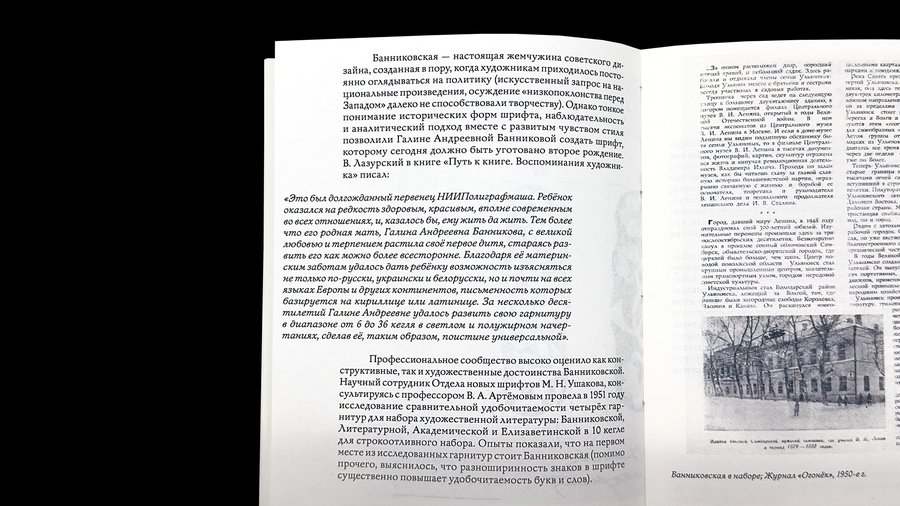
«Galina Bannikova and Her Typefaces» — an exhibition dedicated not only to the works of Galina Bannikova, a Soviet artist and typographer, but also to the fundamental principles behind her typeface design. The exhibition catalog is an investigative essay on Bannikova’s methodology, supported by sketches, production materials, and drafts.
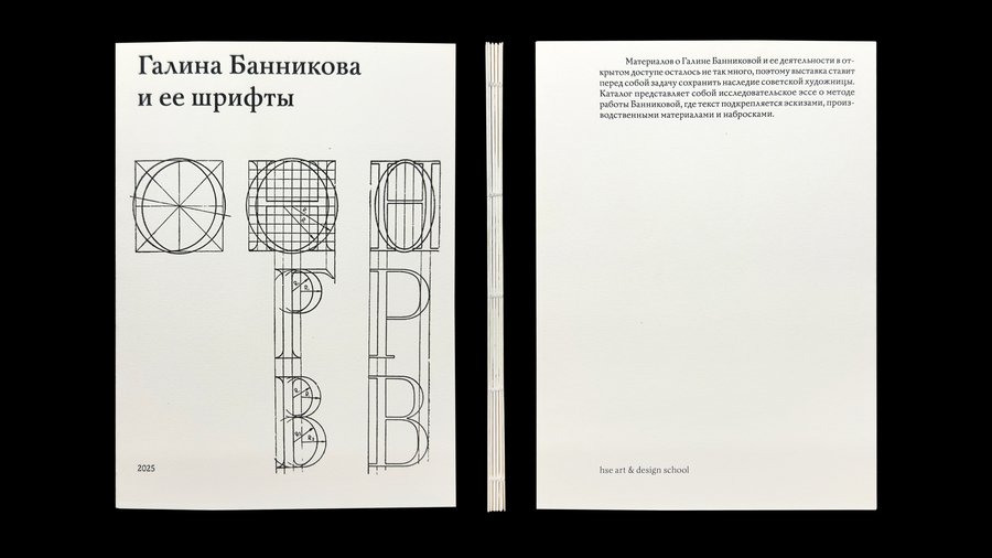
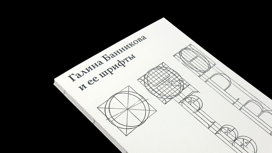
The first section of the catalog is dedicated to the predecessors of the Bannikov typeface—it was these works that the artist studied and analyzed in order to apply similar techniques to her own typography.
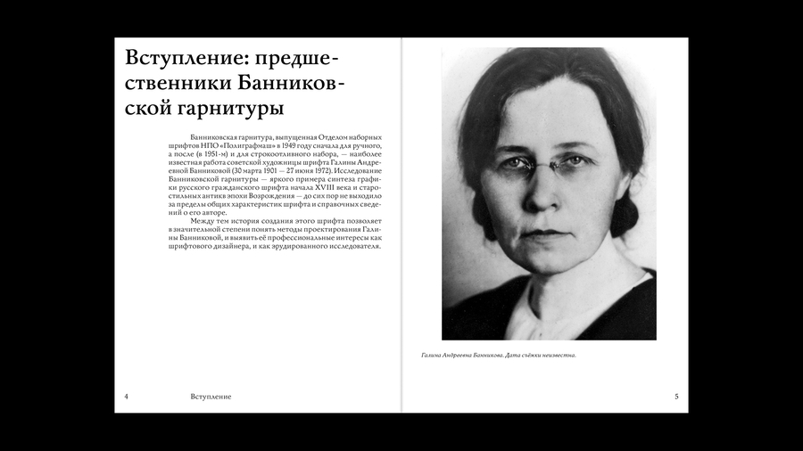
Her most famous work is the Banninkovskaya typeface, named after her, which was released in 1949 first for manual typesetting, and in 1951 for letterpress. It is the first original Cyrillic serif typeface designed for setting artistic literature.
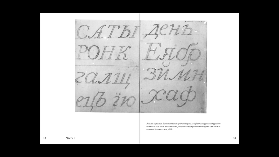
Bannikova’s second significant project is the Baikonur typeface, an exploration into creating a new style of book antiqua. The main hurdle she faced was the high contrast inherent in such antiquas, which diminished readability when set in small point sizes across large bodies of text. Bannikova’s third typeface is Kama, an expressive grotesque. Kama’s design is open and vibrant, featuring soft, plastic forms with rounded terminals.