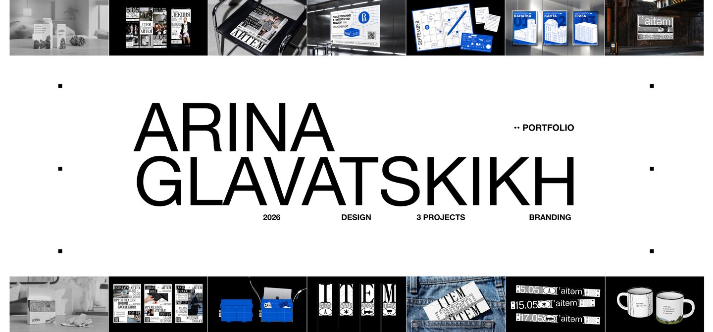
I’m Arina Glavatskikh, a communication designer. I create visual content for businesses that makes the consumer experience comfortable and the brand recognizable.
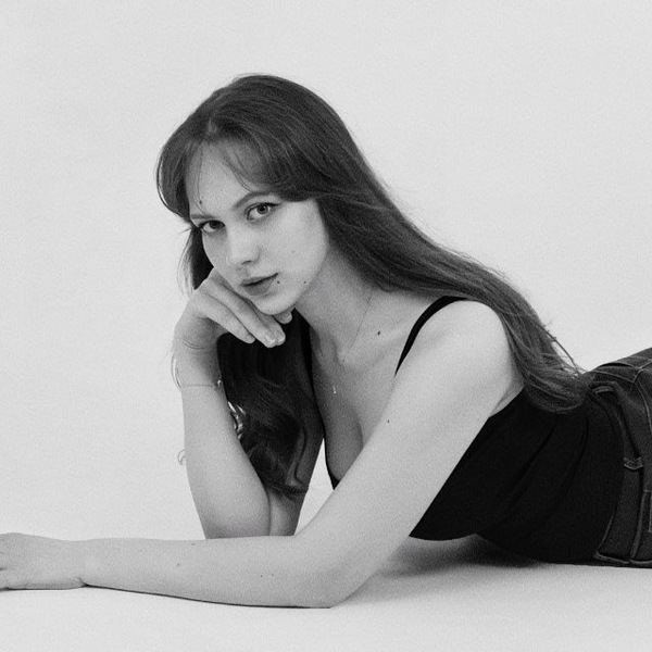
Work experience: — Yandex Museum: creation of a branded merchandise line (2025–2026). — Gazprom Neft: development of a 2026 corporate calendar. — Branding for «glavatskikh» — convertible fashion accessories (2026–present). — Participation in the «Terminal Design Future Fest» open call; winner in the «Parallel Worlds» category. Created a motion video about the future (April 2026). — «Pereplet» Book Festival: creation of two books—a visual study titled «Audio Equipment of the Last Century» and a pocketbook titled «Wooden Heritage: The Art of Russian Craftsmen» (2025). — Freelance work: creation of logos and branding for businesses (2023–2026).Education: Bachelor’s degree in Communication Design at the Higher School of Economics, St. Petersburg (2023–2027)Social media: @arinaglavv (Instagram) Open to collaborations — @arinaglav (Telegram)
Case 1: Identity for the 30th Anniversary of HSE University (St. Petersburg)
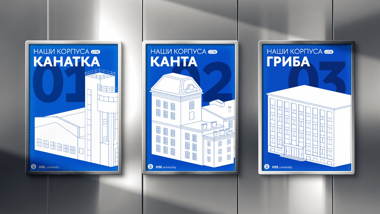
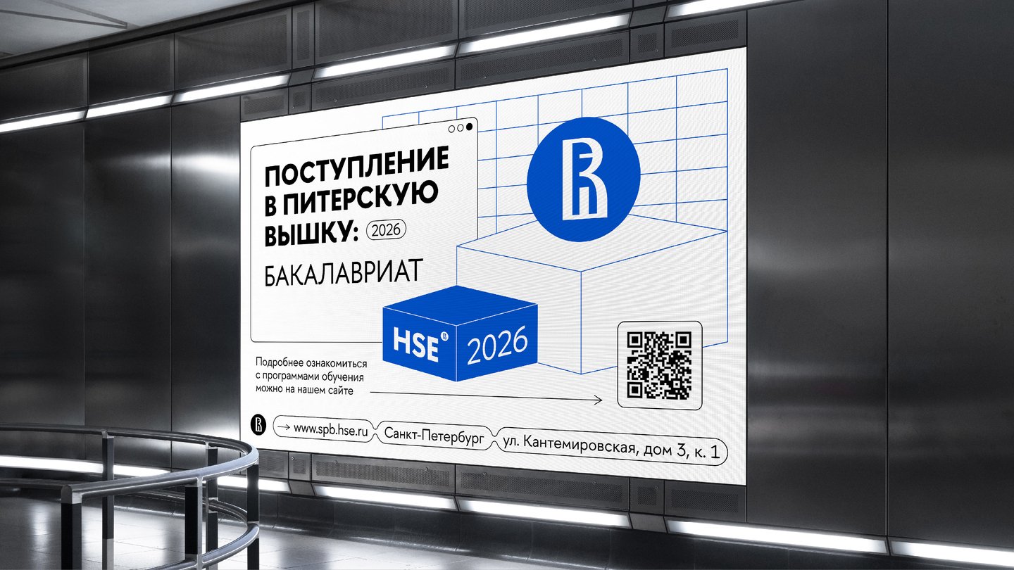
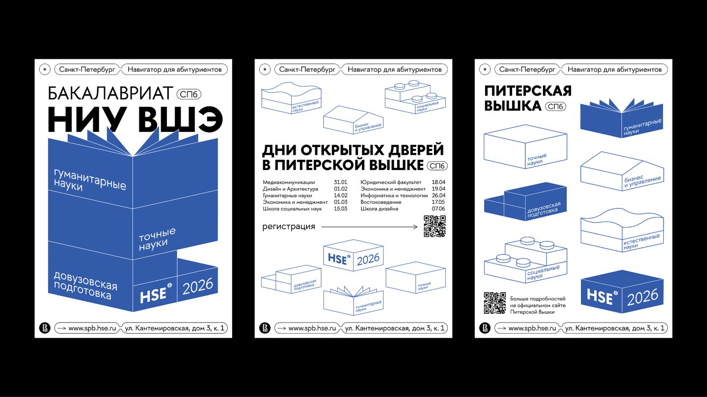
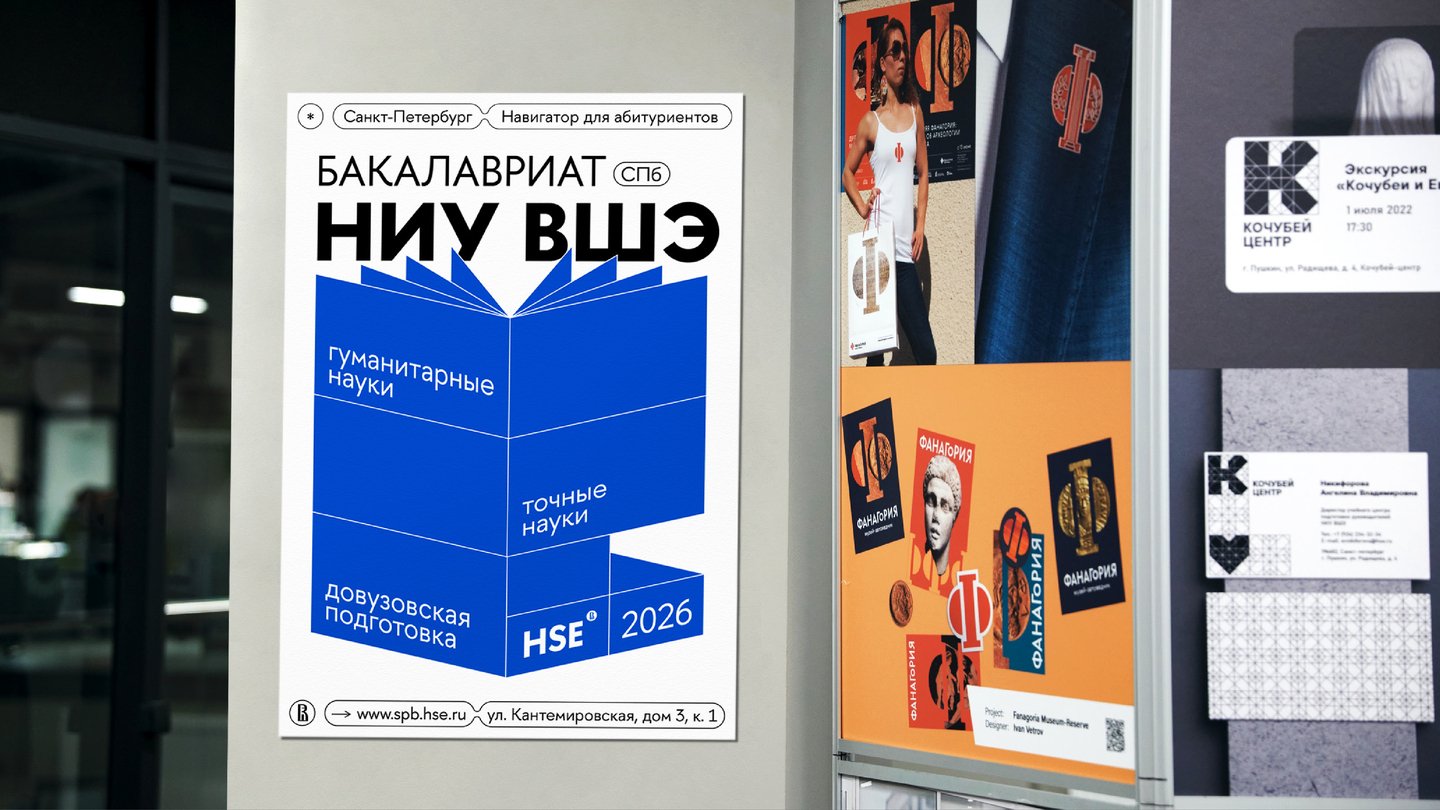
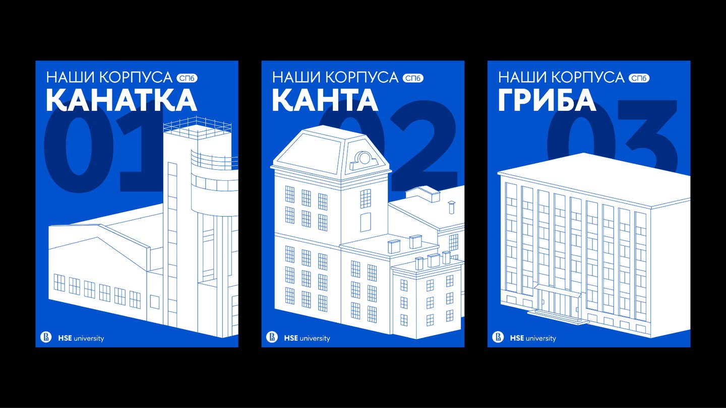
HSE University needed a visual design for the 30th anniversary of its St. Petersburg campus. My main task was to refresh the perception of the brand and reflect both its focus on the future and its academic precision, without losing the recognizability of its core visual constants. I kept the corporate blue and the HSE Sans typeface, and introduced modular graphics. Each field of study received its own 3D block, and the blocks stack together into a single educational construction set. This modular system structures complex information for applicants and students, and makes the user experience comfortable and memorable.
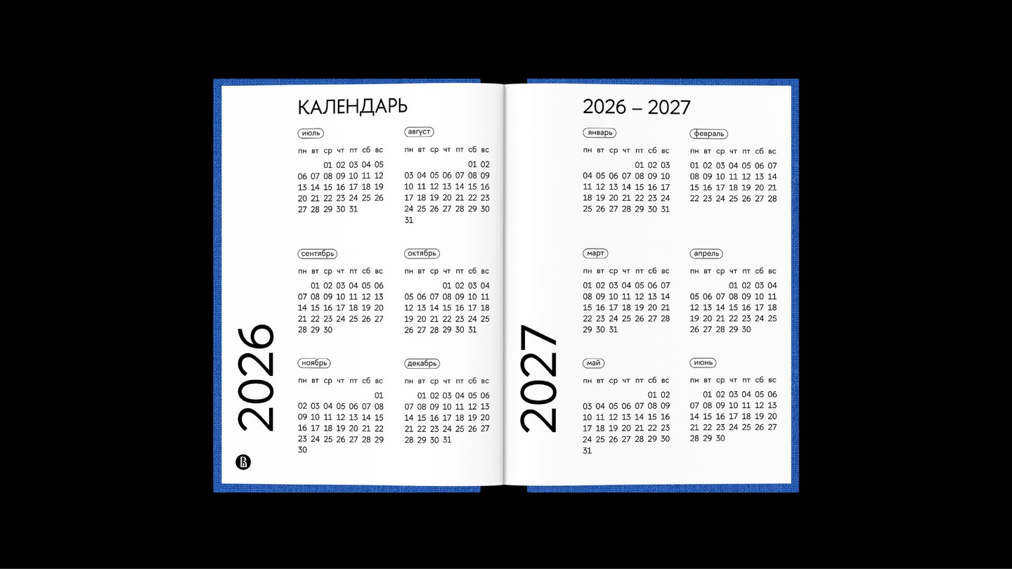
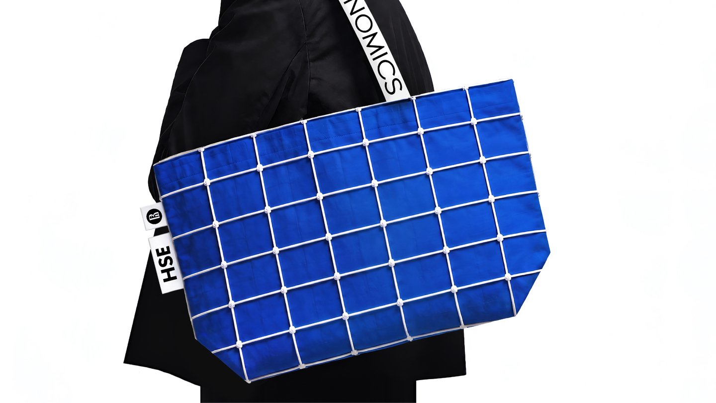
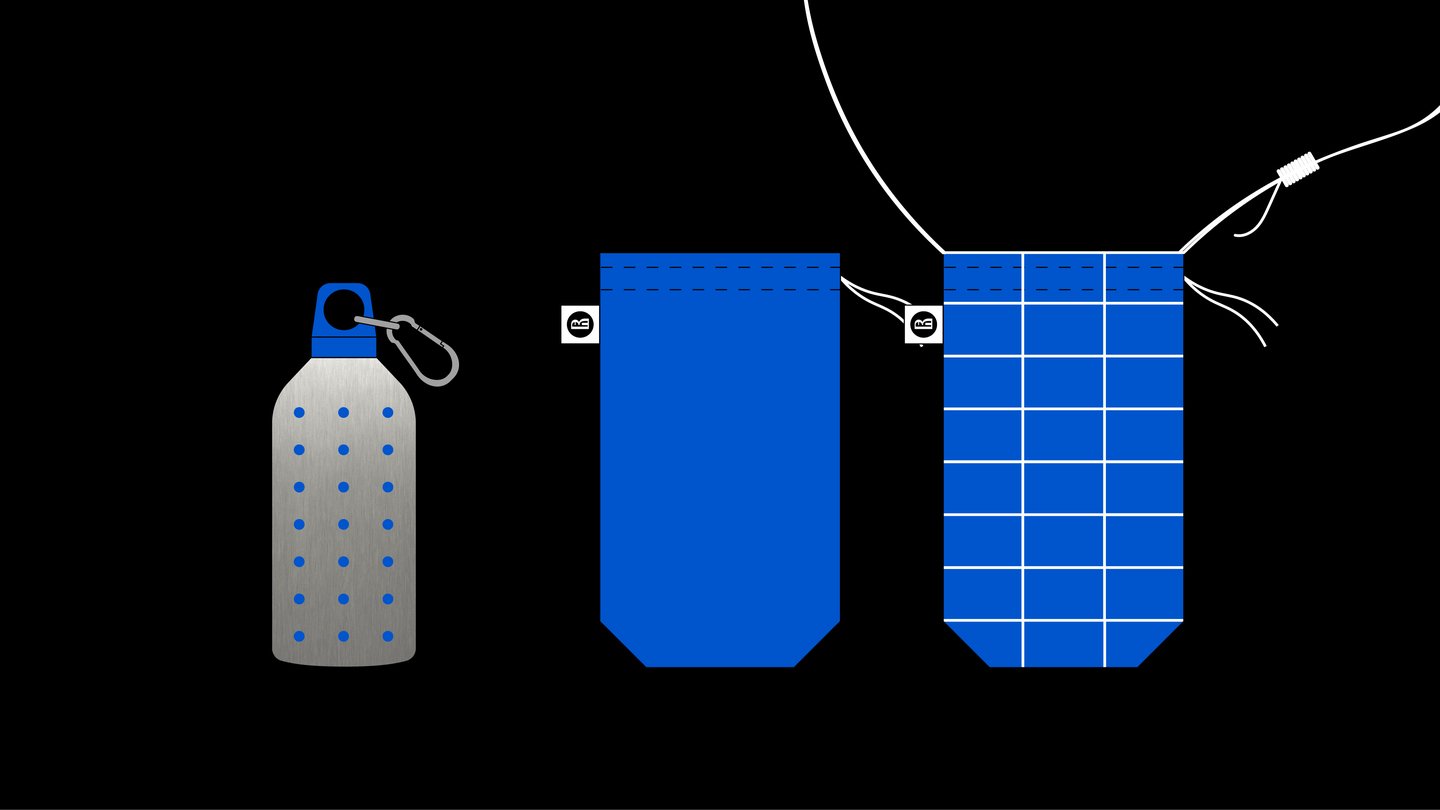
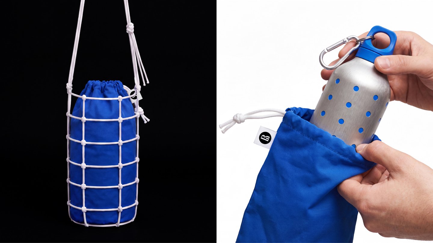
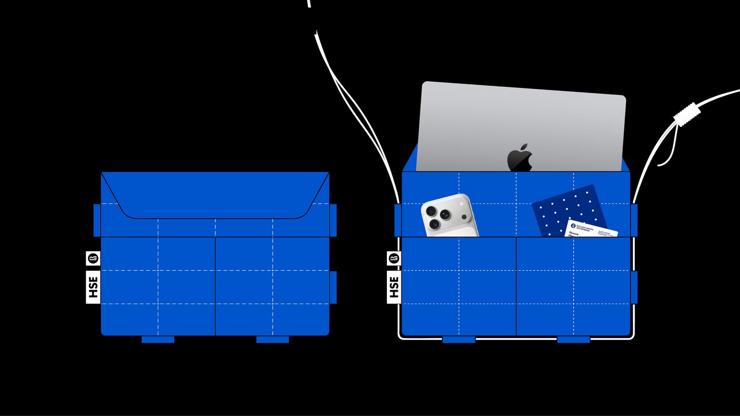
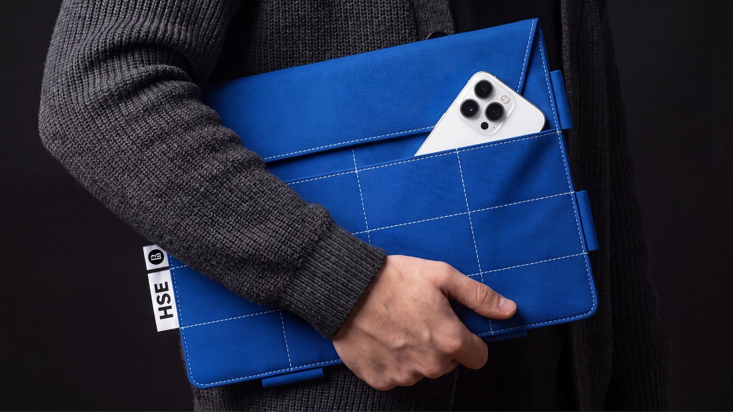
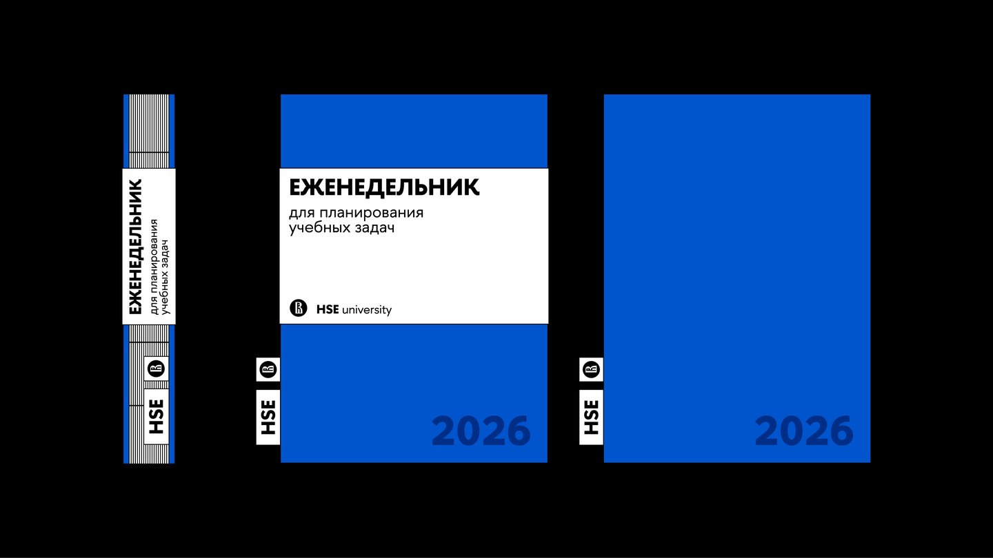
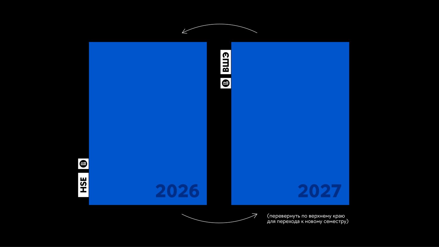
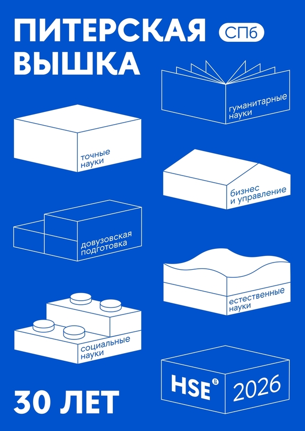
The updated visual identity, created for the 30th anniversary of HSE St. Petersburg, reflects the university’s contemporary character, academic precision, and commitment to growth. This flexible visual system integrates various communication formats while maintaining a cohesive image that works effectively in both physical and digital spaces.
Case 2: «ITEM» POP-UP: Branding for a Fashion Space
«ITEM» is a new format of temporary department store in Nizhny Novgorod. It brings together Russian brands of clothing, footwear, accessories and product design, as well as private shows, lectures and parties. I needed to create a universal design that would be distinctive for the brand. The logo is based on the dictionary transcription ITEM [‘aitəm]. The square brackets became a container that adapts to any business need: dates, formats and sections change inside it, such as [market], [events], [people], [17.05]. To help visitors easily find their way around the packed program and the sales floor, I developed a system of oval pictograms in three categories: product information, spatial navigation and event types. Strict typography and the bracket system made it possible to integrate collaborations with major brands seamlessly. The whole identity looks cohesive and stands out both offline and online.
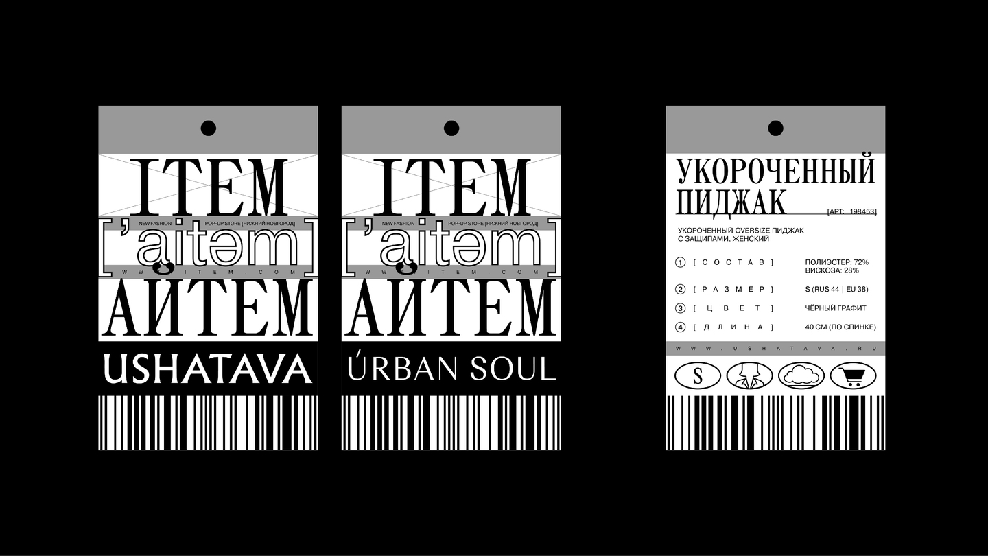
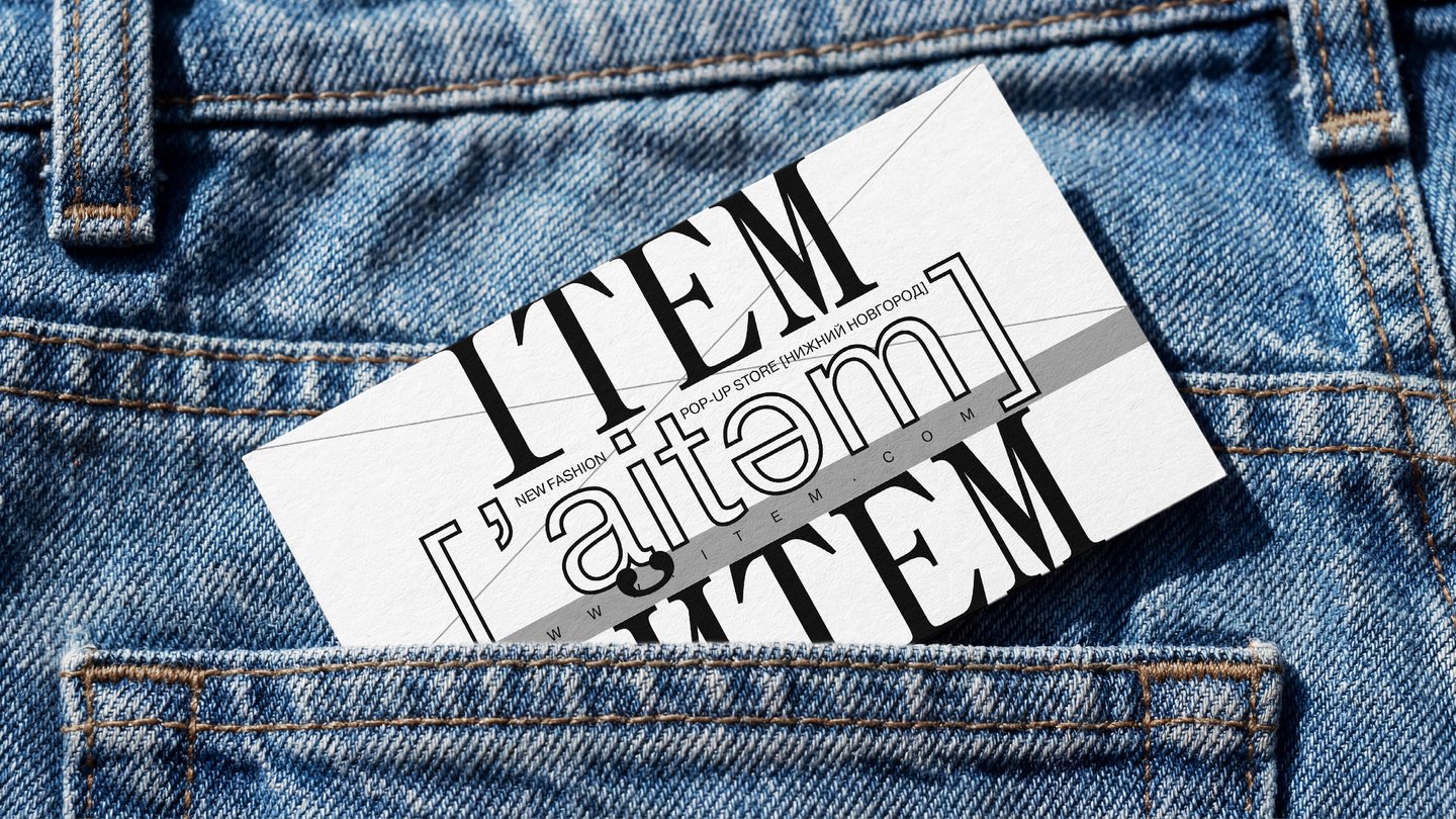
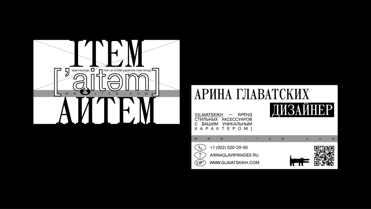
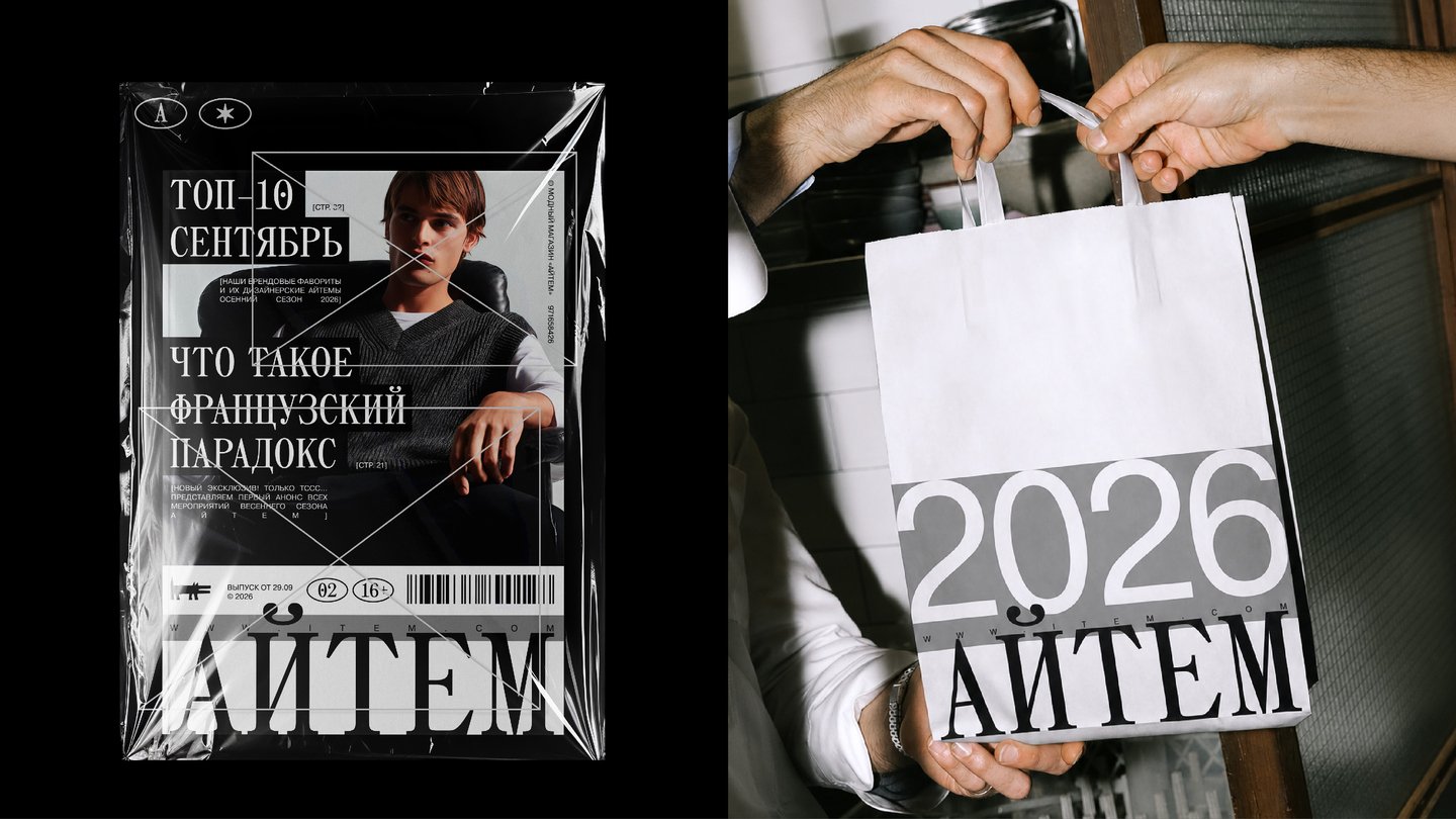
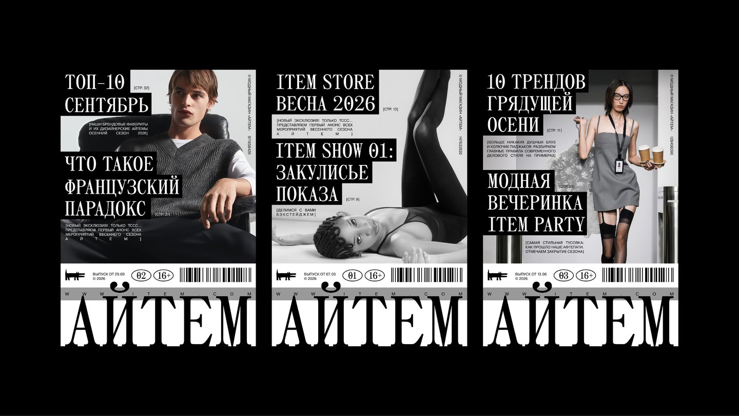
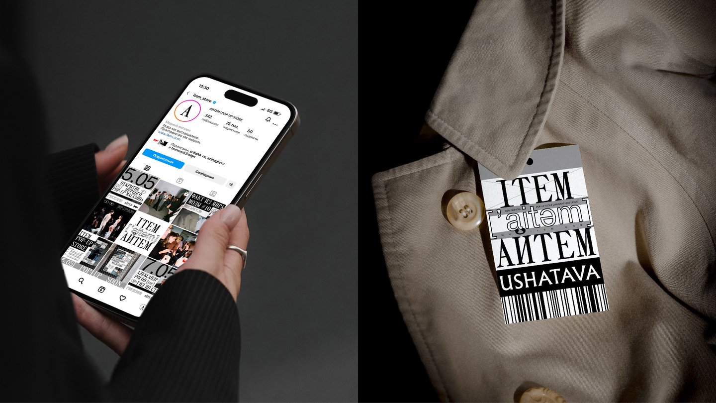
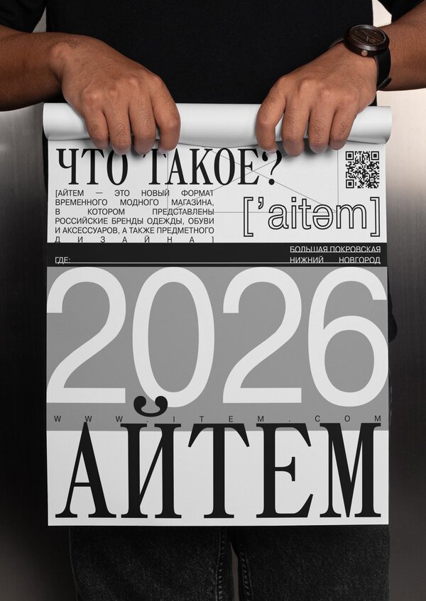
ITEM is a new pop-up retail concept showcasing Russian brands across fashion, footwear, accessories, and object design. The project hosts a variety of exclusive events, including designer parties, collection launches, lectures, and masterclasses led by fashion industry experts.
Case 3: «izba»: A Brand of Ural Amulet Boxes and Home Fragrances
The market for home goods and aroma diffusers is oversaturated with generic visuals. The task for the «izba» brand was to package a line of natural Ural incense, essential oils and ceramic amulet boxes in a way that conveys the pristine nature of the Urals through a modern aesthetic. As part of the project, I developed a logo with a fine tree-ring pattern. The product itself is designed as an ergonomic ceramic little house made of three modules: a base, a removable dish for oils, and a lid with a chimney. On the outside, the packaging looks minimalist, with an emphasis on naturalness (birches, conifer needles, oak leaves). When customers open each box, they find the natural textures of a pine cross-section or dense conifer needles, along with warm message phrases. This look makes the brand stand out on the store shelf among other manufacturers. The box also includes an illustrated insert that shows two ways to use the amulet box step by step, along with safety rules. The well-thought-out packaging and the «wow effect» of the interior encourage users to create organic UGC (unboxing posts on social media) and give the brand clear differentiation from competitors in retail.