I find distinctive details in people’s stories and places, and turn them into visual identities, packaging and publications
ABOUT ME

I’m Ivan Dergachev, a communication designer specialising in branding, editorial design and visual research.I enjoy working across different formats, especially when a project explores a sense of identity: what makes a person, a place or a brand who they are. I’m drawn to personal memories, local stories and the connections between people and their surroundings.I’m interested in collaborating with independent brands, local producers and cultural projects that want to express their character through thoughtful, distinctive design.
MY APPROACH
A small detail can shape a whole visual language.

I start by exploring a project’s story, its audience and what it needs to communicate. Through visual research, I look for details that reveal its character and develop them into a concept expressed through typography, colour, imagery and materials.I like to connect these stories with my own experience, finding echoes in familiar situations, memories and feelings. This personal connection helps me understand a subject more deeply and find my own way of expressing it.
Nikitsky Botanical Garden
Many shapes. Many colours. One garden.

Context
Nikitsky Botanical Garden in Crimea brings together plants from around the world and welcomes visitors of all ages. Its collections and seasonal flower exhibitions offer a rich variety of colours and forms. However, its visual communication was inconsistent: signs and promotional materials lacked a shared identity that reflected the garden’s characterChallenge
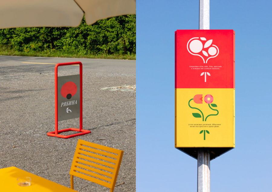
My task was to bring this variety into one coherent visual system. The identity needed to feel clear and welcoming to children, adults and older visitors, while adapting to plant information signs, everyday communication and seasonal events such as the Tulip Parade, for example.
Concept
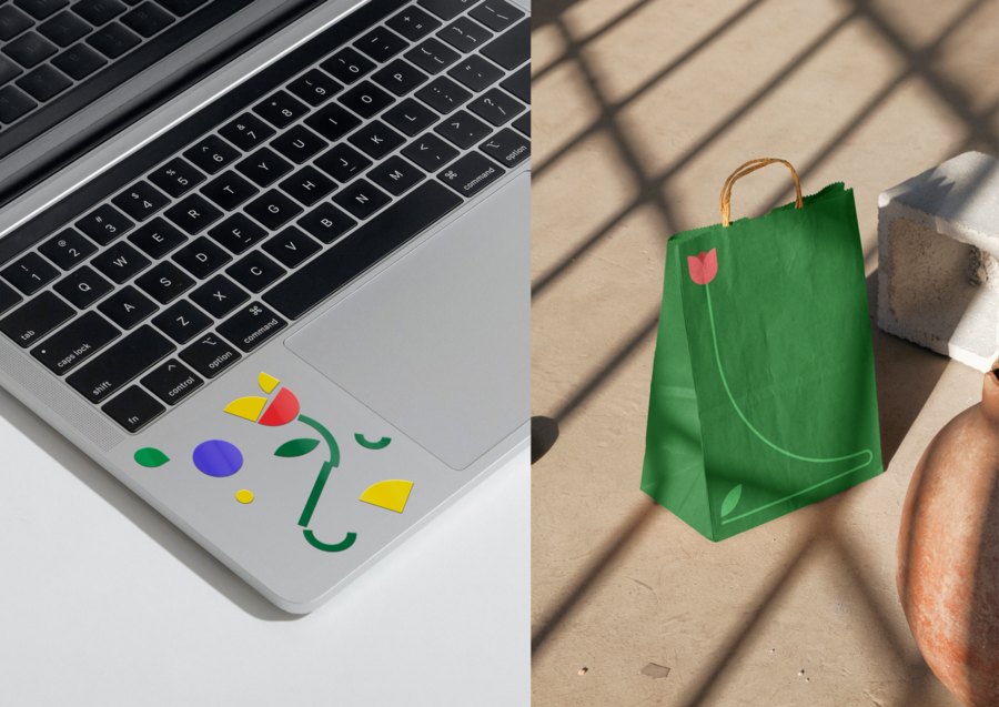
I explored the garden and studied visitor reviews to understand what people remembered about it. One review stood out: a visitor described the abundance of colours and forms. This observation became the starting point for the identity.I built a graphic system from simple shapes that fit together like a construction set. Combined in different ways, they form recognisable flowers or larger compositions. The colours reflect the garden’s plants, extending the range of possible combinations.The same elements can create a flower icon for an information sign or a composition for a seasonal exhibition. This gives the garden a varied visual language with a consistent underlying structure.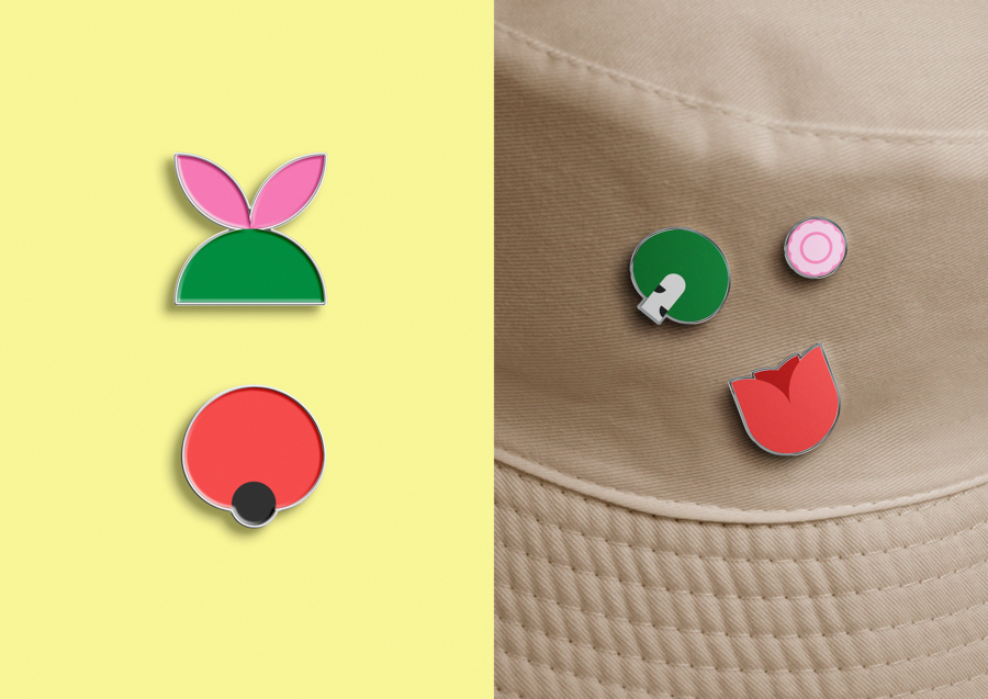
Result
I developed a visual identity concept that brings the garden’s communication into one flexible system. Its modular graphics allow new flowers and event materials to be created while keeping a recognisable character. The result is a colourful, approachable identity designed to express the garden’s diversity and welcome visitors of all ages.SACHOK — A Visual Study of Crimean Insects
To understand what once frightened me, I decided to look closer.

Context
I grew up in Crimea with an insect net in my hands. I was surrounded by insects and often afraid of them, but I still tried to catch them and look closer. Years later, I returned to these memories to explore the small creatures I encountered throughout my childhood. Sachok is a personal visual study of Crimean insects, their habitats, colours, textures and patterns of behaviour.Challenge
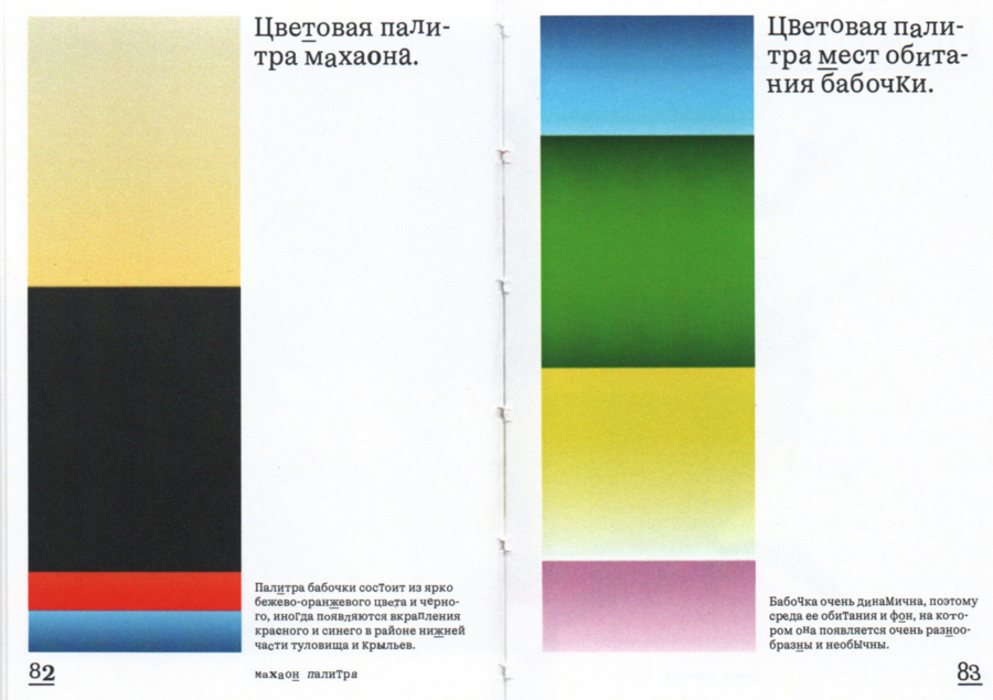
My goal was to examine how the appearance of insects relates to their environment. I compared their colours and textures with those of their habitats and focused on two contrasting survival strategies: camouflage and warning signals.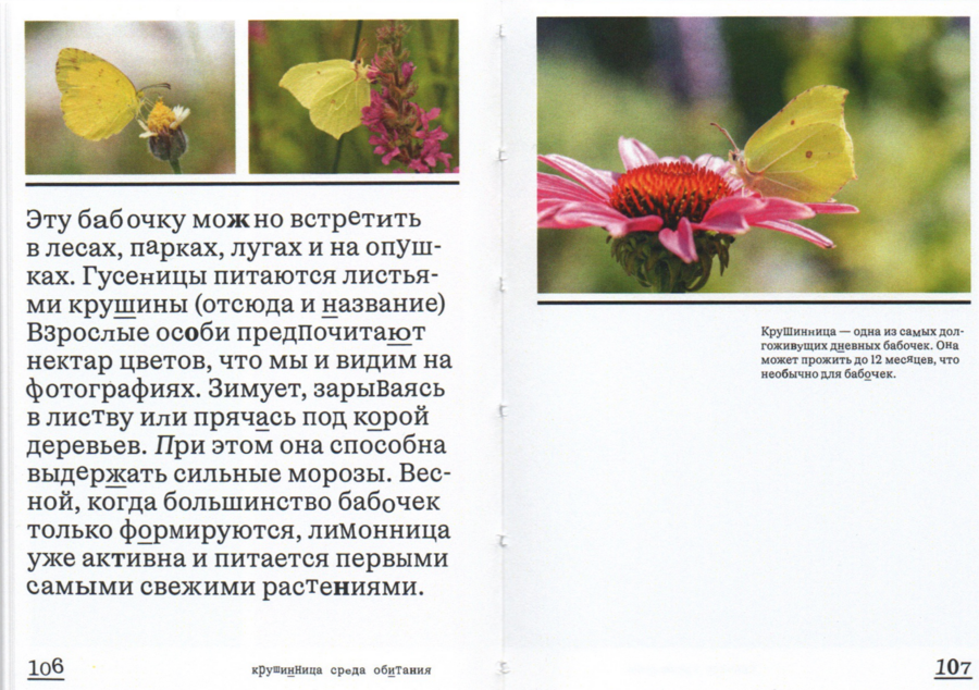

Concept
Insects rarely remain still: they crawl, jump, buzz and fly. This constant movement became the main principle of the book’s visual language.The typography behaves like the insects themselves. Letterforms change in weight and scale, shift from the baseline, crawl across the page or appear to take off. The changing rhythm makes every spread feel different, while a consistent structure keeps the research connected.The book is divided into two sections: camouflaging insects and warning-coloured insects. Each species is examined through its appearance, habitat, colour palette, textures and behaviour.
Object
The book is produced in a compact A7 format that reflects the small scale of its subject. It comes with a magnifying glass, inviting the reader to examine both the insects and the publication’s smallest details more closely.Result
The result is a compact visual research book that connects personal memory with close observation. It reveals how Crimean insects use colour, texture and movement to adapt to their surroundings, while the publication itself turns reading into a process of discovery.By looking closer, I transformed a childhood fear into curiosity and found a new way to see the familiar environment of Crimea.VINO VANO — A Family Winery Identity