Guidelines for the visual and technical presentation of Module 1 projects for the «Design and Programming» and «Design and Digital Product Promotion» tracks in the 2nd Year.
The most important point: the project format for the School of Design showcase differs from the student portfolio—these projects practically omit the development stages and proceed directly to the core concept.
I. Fundamentals (cover, background, layout)
Cover
The background of the platform is very light, and white covers on it will not look as strong as contrasting ones.
The situation: the white color dominates the long-read article. The solution—invert the cover or make it half a shade darker. You could also add a border to define the edges of your project cover.

Check the cover for contrast and appeal. The cover is the face of the project.
Background
Slides must contrast with the portfolio background, or they will «pop out» and disrupt the composition.
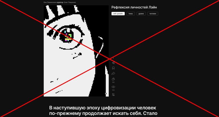
The backgrounds on the cover and portfolio differ, but due to low contrast, the image is cropped unpleasantly. One should pay attention to such nuances.
There is contrast—it is easy for the eyes to scan the content.
Layout
It is crucial to maintain a logical content layout to support the composition. A tiled layout makes a project stable, even when slides without a background are present.
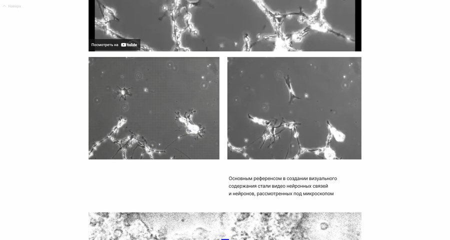
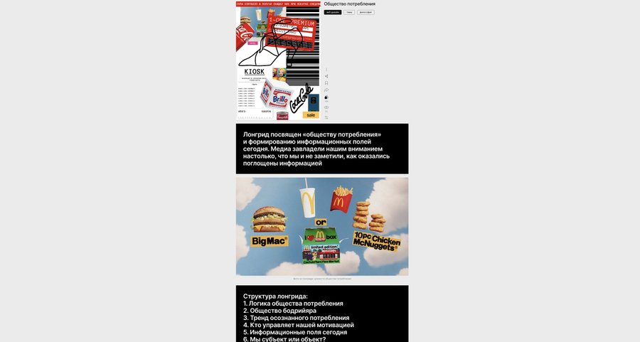
Good examples, images, and text alternate. The contrasting background of the text blocks supports the composition effectively.
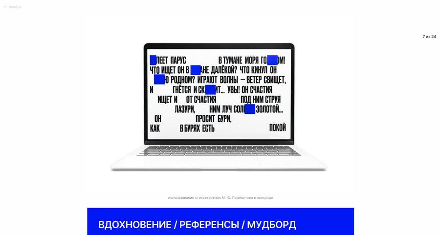
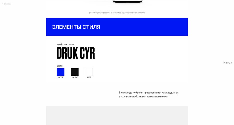
Poor layout choice. There is a lot of empty space, and the white background of the mockup creates a «void.»
II. Content (statics, dynamics, mockups)
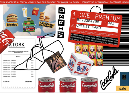
The Most Important Thing
Slides must be dynamic and engaging—attention-grabbing. Avoid white space or gaps, but do not overdo the details—that can create visual clutter. It is crucial to clearly define what you are showing and why.
Static: single images, sliders, tiles
What it could be
Our visual assets include screenshots, mockups, mobile versions, renders, and graphic solutions.
Text can be added to the slides if it is integrated thoughtfully into the image and typeset in the brand’s typeface.
The slides themselves can be presented in various ways: as a slider, a grid, or as a standalone image. Everything depends on your vision and the value of the content.
Show the most vibrant and creative snippets of the long-form article in large format.
At the beginning of the project, you can show the longread cover or create a horizontal cover specifically for the portfolio.
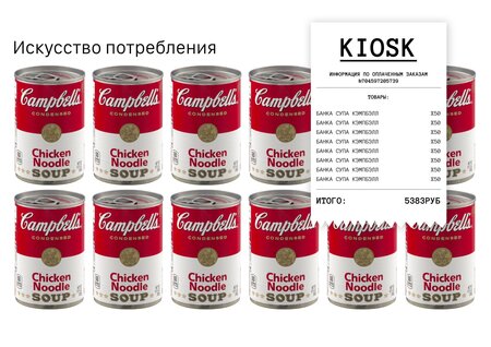
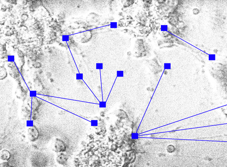
Tiles — you can show fragments from the longread (an interactive frame and pattern from the reference)
For example, there are two points below.
Point 1: A slider can be used to display several similar excerpts from a long-read article (or the entire long-read article, broken into sections);
Point 2: Overall, certain excerpts can be presented in a vertical stack of several frames. It is important that the image background contrasts with the portfolio background.
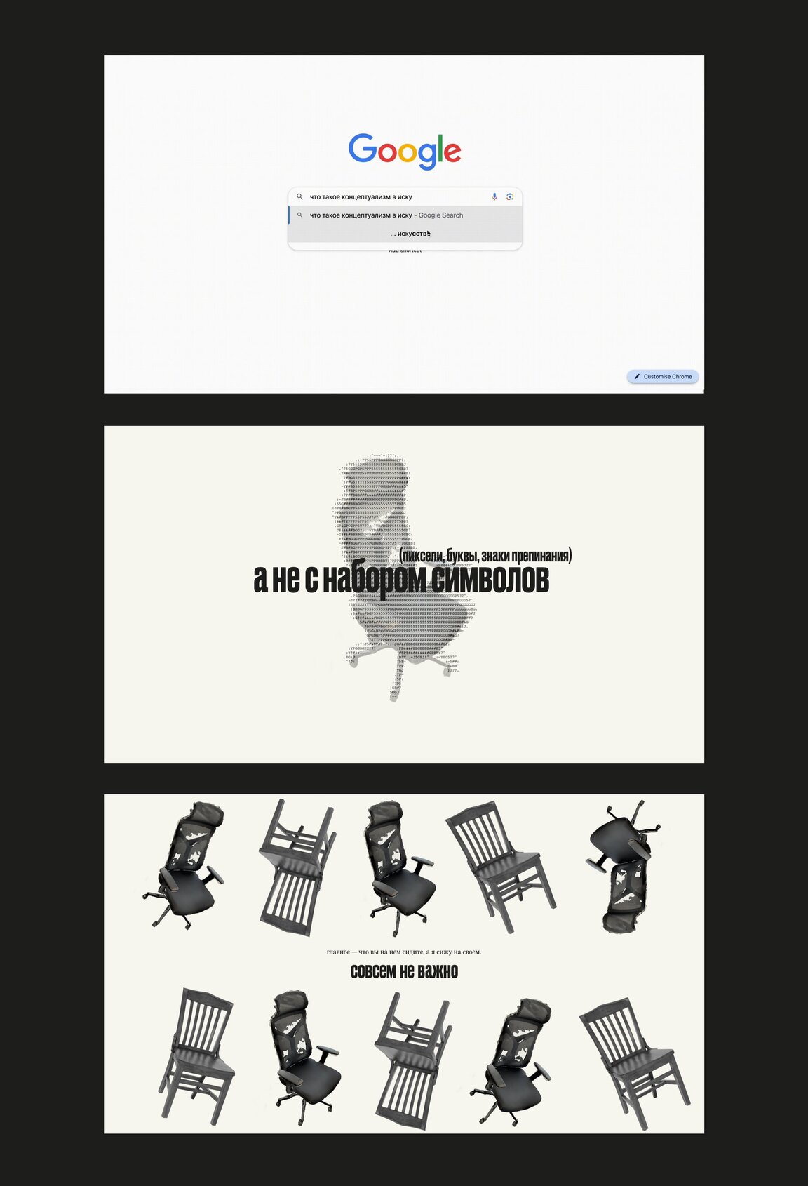

If you display similar details—present the content within the slide cleanly and engagingly.
For example, show what you created yourself below. Do not add other people’s images to create the desired atmosphere; it is better to display your graphics or add a link to a playlist with the appropriate mood.
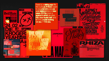
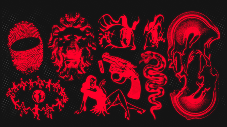
Image 1 — mood board; Image 2 — graphics in the long-form article.
Dynamics: video and gif
Videos and GIFs help reduce the length of a boring scroll of identical elements and allow techniques to be presented cohesively.
What this could be
Website animations; demonstration of specific features; site videos; renders; animated mockups.
We add videos via Kinescope, and GIFs as an image.
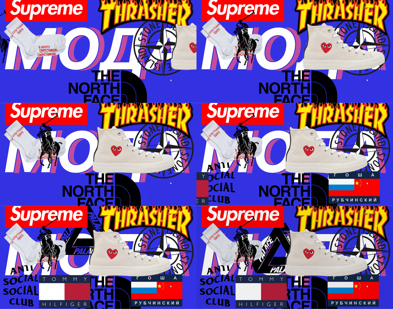
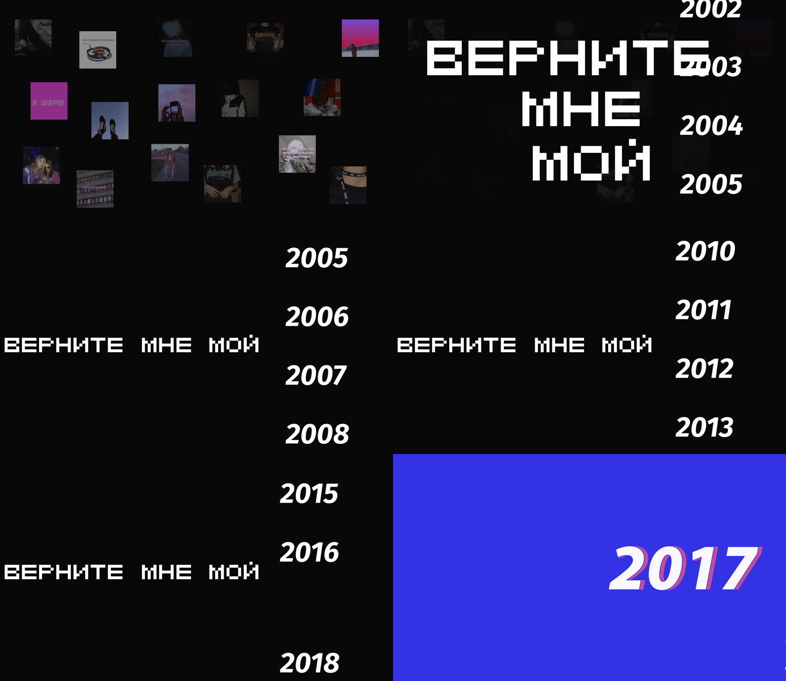
Several screens—can be a slider
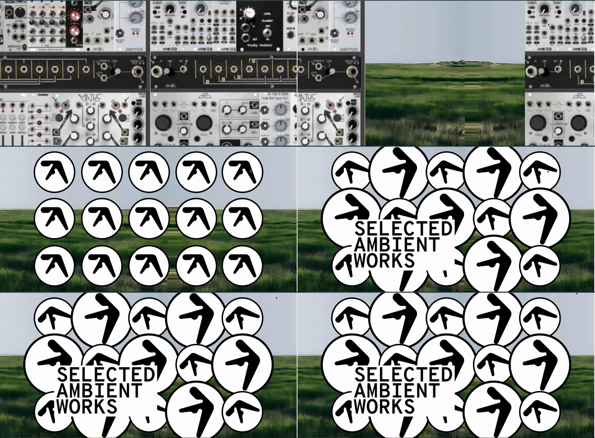
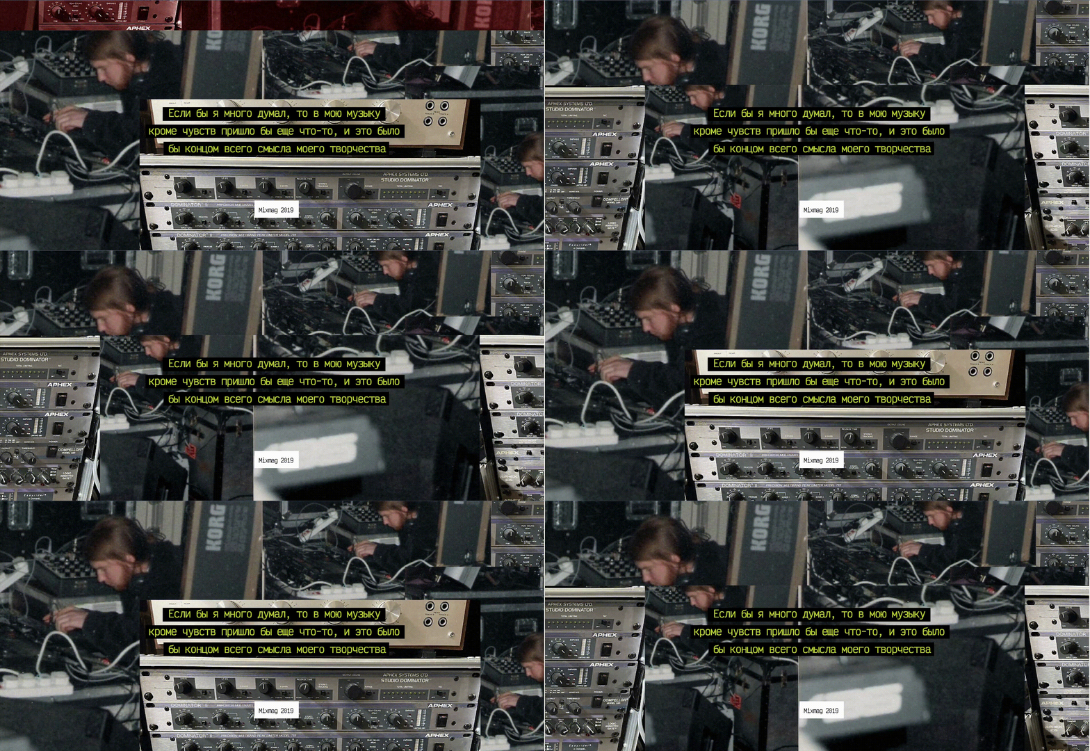
The tiles can be used if the GIF has a low resolution.