Hi, I’m Larisa
I design visual identities and websites for small businesses that want to stand out
Who I work with
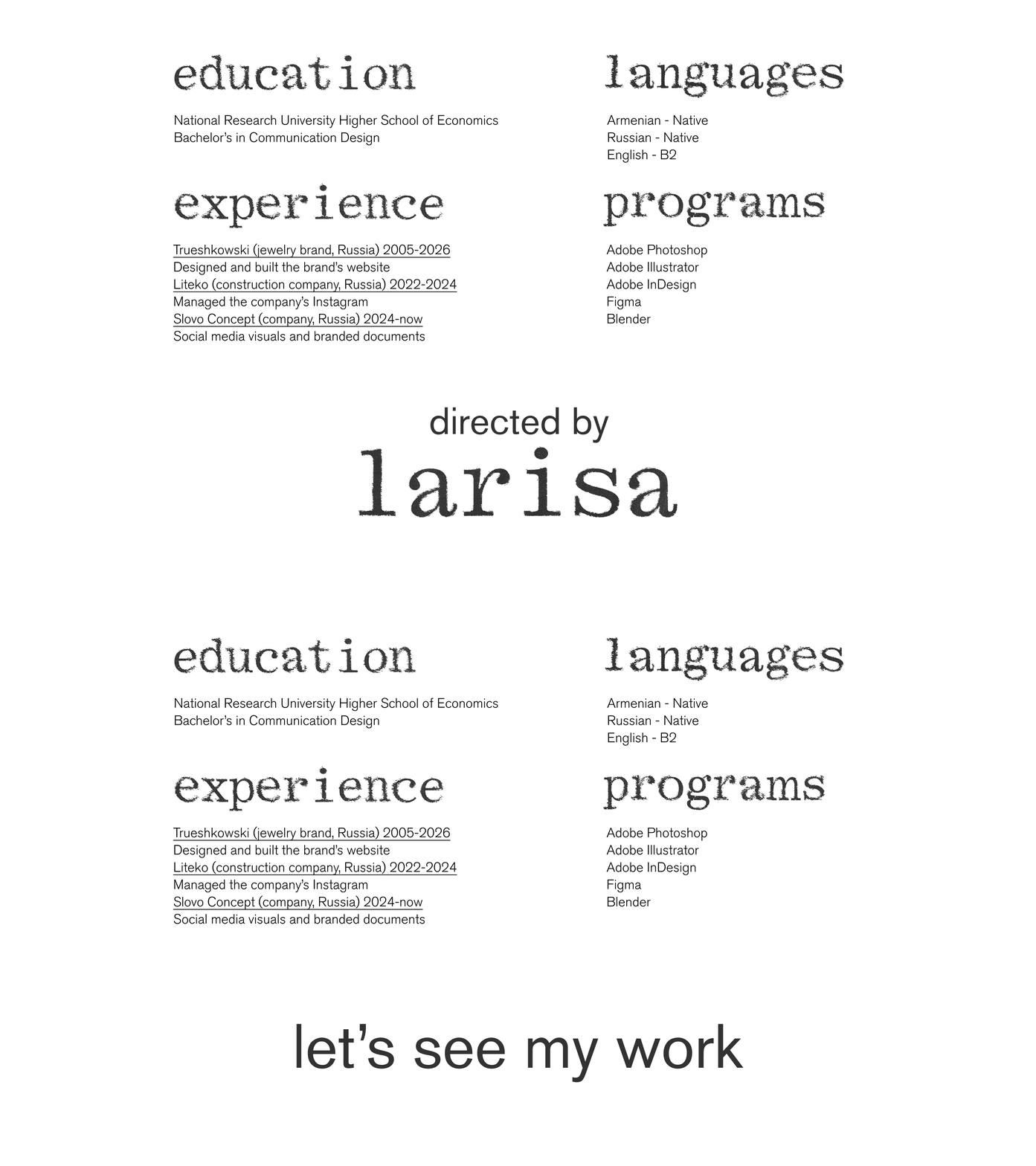
Founders and small teams who need a clear, bright visual image but don’t have a design department
Исходный размер 2880x1620
Исходный размер 2880x1620
Исходный размер 2880x1620
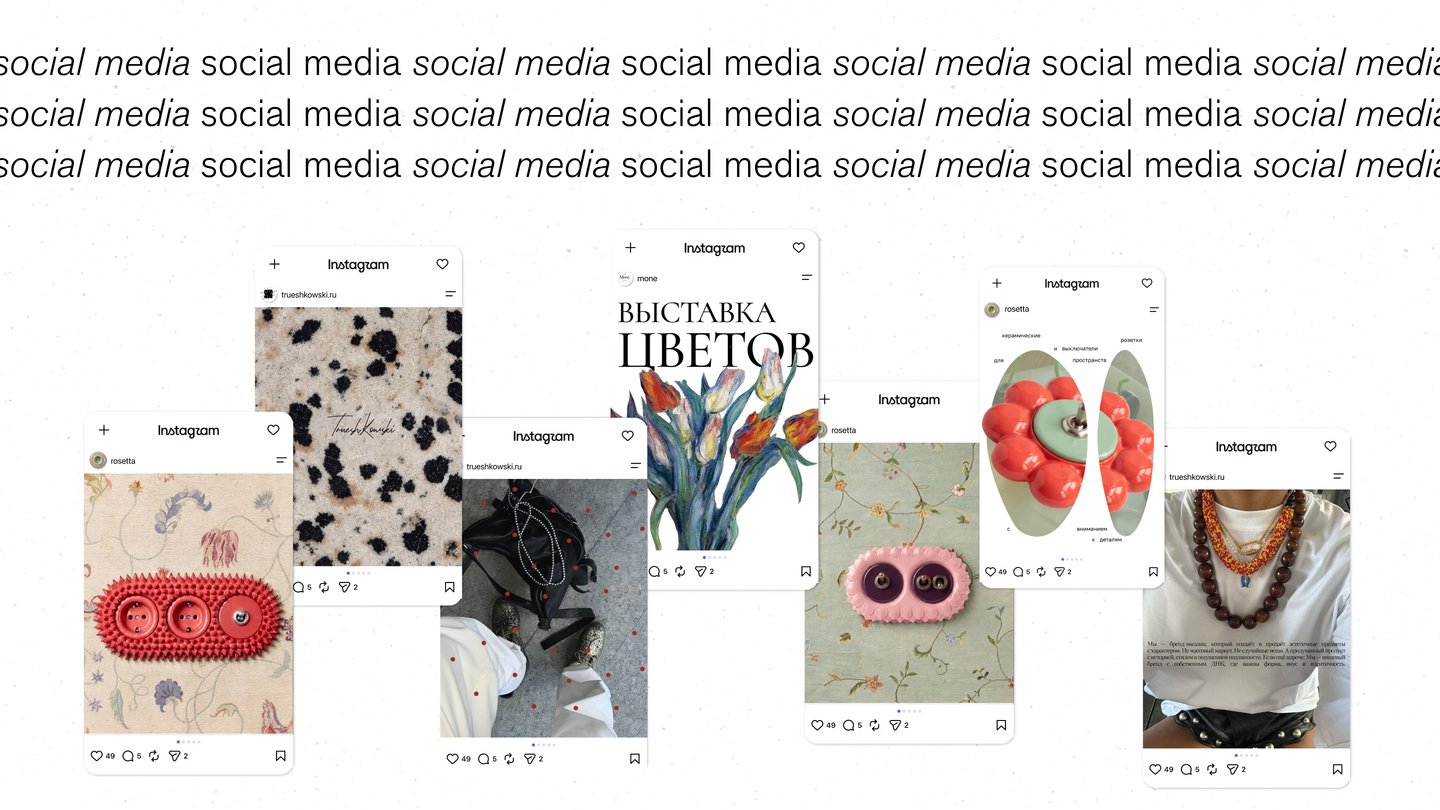
(1) Trueshkowski
Jewelry and body kits handmade from natural stone
My role: graphic designer, brand identity
For whom: a young handmade brand that needs a bold, recognisable image, so it doesn’t get lost among the usual «minimal jewelry» look.
Idea: hand-drawn boots as a metaphor for freedom and self-expression. Everything is drawn by hand, just like the jewelry itself is handmade. The identity is wild and restrained at once: a calm base with one red accent that works as the statement.
Why it stands out: instead of showing jewelry the way everyone does, the identity gives the brand a character. The red is used sparingly, so every red detail draws the eye.
Исходный размер 2000x657
Исходный размер 2667x1500
Исходный размер 2667x1500
Исходный размер 2667x1500
Исходный размер 2012x1057
Исходный размер 2667x1500
Исходный размер 2590x1498
(2) Alinos Scents
Corporate identity and social media design for a perfume store
My role: graphic designer, brand identity and social media design
For whom: a store of individual fragrances, for customers who choose a scent as a personal statement.
Idea: scent is invisible, so I made it visible through nature. Soft floral imagery and gentle colour transitions show a fragrance spreading through the air, while the minimal base keeps the focus on the scent.
Style: a delicate serif and a palette of green and soft pink-red: fresh, warm, calm.
Why it stands out: with many fragrances in the store, the identity works as a flexible system. Each scent gets its own colour mood, yet everything reads as one brand.
Исходный размер 2152x1210
Исходный размер 2604x1574
Исходный размер 2152x1208
Исходный размер 2150x1214
Исходный размер 2152x1210
(3) Rosetta
Visuals for a brand of bright, unusually shaped sockets
My role: graphic designer, posters, banners, business cards
For whom: a brand that turns an everyday object into a design piece, for people who care about interior details.
Idea: a socket is usually hidden, here it becomes the hero. One bold socket is the only accent in the frame, set against textured wallpaper that creates the interior mood.
Why it stands out: the visuals sell the socket as decor, not hardware, and keep all materials in one recognisable system.
Исходный размер 3300x1159
Исходный размер 2667x1500
Исходный размер 2275x1280
Исходный размер 2667x1500
Исходный размер 2667x1500
Исходный размер 2667x1500
Исходный размер 2667x1500
(4) Touchpoint
Visual identity for a dance festival
My role: graphic designer
For whom: dancers and audiences who come for freedom of movement.
Idea: a touchpoint is the moment of contact. Geometric shapes carry movement across the frame, and gradients make them flow like a dance caught mid-motion.
Why it stands out: motion is expressed through shape and colour, not literal photos of dancers, so the identity works on any format and stays one recognisable festival.
Исходный размер 2880x1271
Исходный размер 2880x1620