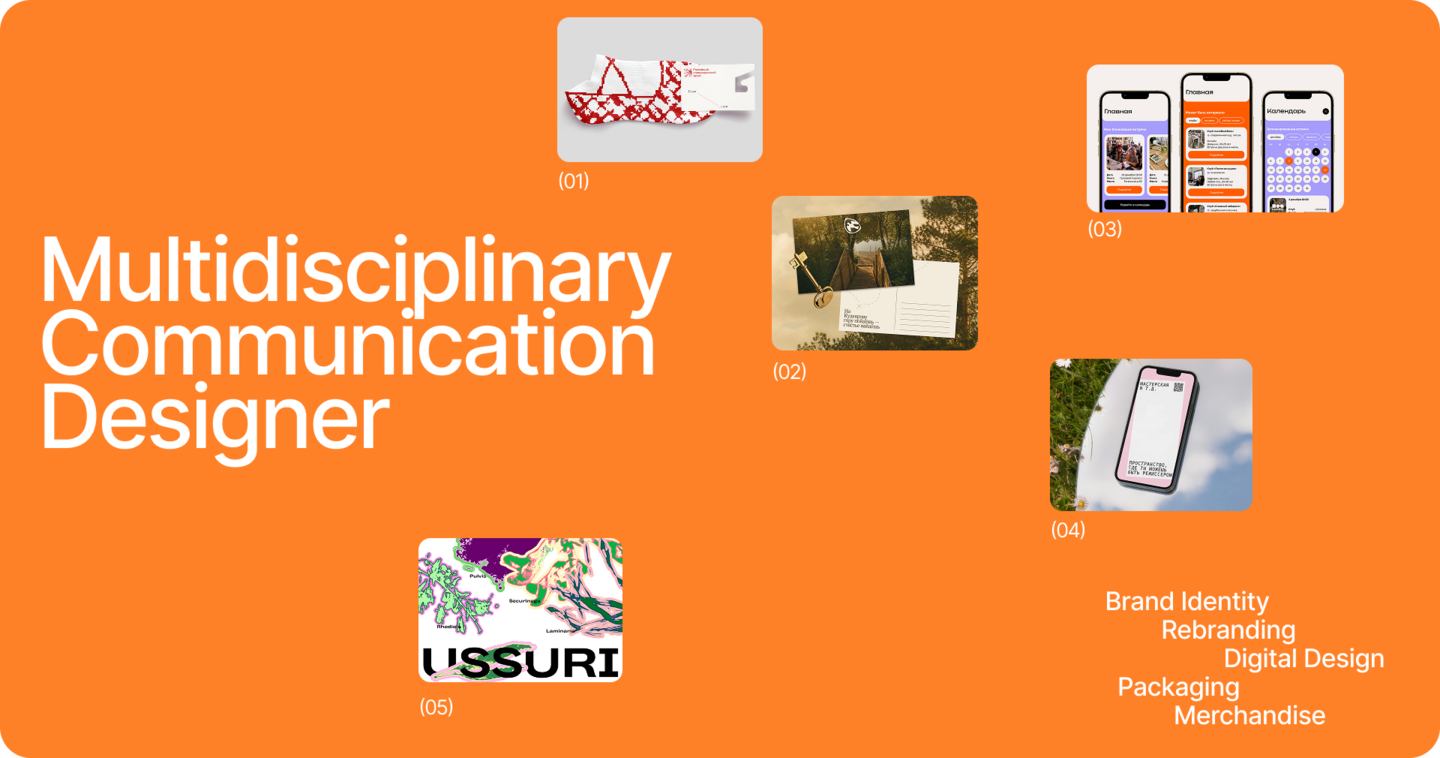
My name is Natalia, and I am a multidisciplinary communication designer. I help brands build a strong image, develop cohesive and memorable visual identities, stand out from competitors, and attract new customers
I create brand identities and visual systems, websites and apps, packaging, print materials, and a wide range of other design solutions. I take a holistic approach to branding — from the initial concept and positioning to bringing ideas to life across different formats and brand touchpoints. For me, design should be not only visually appealing but also functional, reflecting a brand’s values, communicating its personality, and helping businesses achieve their goals
You can come to me with any design challenge and leave with a complete, ready-to-use solution
Path 1: Brand Identity & Full Brand Development
I develop brand identities and create complete visual branding solutions — from logos and typography to websites, social media, and merchandise. My goal is not simply to make things look beautiful, but to create a distinctive brand image that captures attention at first glance, sets the business apart from competitors, and builds a strong brand presence. Every element comes together as a cohesive visual system that communicates the brand’s personality, evokes the right emotions, and helps build a meaningful connection with its audience
About a brief:
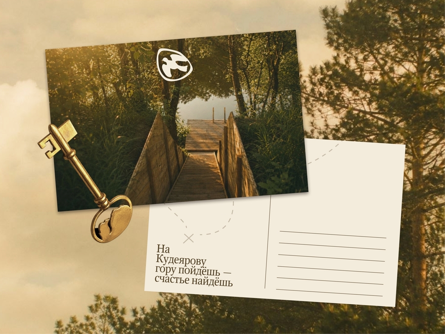
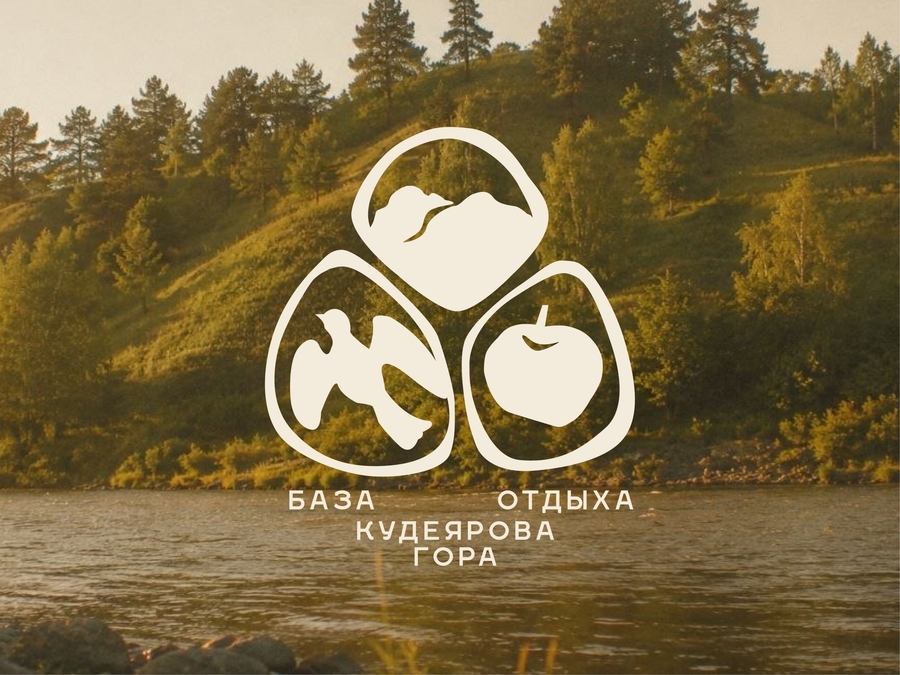
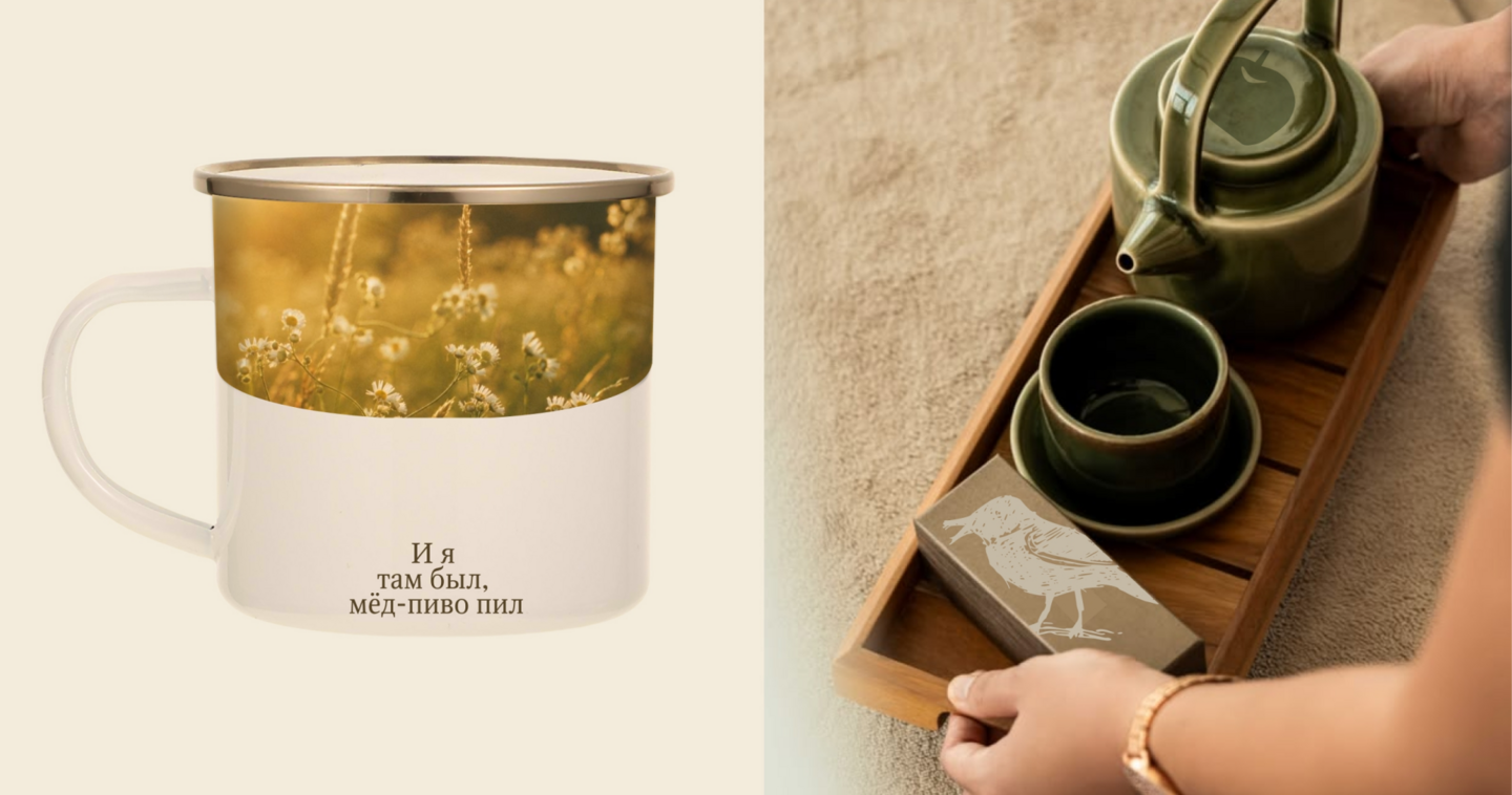
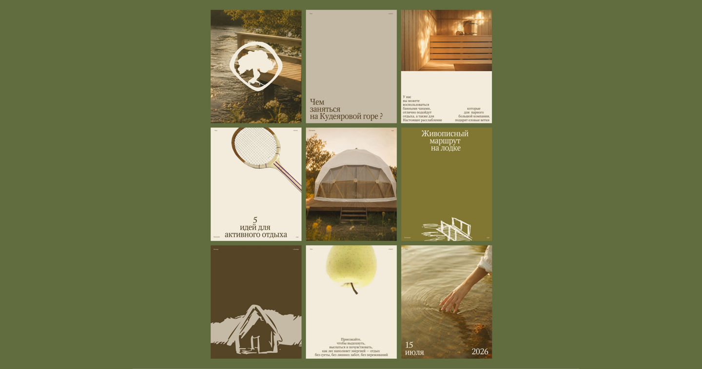
«Kudeyarova Gora» is a countryside retreat located in a picturesque setting by the river. It is a peaceful and cozy destination away from the noise of the city, where nature, tranquility, and a special atmosphere invite guests to slow down, recharge, and escape their everyday routine. The place is also connected to a local legend, giving it a sense of mystery and a story of its own. At the heart of the brand is a combination of natural beauty, comfort, and a fairytale-like atmosphereMain goal:
To create a brand identity that captures the atmosphere of the place, its natural beauty, and its connection to the local legend. The goal is to build a memorable brand image that sets the retreat apart from competitors, creates an emotional connection, and inspires people to visit. The identity should do more than communicate the services — it should convey the feelings guests will experience during their stay and make them want to return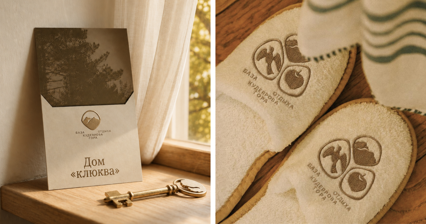
The Solution:
The project is built around the concept «Your Fairytale Begins Here.» It represents a place that embraces guests with its unique atmosphere: nature, the river, and cozy surroundings create a feeling of magic, tranquility, and renewal. This idea became the foundation of a complete brand identity system, including the logo, typography, color palette, graphic elements, brand guidelines, website, social media design, and merchandise. Every element supports the central concept and communicates the character of the place across all guest touchpoints. The result is a cohesive and recognizable brand that transforms an ordinary countryside retreat into a special destination with its own story and atmospherePath 2: Rebranding
I help established brands refresh their visual identity when it no longer reflects their value, matches the level of their business, or attracts new audiences. Rebranding allows a brand to preserve its recognition while unlocking its potential through contemporary design and a new visual concept.
About a brief:
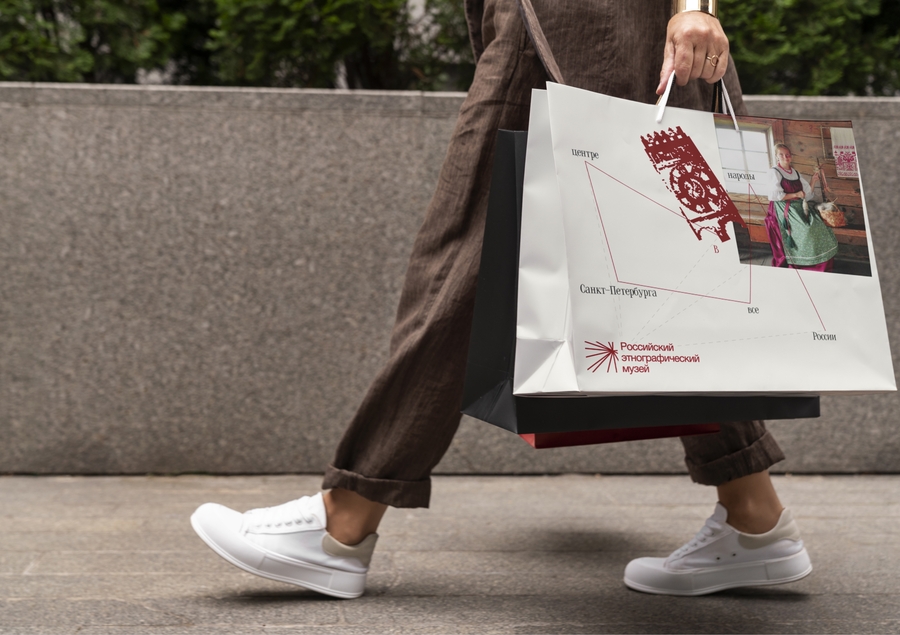
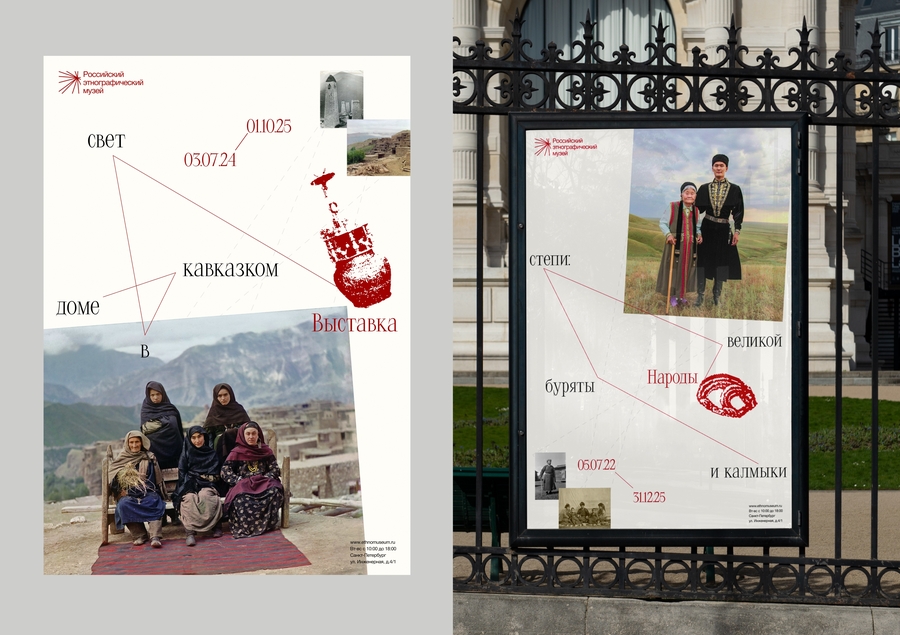
An ethnographic museum in St. Petersburg with a rich history and a collection of artifacts representing diverse cultures. Despite the uniqueness of its collection, the existing visual identity feels outdated and fails to communicate the museum’s depth, diversity, and value to a contemporary audienceMain goal:
To develop a cohesive visual system that brings together the identity, website, social media, and merchandise under one unified concept. To create a modern and distinctive image that reveals the museum’s uniqueness, attracts new audiences, and offers a fresh perspective on its cultural heritage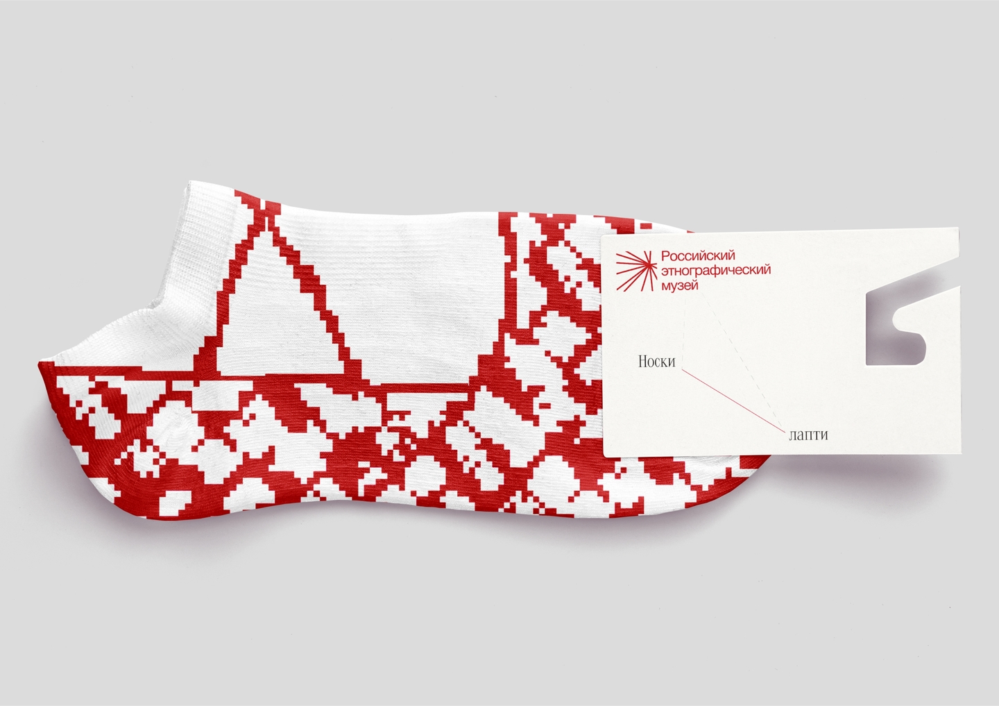
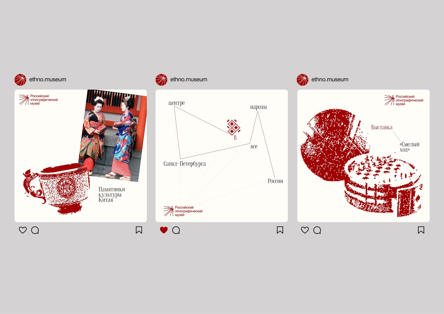
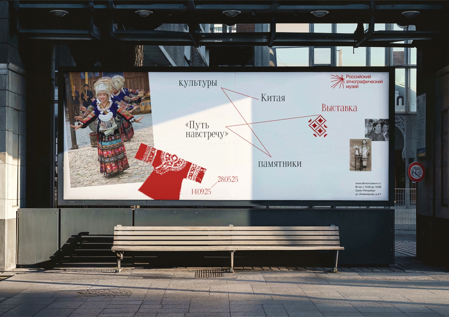
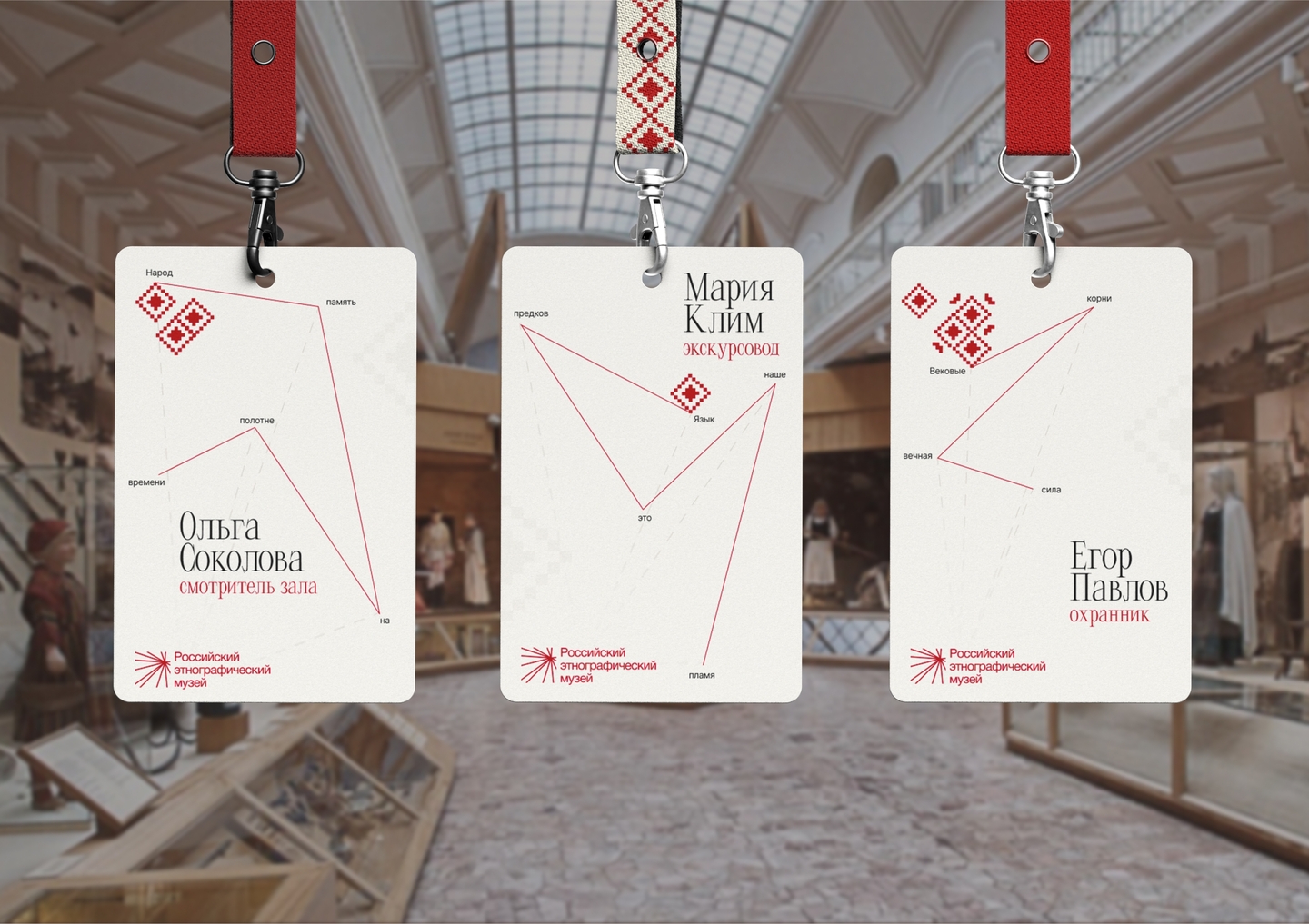
The Solution:
The rebranding is built around the concept «Connected», reflecting the connections between peoples, cultures, objects, and eras. This idea became the foundation of a unified visual system that brings together every point of interaction with the museum. The identity goes beyond refreshing the museum’s appearance — it tells the story of its rich cultural heritage in a contemporary visual language, bringing new life to historyPath 3: Packaging
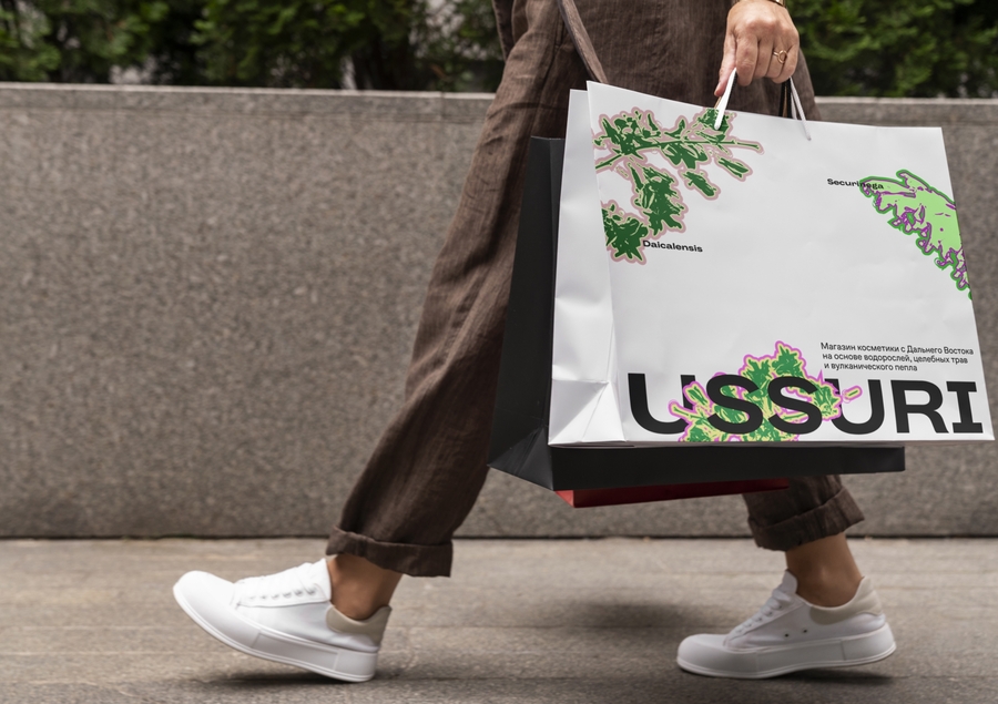
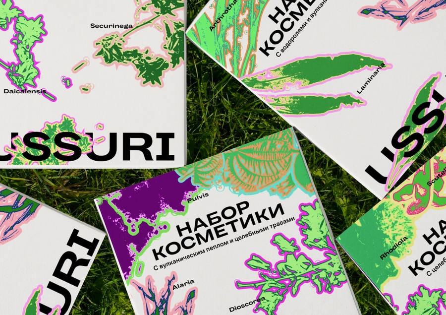
I create beautiful, functional, and memorable packaging that captures attention at first glance and helps brands stand out from competitors on the shelf. I focus not only on visual appeal but also on usability: information is arranged clearly and logically, while the design communicates the brand’s personality, values, and identity. Packaging becomes an essential part of brand communication, helping create a strong first impression of the product
About a brief:
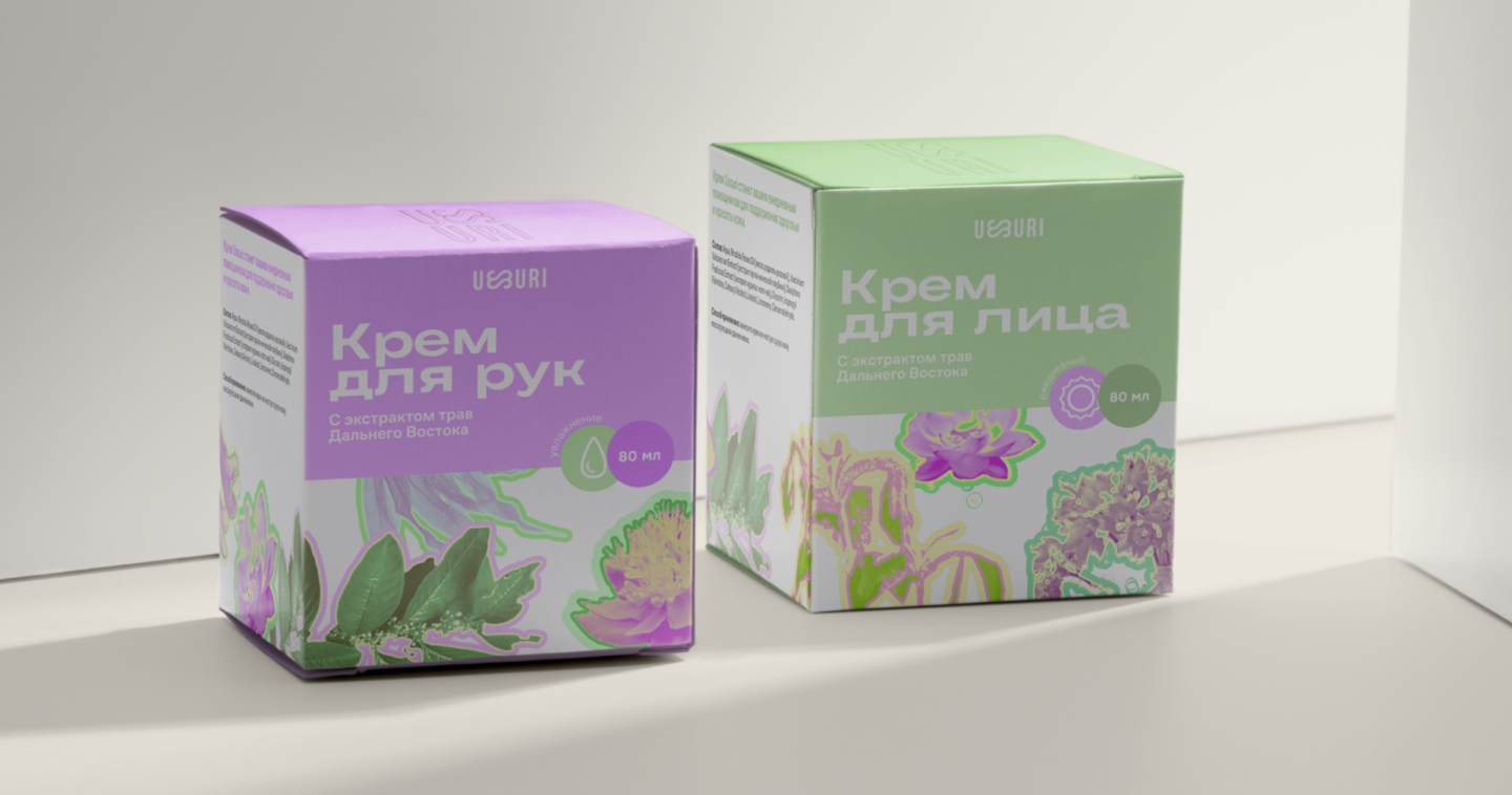
A skincare brand from the Russian Far East, built around natural ingredients inspired by nature. Its personality is vibrant, bold, and expressive, while remaining caring and attentive to the needs of the skin. The product range includes different skincare categories: hydration, nourishment, SPF protection, and care for problem skin. The brand’s main strength lies in combining natural origins, effectiveness, and a fresh, contemporary aestheticMain goal:
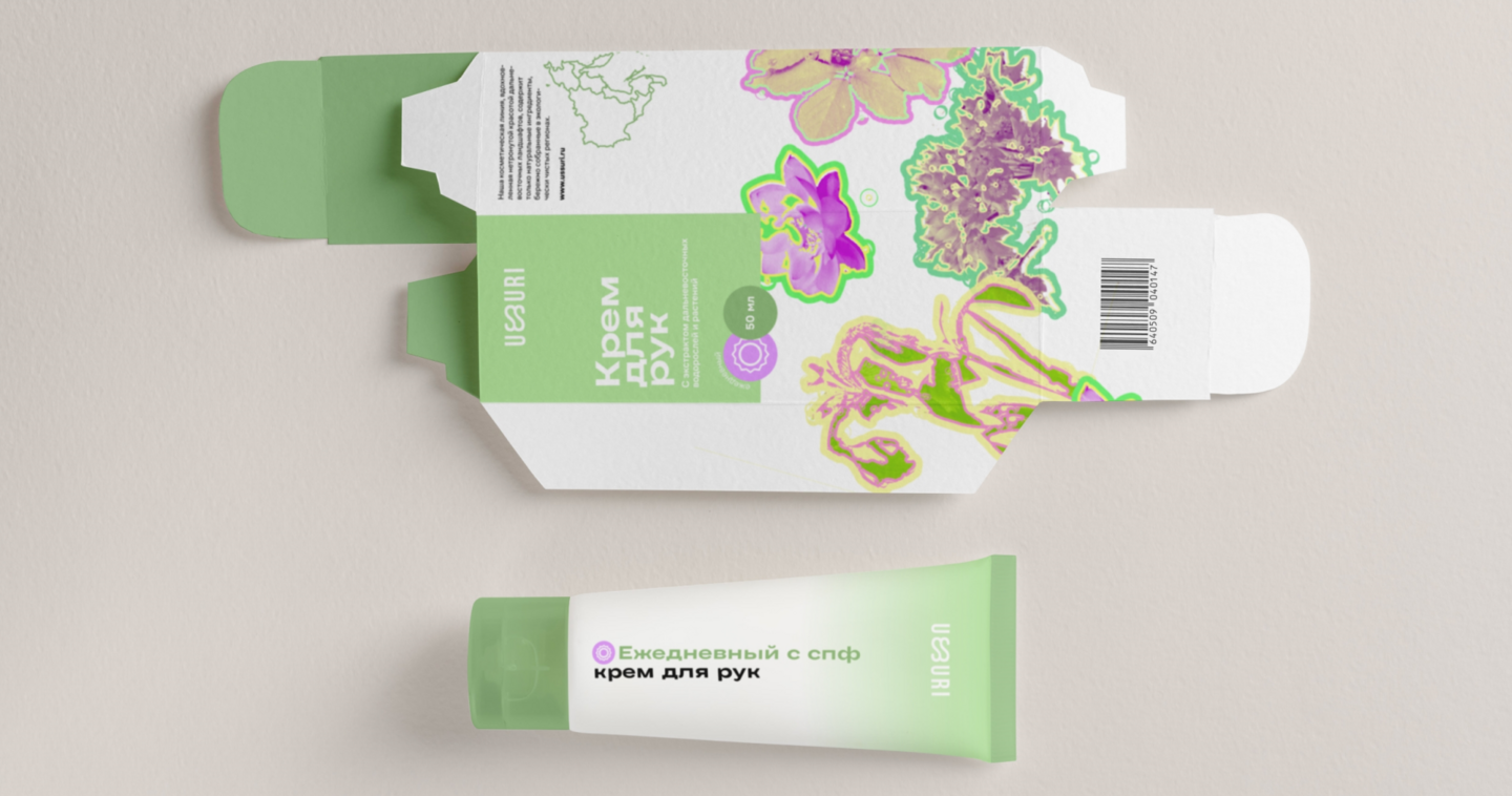
To develop a cohesive packaging system for the entire skincare range that preserves the brand’s individuality and helps customers easily navigate the product selection. The goal is to visually distinguish products by their purpose, make key information clear and noticeable, and create intuitive navigation based on product types and areas of application. At the same time, the packaging should remain vibrant, distinctive, and recognizable, reflecting the brand’s personality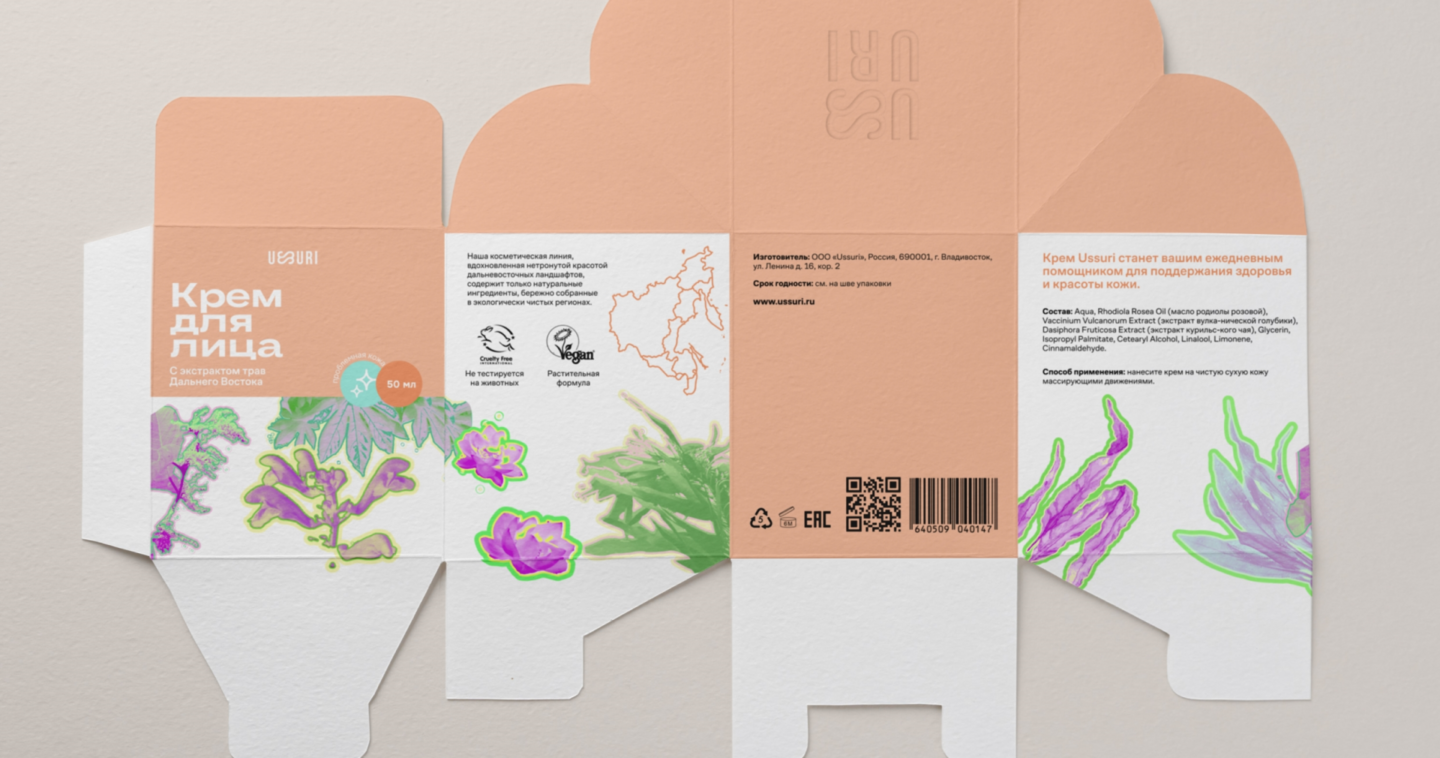
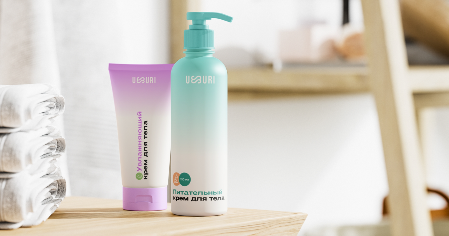
The Solution:
The packaging system is built around color-coded product categories, with each skincare direction assigned its own color, making products easy to distinguish even from a distance. Clear application labels — face, hands, and other areas of the body — provide additional guidance. Information is organized through a clear visual hierarchy, allowing customers to quickly identify the product name, purpose, and key benefits. Infographics help communicate product features visually and make choosing the right product easierThe result is a vibrant and cohesive packaging system that preserves the brand’s bold personality, makes the product range easy to navigate, and helps each product stand out and find its customerPath 4: Digital Design
I create digital products that help businesses present themselves effectively online, stand out from competitors, and attract new customers. I don’t just design visually appealing interfaces — I create thoughtful, user-friendly solutions where visual design and user experience work together. I focus on structure, navigation, and user flows to make every interaction intuitive, enjoyable, and effective