Brand communication MANEVR
Communication Theory
in the Field of Design and Contemporary ArtCommunication is fundamentally a process of creating meaning through the exchange of symbols within specific contexts. It is inherently relational, symbolic, and situated—the significance of a message shifts profoundly depending on whether it appears in a gallery, a social media story, or a private conversation. Theory provides a structured framework for understanding these dynamics. It translates intuitive understanding into systematic concepts that describe, explain, and even reshape how communication functions. This is especially evident in design and contemporary art, where every visual object—be it a poster, an installation, or an everyday item—operates as both a functional artifact and a theoretical proposition concerning identity, power, or culture.
Broadly, communication theories can be approached from two primary orientations: Objective theories seek measurable patterns in communication, such as behavioral effects or audience responses, often employing quantitative methods. Interpretive theories focus on the meanings, values, and multiple realities constructed through communication, typically using qualitative analysis and close reading of texts and practices.
More on how objects are variously interpreted, how they participate in forming identity, and how they engage with cultural meaning. *A useful meta-framework, such as Robert Craig’s seven traditions of communication theory, offers distinct lenses for analyzing any project. These include the cybernetic, socio-psychological, socio-cultural, critical, rhetorical, phenomenological, and semiotic perspectives. Applying this to a design or art brand means any object can be examined as: * •
semiotic system
of signs and visual codes. •socio-cultural practice
that enables the performance of identity. •critical discourse
that affirms or challenges prevailing norms. •medium for interpersonal communication
that shapes interaction and self-presentation.MANEVR Brand of
3d-printed Accessories
каффы из 3D принтера / дизайнер Томилина Ксения / MANEVR
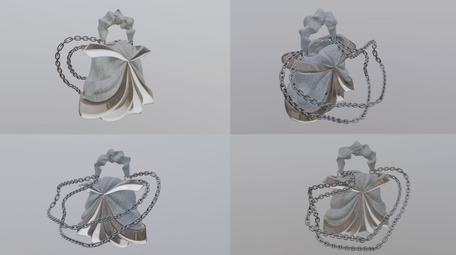
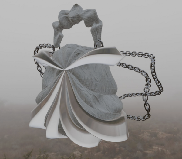
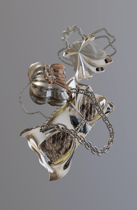
сумка из 3D принтера / дизайнер Томилина Ксения / MANEVR
A strategy integrating cybernetic, phenomenological, and semiotic approaches has been chosen for the MANEVR brand. Cybernetically, the products function as information processing systems in a digital world, transforming with the user. Phenomenologically, they emphasize lived experiences of self-transformation between fears and discoveries. Semiotically, forms like spirals and bends serve as signs reinterpreting boundaries and flexibility.
This approach is grounded in
the concept of accessories as portals to alternative selves
—a medium to articulate personal values and achieve social recognition. MANEVR provides instruments for the performance of identity.Consequently, through its use of nonlinear, technological symbols, the brand enables creative young adults to publicly enact an independent, boundary-pushing interpretation of self in their daily lives.
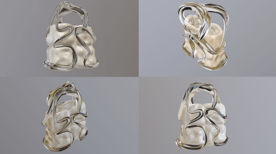
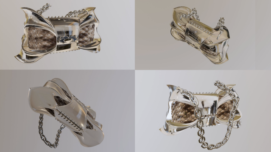
сумка из 3D принтера / дизайнер Томилина Ксения / MANEVR
Presentation of MANEVR Brand for a
General Audience
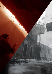
MANEVR is a design brand that creates 3D-printed accessories like bags and cuffs inspired by cyberpunk and Y2K aesthetics—reimagining forms as living matter in a digital world, transforming with you on paths between fears and discoveries.
Slogan:
«Opening portals to alternative versions of yourself»
Finally, own your transformation and use it to express your unique style in urban, extreme fashion contexts.
The brand supports identity needs. Customers literally use the accessories as tools to say «this is who I am» in interpersonal communication (IPC satisfies identity and spiritual needs and helps us construct and negotiate relationships).
It also serves instrumental needs: it’s an art-object, and an accessory you can take to events or integrate into daily outfits at the same time.
Communication is symbolic and relational. The spiral cuff becomes a message to others (friends, colleagues, strangers at parties), and the reactions («wow», curiosity, compliments) become feedback in the communication process.
Target
Audience
— Rewards:
attention, compliments, sense of uniqueness, emotional comfort, playful fantasy, identity reinforcement.— Costs:
financial cost + the «risk» of standing out.The brand communication reassures the audience that the rewards (confidence, mood, uniqueness) are worth the cost of being seen and noticed.
Presentation of MANEVR Brand for a Professional Audience
(Designers)
For designers, we can present MANEVR using more precise visual and theoretical language, focusing on color, symbols, form, and typography in terms of semiotics, phenomenological, and cybernetic traditions.
Concept
& FormA «maneuver» as a core form — nonlinear structures like spirals, bends, and multilayered designs, produced by 3D printing.
This is a reinterpretation of traditional forms through a technological, futuristic aesthetic.
From a semiotic perspective, this is a strong example of sign transformation:
Traditional accessory
→ symbol of status, utility.VS
MANEVR accessory
→ dynamic, transforming object; now it signifies flexibility, boundary-crossing, and self-construction in a digital age.From a phenomenological angle, the tactile, complex geometry invites a lived experience of transformation, while still functioning as a stylish accessory.
Color
PaletteThe main colors are various shades of gray, ranging from deep black to light white, with 3D shading effects to create depth and dimension. This includes gradient grays that mimic metallic surfaces and shadowed spheres, evoking a sense of volume and tactility in a digital context.
These colors work on several levels:
Cybernetic tradition:
they reference digital interfaces, data flows, and technological transformation — the visual language of the digital world, with 3D renders adding a layer of simulated reality. At the same time, in contemporary design they are linked to cyberpunk, Y2K, and experimental visuals.Semiotically:
•Grays (black to white) →
connotations of mystery, neutrality, urban sophistication, and infinite possibilities through gradients. •3D effects →
enhance the perception of forms as living, transformative matter, symbolizing depth beyond flat surfaces.Visual Symbols
& Illustration SystemBrand uses dynamic iconography derived from the logo, such as distorted letterforms that evolve into symbols. Key signs include intersections of circles (representing overlapping realities or portals), blurred crosses (symbolizing convergence or disruption), acid graphic processing with vibrant distortions, and heavy use of blurs for a dreamlike, motion-infused effect.
The illustration system focuses on photo processing style:
acid treatments that introduce chromatic aberrations, neon glows, and high-contrast distortions; blurs to convey movement and ambiguity; cyberpunk aesthetics with dramatic lighting, reflections, and urban decay motifs.From a semiotic tradition standpoint:
These are signs with cultural meanings (transformation, intersection, discovery), formed from logo elements for brand cohesion.).MANEVR uses them with irony and role reversal:
Circles intersect to suggest multiple selves merging. Blurred crosses disrupt linear paths, emphasizing maneuvers through fears.From a critical tradition perspective: This is a subtle critique of rigid norms in fashion, where individuals are passive consumers.
«The modern creative is technologically empowered; they can design their own path.»
Typography
The logo serves as the core graphic element, featuring distorted, twisted, sharp, 3D-rendered letterforms for «MANEVR» that appear sculptural and dynamic. Typography extends to postcards and posters with bold, futuristic sans-serif styles, often integrated with 3D effects, distortions, and thematic phrases like
«ONE BODY / MANY VERSIONS» or «FOR THE CHOSEN»
.This typography alludes to tech scripts (code, interfaces), but is implemented in a contemporary, bold way as graphical elements.
Through the semiotic and rhetorical traditions:
It connects the brand to innovation, narrative, and high tech, giving depth to otherwise provocative forms and colors.«Yes, we’re experimental and bold, but we also know the history of visual culture and place ourselves in that continuum»
Brand Character
& Communication Tone

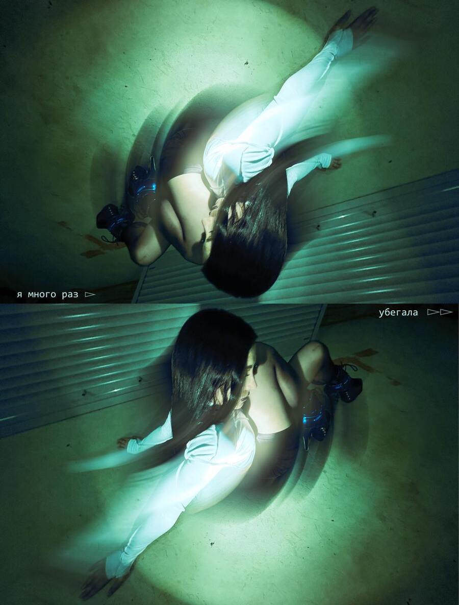

фотосессия с блюром и тенями / MANEVR
Character: «icon archetype», provocative, conceptual, intellectual, aesthetic maximalist, leading the audience.
In interpersonal communication terms: This brand-voice manages positive face needs of the audience (they want to be admired) by framing them as
«boundary-pushers, digital explorers»
.At the same time, it respects their negative face needs (autonomy) by emphasizing flexibility, choice, experimentation — no one dictates how to maneuver.
For designers, we can frame MANEVR as:
A cybernetic system:
processing transformation via tech forms and digital aesthetics.A phenomenological playground:
experiencing self through tactile, nonlinear objects.A critical commentary: deconstructing conformity through provocative, boundary-challenging design.
The Communication Theory
Framework
for the Brand Presentation
The MANEVR brand constitutes a continuous communication process, where the exchange of meaning occurs through visual symbols (intersections of circles, blurred crosses, logo-derived forms) and their integration into social practices—from urban events to personal self-expression, enhanced by acid photo processing and blurs that evoke ambiguity and transformation.
An interpretive foundation
This research is consciously built on an interpretive paradigm, focusing on the subjective meanings the audience projects onto the objects, rather than measurable effects. This reflects the nature of design as a field for identity construction, where 3D grays and distorted typography invite personal interpretation.Theoretical framework: three of Craig’s traditions The brand strategy is structured by three traditions: •
Cybernetic:
TThe products are analyzed as information systems, where forms process digital transformation, with blurred and acid-processed visuals symbolizing data flows and feedback loops. •Phenomenological:
Emphasizes the lived experience of maneuvering between fears and discoveries, amplified by tactile 3D elements and blurs that create immersive, sensory ambiguity. •Semiotic:
The accessories are viewed as a system of signs, where nonlinear forms (like circle intersections and blurred crosses) establish a new norm—the idea of self-constructed reality, formed from logo graphics and postcard typography.Communication and identity MANEVR
functions as a tool for interpersonal and identity communication:• The bag satisfies the need for public identity expression («digital explorer»), using gray palettes and 3D depth. • The cuff addresses the spiritual need for boundary expansion, through symbols like blurred crosses. • Together, both objects solve a practical task, merging functionality with a deep symbolic layer, processed with acid graphics for emotional resonance.
Exchange theory as an explanation of value
Following the logic of Social Exchange Theory, MANEVR’s value to the audience lies in high emotional rewards. The «accessory as portal» combination in a single object increases the perceived benefit, justifying the cost. The brand’s promise—"opening portals to alternative versions of yourself"—directly appeals to this economy of emotions and self-worth, reinforced by visual elements like intersecting circles symbolizing shared experiences.Result: the hybrid object as a communication node
The analysis of MANEVR demonstrates how a design object becomes a multi-contextual communication node, functioning simultaneously across various environments: as an accessory in urban settings, a topic of discussion on social media, an art object at events, and a personalCourse «Communication Theory: Bridging Academia and Practice»: lectures 1.1–1.6, 4.4–4.5; module on critical theory, Marxism and the Frankfurt School (ideology, culture, culture industry, public sphere) [Electronic resource]. — Electronic text data. — 2025. Accessed 12.12.2025.
Fiske J. Chapter 4. «Theories of Signs and Signification»; Chapter 5. «The Subject and the Social» // Introduction to Communication Studies. 3rd ed. — London; New York: Routledge, 2011. — P. 66–118.
Journal of Consumer Research [Electronic resource]. — Electronic text data. — 1974–2025. — Accessed 12.12.2025
Tomilina K. MANEVR — Accessory Design // Portfolio of the HSE University School of Design. 2025. URL: https://portfolio.hse.ru/Project/274337 (accessed: 14.12.2025).
Tomilina K. Extension: manevr // HSE University School of Design. [n.d.]. URL: https://hsedesign.ru/project/cd3094cc32f543109957f2a50c9e18b4 (accessed: 14.12.2025).
Tomilina K. MANEVR // Portfolio of the HSE University School of Design. 2024. URL: https://portfolio.hse.ru/Project/201993 (accessed: 14.12.2025).
Tomilina K. MANEVR Application // Portfolio of the HSE University School of Design. 2023. URL: https://portfolio.hse.ru/Project/191309 (accessed: 14.12.2025).
Tomilina K. MANEVR // Portfolio of the HSE University School of Design. 2023. URL: https://portfolio.hse.ru/Project/189213 (accessed: 14.12.2025).
Tomilina K. MANEVR Rebranding & Phenomena of Unusual Packagings // Portfolio of the HSE University School of Design. 2025. URL: https://portfolio.hse.ru/Project/264880 (accessed: 14.12.2025).
For the Instagram profiles (@xkinsk, @mhauberk, @badbaarbie), cited as references for audience and style:
Kinski A. Xkinsk [Electronic resource] // Instagram. [n.d.]. URL: https://www.instagram.com/xkinsk/ (accessed: 14.12.2025).
Hauberk M. Mhauberk [Electronic resource] // Instagram. [n.d.]. URL: https://www.instagram.com/mhauberk/ (accessed: 14.12.2025).
Anastasiia’s story. Badbaarbie [Electronic resource] // Instagram. [n.d.]. URL: https://www.instagram.com/badbaarbie/ (accessed: 14.12.2025).