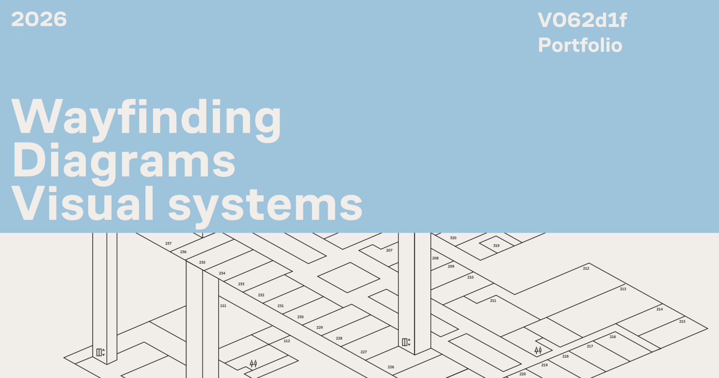
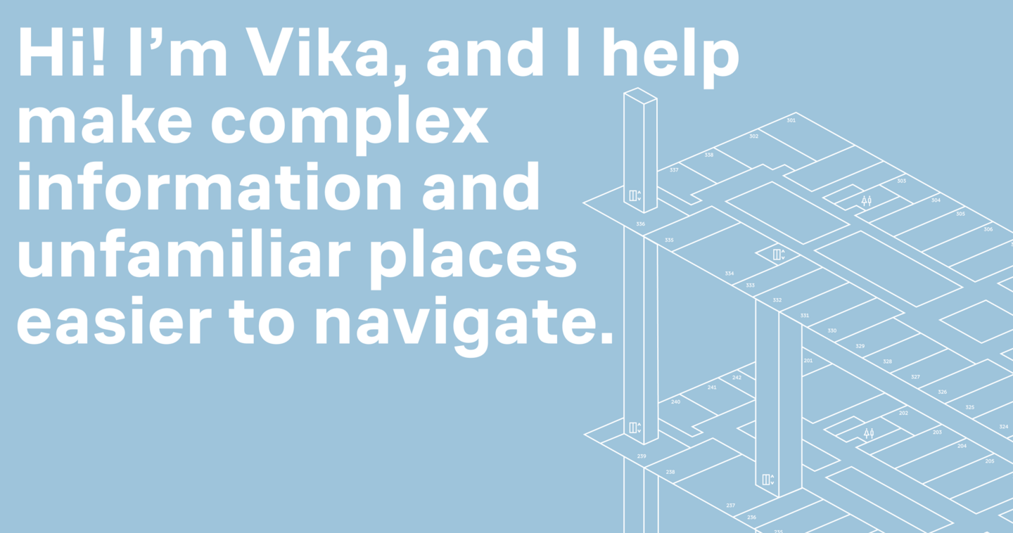
I’m a communication and information designer specialising in wayfinding, diagrams, instructions, and visual systems for organisations that work with visitors, learners, or customers. I help people find what they need faster and feel more confident navigating a product or space
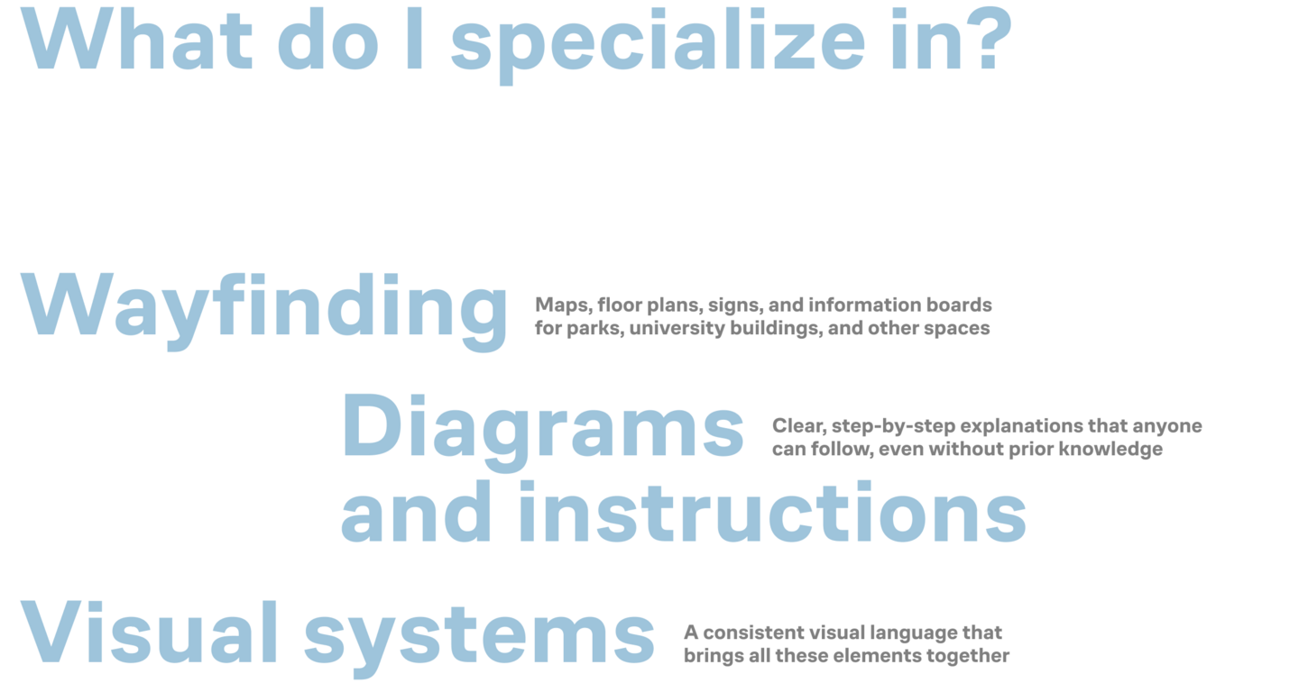
I’m drawn to projects where information is designed for everyday people, not specialists — whether it’s finding a room, following a route, or assembling a model using instructions
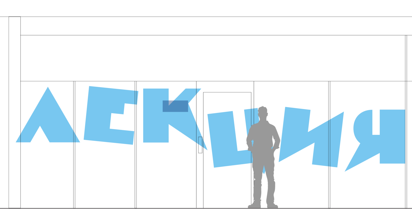
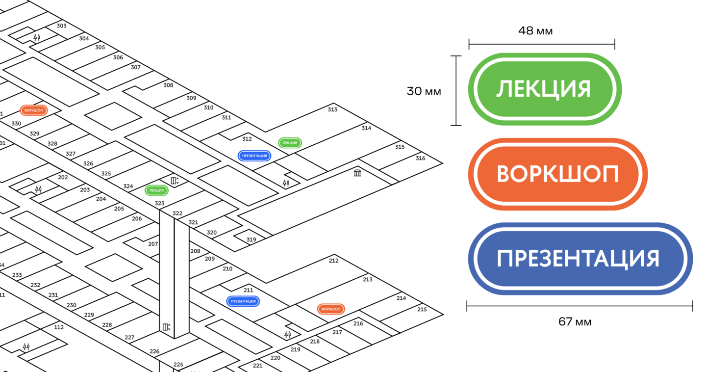
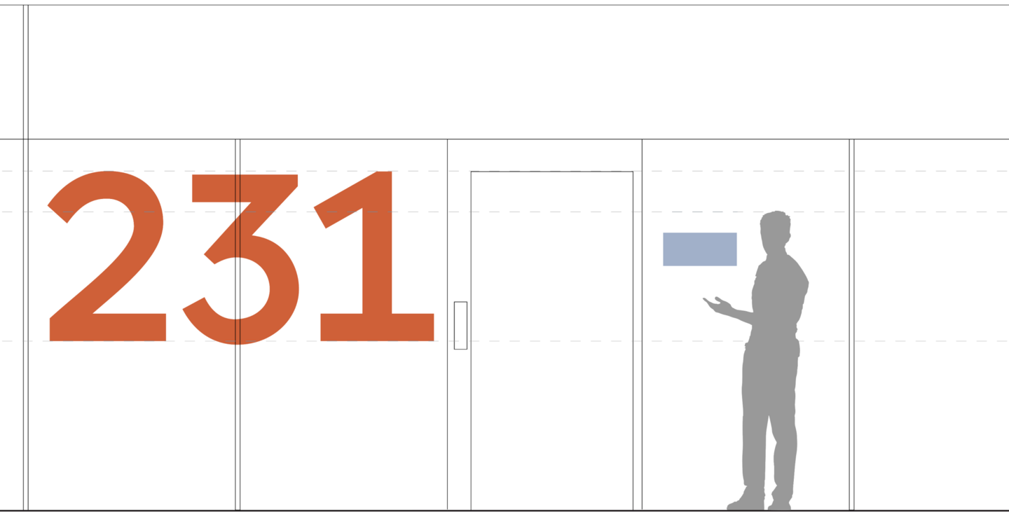
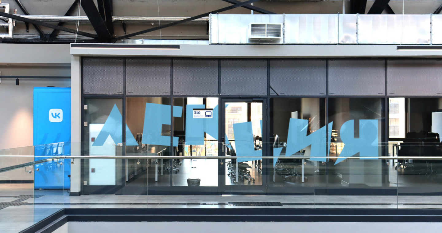
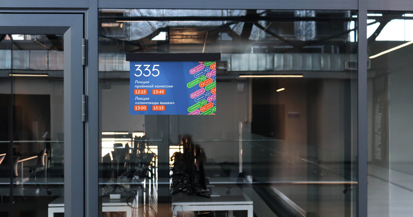
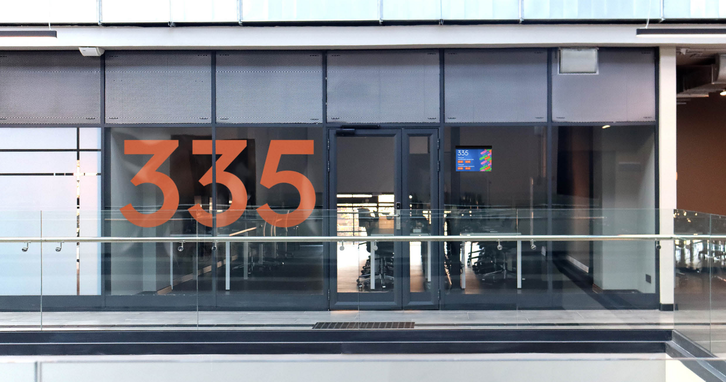
Wayfinding System for HSE University’s Campus
Context and Challenge Kanatny Yard is a landmark of Constructivist architecture that became part of HSE University in 2025. By September 2025, it was home to students from six academic programmes, as well as visiting guests and event attendees. The challenge was to create a wayfinding system that worked for everyday campus life while remaining flexible enough to accommodate events and help first-time visitors find their way around
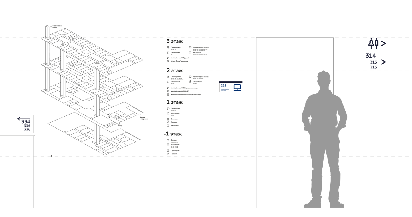
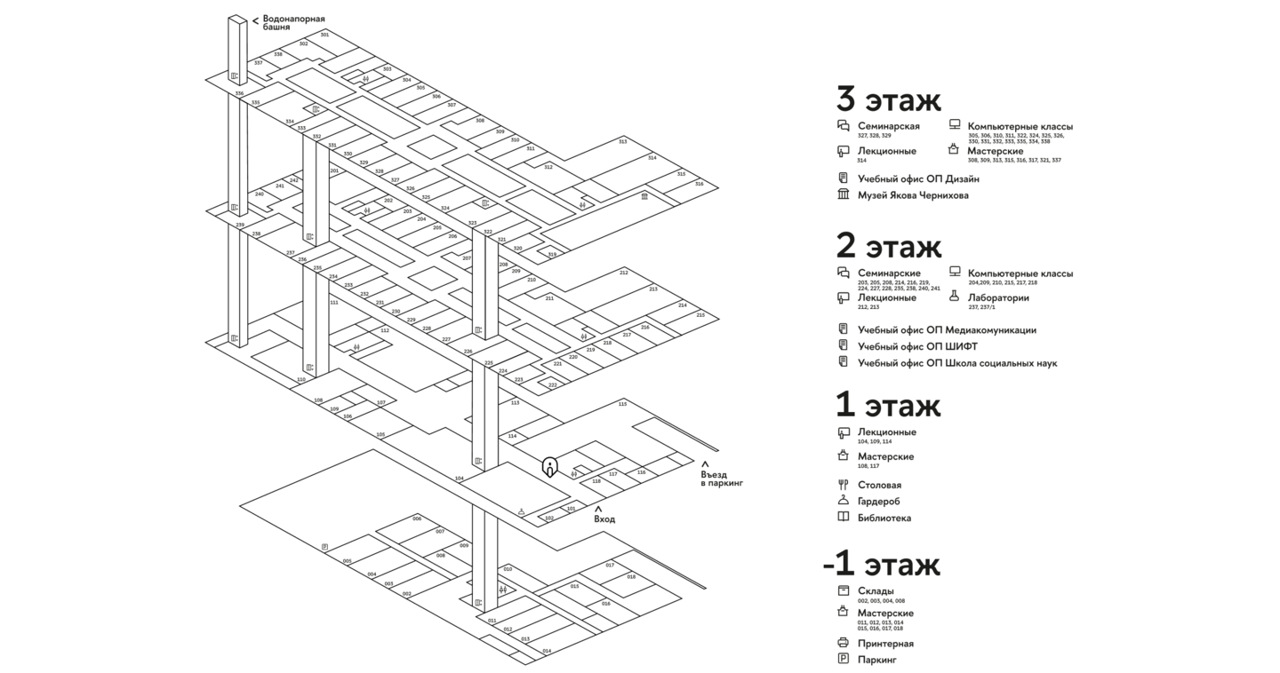
Approach and Solution I studied how people moved through the building by mapping routes, surveying students, identifying where people tended to stop, and analysing visitors’ needs. I designed movable sign panels and plotted the maps on a cutting plotter so that information could be updated quickly and easily. I also created a separate wayfinding layer for events, aligned with the university’s existing visual identity
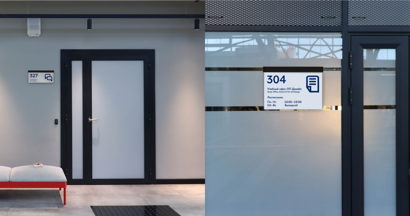
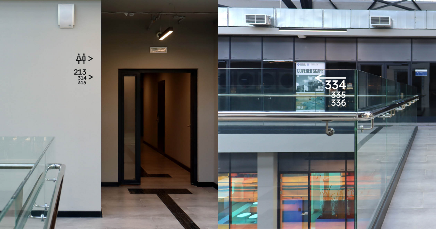
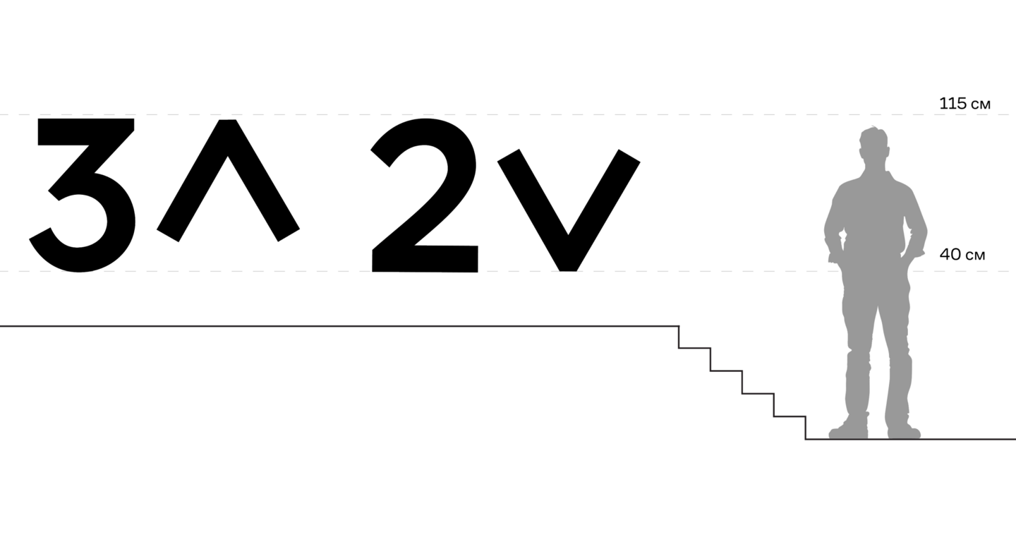
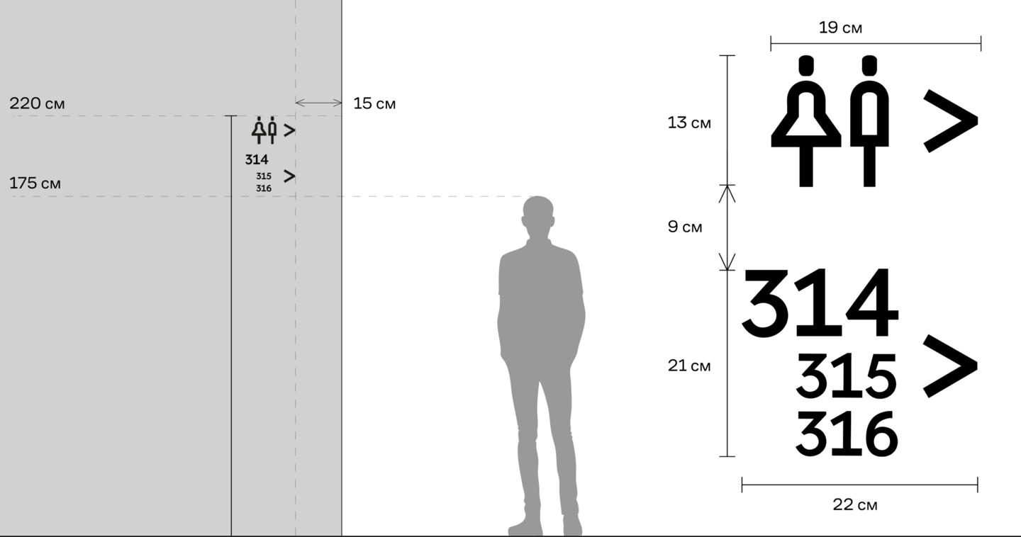
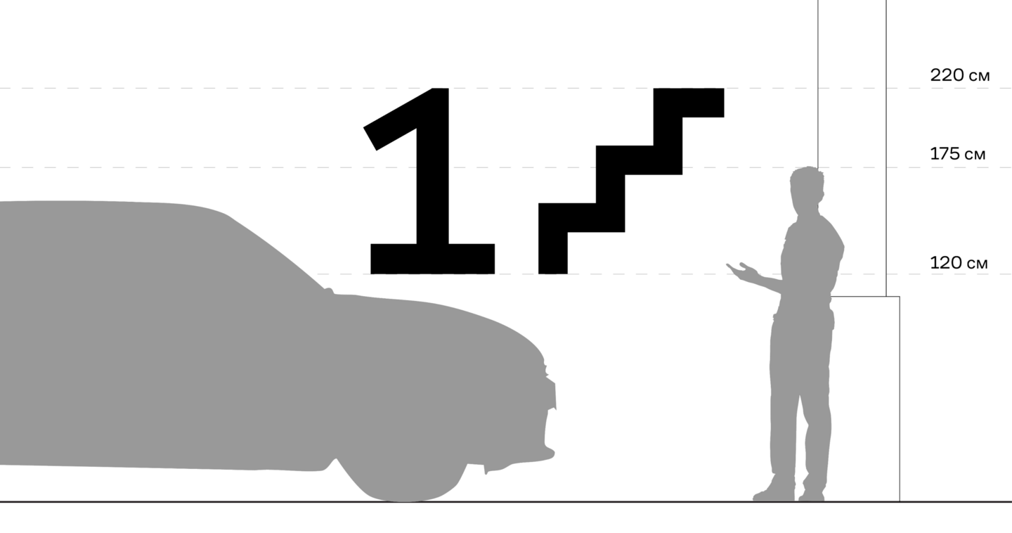
Outcome A building-wide wayfinding system covering the entire campus, including the basement and emergency staircases, along with a concept for event navigation developed around the university’s Open Day. The project taught me how to build a layered wayfinding system and develop it in stages
Assembly Instructions and Brand Identity for an Architectural Building Kit
Context and Challenge A brand of architectural building kits inspired by Neo-Brutalism, designed for curious people who love learning about architecture, whether they study or work in the field. The goal was to develop both the assembly instructions and the brand’s overall visual identity
Approach and Solution I started by developing the brand platform: researching competitors, defining the brand’s tone of voice, and figuring out how it should communicate with customers. These insights informed the visual direction of the instructions. I then went through the entire assembly process myself, deciding which steps needed detailed explanations, which required short captions, and which were intuitive enough to leave unexplained. In many ways, I also took on the role of an instructional designer
Outcome A 36-page assembly guide for one section of the building, along with a visual identity for the entire brand. The diagrams created for the instructions became the foundation of the brand’s visual system, built around the idea of a modular kit. This project strengthened my ability to break complex processes into clear steps and build explanations that guide people through a task from start to finish
Wayfinding for the Baikal National Park
Client and Challenge The Baikal National Park welcomes large numbers of visitors, who need to stay on designated routes and within marked areas to protect sensitive natural habitats. The park needed to expand its existing wayfinding system. My task was to design information-rich maps that matched the park’s visual identity and helped both first-time visitors and returning hikers find their way around