Communication theory: MURMUR
COMMUNICATION
THEORY IN THE
DESIGN FIELD
Communication theory views meaning not as something transmitted mechanically, but as something created in the interaction between sender and recipient. In design, this principle becomes especially clear, because every visual decision is both a message and a relationship. By arranging shapes and colors, a designer also shapes the way the audience sees and interprets the message.
Design functions as a system of signs, where form, color, composition, scale, rhythm, typography, and movement together create a symbolic system that carries emotional, cultural, and functional meaning. Through semiotics, designers learn to treat visual elements as codes that evoke associations, where a curve may signal softness or a symbol may activate a cultural memory. Even small choices shape how the user «reads» a visual message.
Communication theory also emphasizes the importance of channels and contexts. The same message will be understood differently on a screen, on packaging, or in a public space. Design must respond to this fluidity. Theories of perception further underline that «noise» can distort a message. For example, excessive detail, stylistic mismatch, or unclear hierarchy can break communication. Eliminating this noise is an essential task of design, turning visual chaos into clarity.
Narrative approaches in communication remind us that humans understand the world through stories. A design object, whether a logo or an entire brand, can become a small narrative structure, guiding emotional connection. A well-built visual story not only conveys information but creates value, trust, and engagement.
Socio-cultural approaches highlight that communication is never isolated from its audience. Meaning is interpreted through shared habits, expectations, and cultural codes. Effective design therefore resonates with the viewer’s symbolic universe rather than imposing an alien one. In this sense, design becomes a dialogue rather than a broadcast — a co-construction of meaning between designer and audience.
Taken together, these theories show that design is not simply aesthetic embellishment. It constructs relationships, guides behavior, clarifies function, and shapes emotional response. Communication theory provides the framework that allows designers to think not only about how something looks, but about how it is perceived.
Seeing design as meaning, story, and relationship guided the creation of our brand concept, giving it clarity of symbolism and a gentle emotional tone.
PRESENTATION FOR
A GENERAL AUDIENCE
MURMUR
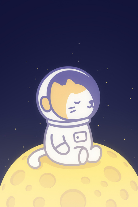
— a brand that turns the journey to sleep into a magical space adventure for you and your child.The moments before sleep are precious. They are a unique opportunity to build a sanctuary of comfort, trust, and imagination together. Our products are more than just sleep accessories. They are tools for creating family rituals and personal stories, centered around our main guide — Astronaut Cat.
A hyper-detailed, photorealistic studio product shot of a single, minimalist plush toy. The toy is a soft, elongated crescent-shaped cuddle pillow (body pillow) designed as an astronaut cat.
Talismans for Sweet Dreams
Every product we create is designed to be a personal charm that provides a sense of security:
★ Purring Kitten Pillows are more than a plush toy. Their soft, vibrating «purr» soothes and helps your child relax, becoming a loyal companion in bed. Each pillow is equipped with a integrated helmet. On this helmet, you’ll find subtle «Purr Control» dials that allow you or your child to adjust the vibration’s intensity — from a gentle, almost imperceptible hum for light sleepers to a steady, soothing rumble for deeper comfort.
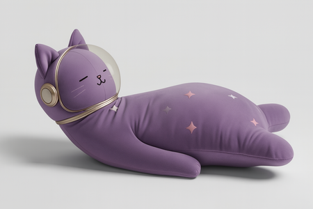
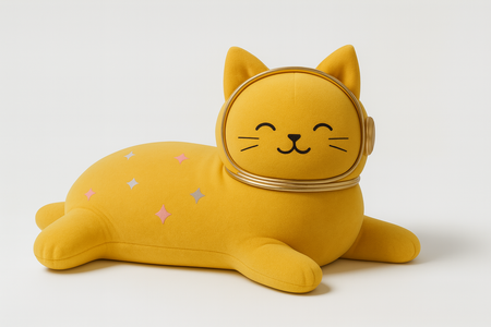
A hyper-detailed, photorealistic studio product shot of a plush toy. The toy is a soft, elongated crescent-shaped cuddle pillow (body pillow) designed as an purple and yellow astronaut cat.
★ Glow-in-the-Dark Stickers create a universe on the wall or ceiling. Gently glowing planets and cats transform fear of the unknown into curiosity and a desire to explore space.
Glow-in-the-dark sticker sheet for children: softly glowing planets and astronaut kittens playfully floating around them. Flat illustrations with clean outlines, designed specifically as stickers.
★ The Sleep Mask gently blocks out excess light, creating the perfect conditions to drift into the world of dreams.
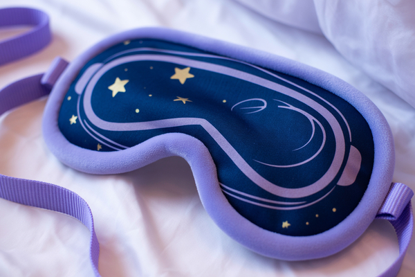
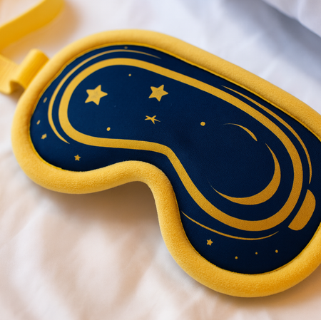
A product photograph of a children’s sleep mask designed as a minimalist astronaut helmet, lying flat on a soft white surface.
★Glow Jammies are not just sleepwear. They are a spacesuit for nightly adventures, crafted from incredibly soft and safe materials. Their key feature is glow-in-the-dark elements woven into the design. This creates a magical effect: when the lights go out, the child’s personal night sky lights up on their pajamas, providing calm and a sense of wonder. It turns falling asleep into a gentle game and helps ease the fear of the dark.
A realistic nighttime photograph of a 10-year-old child wearing adorable cotton pajamas designed to look like a soft astronaut suit, with printed control panels and space details across the fabric.
A realistic nighttime photograph of a 10-year-old child wearing adorable cotton pajamas designed to look like a soft astronaut suit, with printed control panels and space details across the fabric.
PRESENTATION FOR
A PROFESSIONAL
AUDIENCE
The Murmur brand operates through a unified communication ecosystem where every channel reinforces the same visual and narrative code. This section highlights how our identity functions in practical applications across digital and physical environments.
Mobile App: Core Interaction Point
The mobile app serves as the primary interaction point between the brand and the user. Soft color palettes, rounded elements, and playful micro-illustrations ensure a consistent emotional tone. The interface communicates safety, clarity, and accessibility — essential qualities for products associated with night routines.
The storytelling interface extends the brand through an interactive narrative channel. The astronaut kitten acts as a guiding character, shaping the bedtime ritual and creating a personalized emotional connection. This channel exemplifies character-based communication in a digital format.
A soft 2D illustrated mobile shopping app for «Murmur», displaying children’s sleep products with prices. Stylized, simple, cozy UI. Flat shapes, soft rounded cards, pastel muted colors.
A 2D illustrated mobile app design for a children’s bedtime storytelling app called «Murmur». The image must show three different screens of the same app.
Visual Identity System
The visual identity maintains coherence across all media. The palette of soft pastels, cosmic motifs, rounded geometry, and friendly typography ensures recognizability and category alignment. The materials remain consistent regardless of scale — from UI elements to large-format layouts.
A clean, modern brand identity board for a children’s sleep brand with a soft cosmic theme.
Packaging as a Physical Communication Medium
Packaging functions as a physical extension of the brand’s emotional tone. Clean compositions, soft lighting accents, and the presence of the mascot create a reassuring first impression. The packaging communicates the product’s purpose while maintaining the gentle bedtime aesthetic.
A soft 2D illustrated packaging set for children’s sleep products, including boxes, paper bags, gift wraps, and ribbons, without logos. Cozy and cute design with clouds, stars, pastel muted colors.
A soft 2D illustrated packaging set for children’s sleep products, including boxes, paper bags, gift wraps, and ribbons, without logos. Cozy and cute design with clouds, stars, pastel muted colors.
Outdoor Advertising Formats
Outdoor advertising demonstrates how the brand adapts to high-visibility formats. Simple messaging, large-scale illustrations, and clear contrast ensure readability at distance. The astronaut kitten remains a central visual anchor, preserving emotional consistency across campaign contexts.

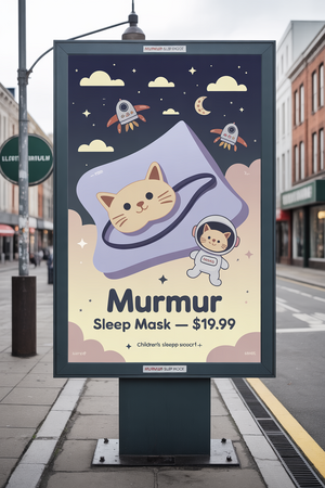
A simple 2D illustrated billboard advertisement for «Murmur» children’s sleep products. The billboard displays a soft sleep mask shaped like a cute kitten in a tiny space helmet.
Across all channels — from mobile apps to packaging and outdoor media — Murmur maintains a unified communication voice. The consistency of symbols, color logic, and character presence allows the brand to remain coherent while addressing diverse touchpoints.
COMMUNICATION
THEORY
AS THE BASIS
Communication theory directly informed the development of our brand by helping us understand not only what we wanted to say, but how meaning emerges in the interaction between designer, product, and audience.
First, the idea that communication is not merely the transfer of information but the creation of a relationship played a central role. Our brand is not limited to presenting a product for sleep — it establishes an emotional bond. The visual world we build connects the child and the parent through shared familiarity and comfort. The cosmic kittens act as symbolic guardians, embodying trust, safety, and gentle presence.
Second, communication theory emphasizes the importance of context, and this directly shaped our symbolic choices. Both elements we use — kittens and space — carry positive associations across cultures. Kittens universally evoke softness, warmth, and care; space evokes curiosity, imagination, and the atmosphere of a bedtime story. Together they form a synthesis that is both recognizable and intriguing to children: the kitten is familiar and grounding, while the cosmos opens a world of possibility.
Third, the notion of multilayered meaning helped us structure the brand on several communicative levels. On the referential level, our project is simply a line of sleep accessories. On the relational level, it communicates safety, tenderness, and emotional reassurance. And on the deeper meaning-making level, it reveals the brand’s narrative — a quiet mythology of kittens traveling through a gentle night sky to watch over children’s dreams.
Fourth, the theory that meaning is co-constructed guided our decision to leave space for imagination rather than dictate a fixed story. We do not offer a rigid narrative. Instead, the brand provides symbolic cues, that children can expand in their own play, and parents can interpret through shared bedtime rituals — characters, mood, and overall atmosphere. The meaning is created not by us alone, but in the interaction between the imagery and its users.
Fifth, the idea of mythologization became a structural tool. The brand’s universe functions as a small mythological framework: its characters, symbols, and gentle cosmic setting help transform ordinary sleep products into elements of a comforting ritual. This mythic layer strengthens emotional attachment and gives coherence to all visual decisions.
Sixth, the understanding that symbols and metaphors are fundamental communicative tools shaped the aesthetic foundation of the brand. Our symbols work not only on a narrative level but on a sensory one: the kitten becomes a metaphor for softness and security, while the cosmic motifs create an atmosphere of peaceful night exploration. These elements resonate across cultures and translate into the physical experience of the product — the suggestion that it feels softer, safer, and more comforting to sleep with.
Realistic warm nighttime photograph of a family in a cozy bedroom. The parents sit or lean beside the child on the bed, smiling gently, creating a warm, supportive family atmosphere.
Together, these communication principles shaped the visual language, emotional tone, and symbolic structure of our brand, allowing it to function not merely as a product line but as a shared world of meaning.
The theoretical part of this project is entirely based on materials from the Communication Theory course.
Recraft. AI-generated images. Accessed 2025.
Leonardo.AI. AI-generated images. Accessed 2025.
Ideogram.ai. AI-generated images. Accessed 2025.
ChatGPT. AI-generated images. Accessed 2025.


