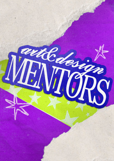

Mentors (sometimes called coordinators in other Programs) are sophomore students who assist incoming students with the adaptation process.


Our main objective was to develop a brand identity for the freshman information channel of the St. Petersburg Art and Design School. We wanted the visual identity to not only help convey important information but also to reflect the individuality of our mentoring team. After all, every generation of mentors has its own character, mood, and approach to communicating with students, and we aimed to convey all of this through the project’s visual language.We began the work by searching for a unifying idea and metaphor that could tie together all the elements of the brand style. We selected typefaces, experimented with graphics, and considered how the informational publications would look. We paid special attention to creating illustrations and designing event announcements. It was important to us to develop a flexible visual system that could be applied to various tasks while maintaining its distinct recognizability and tone.


Anastasia Yastrebova— coordination, approval of the final concept and design solutions, creation of images for posts. Alexandra Khoshabova— selection of typeface and graphic solutions, creation of images for posts. Varvara Mikhailova — selection of metaphor, searching for typeface and graphic ideas, creation of mood boards.During the process, we actively discussed ideas with other members of the mentorship team, listened to their suggestions, and jointly sought the most successful solutions. Nevertheless, we took responsibility for the main part of the work on the visual concept, graphics development, and their subsequent application.Throughout the project, we succeeded in creating several dozen images united by a consistent brand style. For each event, we strove to introduce something new into the design, adapting the graphics to its specific theme and mood. Crucially, we aimed to maintain a recognizable character in the identity so that all materials would be perceived as part of a single visual system.
Our mentorship team is composed entirely of women, and we decided to reflect this characteristic in our brand style. In our search for a visual concept, we looked to the aesthetic of girls' diaries, which became the foundation of the project’s graphic language. At the same time, it was important to us to create not just a vibrant and memorable identity, but also to convey the friendly, open atmosphere of our team through it.
To design the headings, we decided to combine two fonts with contrasting characteristics: the expressive serif, Dentera Display, featuring elongated proportions, with the elegant, bold script, Gloria Script. This combination helped convey the playful mood of our identity and made the headings more memorable. For supplementary information, we selected Helvetica—a concise and neutral typeface that ensured readability.
Each post looks like a collage sketch with preliminary drawings in the margins. The posts turned out lively and colorful; the visual style is simultaneously informal and evocative of creative endeavor.
Each card features the mentor: it includes personal photos, core information, and her own «cutemark”—the symbol we created to characterize each mentor.
Thanks to the developed identity, we managed to create a recognizable visual image for the mentorship team and differentiate our information channels from other student communities. A unified design style helped make publications more understandable and easier to digest, and communication with first-year students—more simple and comfortable.
By drawing inspiration from the aesthetic of young girls' diaries, we were able to convey the mood and individuality of our team. Bright colors, expressive graphics, and a slightly playful tone helped create a friendly atmosphere where communication with first-year students was perceived not as formal notification, but as a lively exchange with senior peers.
In addition, we have started working on merchandise that is also based on the mentors' signature style…
Brand Identity became an essential element in promoting student events. We leveraged the developed graphics to design announcements for the first mentor meeting, a city quest, and the freshman induction ceremony. Our goal was for the posts not only to convey necessary information but also to capture students' attention, set the mood, and generate interest in upcoming events.As a result, our channel gained approximately 200 subscribers and became a space where freshmen could learn about important news, follow events, and interact with mentors. Furthermore, the identity we created continues to be relevant even after the project concluded—it is still used to design informational posts and announcements for student events.
Coordination with HSE was lacking, but the academic office staff sent out a mailing list featuring our informational channel before the start of the academic year.