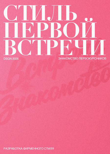

September 1st marks the start of the academic year, where first-year students find themselves in unfamiliar settings, meeting new people and instructors. To ease the anxiety of incoming students during these first few days, we, the mentors, organized a welcoming event featuring numerous icebreaker activities (a longread on the organization). But what kind of event is it without a recognizable style and theme?


Our main objective was to develop a concept for the freshman welcome event and unify all its elements with a cohesive brand identity. We began by researching themes, curating references, and developing visual ideas upon which we created graphics for informational posts, announcements, and printed materials. Special attention was paid to designing the activities in the loft and managing communications on the Telegram channel, all while striving to maintain a friendly and slightly playful tone of voice.
The project’s primary mission was to help freshmen adjust to their new environment and feel like part of the student community. We wanted to make the welcome event a vibrant and memorable occasion where everyone could meet their classmates and mentors. Therefore, we aimed to create a holistic atmosphere where the visual style, communication, and interactive activities complemented one another.

Alexandra Khoshabova — creating brand style constants, designing posts for the Telegram channel, organizing textual content Varvara Mikhailova — creating brand style constants, designing posts for the Telegram channel, organizing textual content Victoria Timofeeva — designing posts for the Telegram channel, organizing textual content, sourcing materialsOur main focus was on the vibrancy and memorability of the visual style. We wanted to reflect the feminine and slightly playful nature of our mentorship team by creating a distinctive identity that conveyed our mood and made the event atmosphere more friendly and relaxed.

For the headings, we selected the expressive antique typeface Didot, with its delicate lines, high contrast, and elegant character. This font helped lend our identity a touch of glamour and references to fashion magazine aesthetics. To complement it, we chose Helvetica, which we used for supplementary information. Its concise forms and versatile weight options allowed it to balance the decorative nature of Didot while maintaining readability and ease of comprehension.
Initial mood board
The visual concept is rooted in the aesthetics of the 2000s—its characteristic glitter, deliberate femininity, and slightly naive mood. We drew inspiration from bimboculture, 2000s pop culture, glossy magazines, and the atmosphere of girl gatherings. Our goal was to capture the spirit of that era through vibrant colors, playful graphics, and recognizable details, layering in a touch of irony and nostalgia into the design.
Pink, in various shades from delicate to rich fuchsia, served as the main color, accented by dark tones to create contrast.
For graphic elements, we incorporated disco balls, high-heeled shoes, flip phones, CDs, cocktails, and glittering decorative accents. The use of grain, light leaks, fading textures, and references to Y2K posters and magazines helped intensify the sense of the era. All of this resulted in a vibrant, slightly bold, and memorable visual style that reflects our team’s feminine spirit.
Posts created for announcements in the Telegram channel
For creating the publication layouts, we drew inspiration from teen magazines of the 2000s. We wanted to capture the atmosphere of glossy spreads with their bold headlines, playful typography, and abundance of decorative details. We incorporated vibrant pink hues, collages, cut-out images, stars, and glitter.
A thematically designed post with the event dress code
In addition to formatting our publications, we developed a series of posters in the Y2K aesthetic, retaining the vibrant colors, expressive typography, and glamorous details characteristic of our identity. We wanted the graphics to exist not only in digital format but also to become a part of physical space, complementing the overall atmosphere of the event. One example of this realization was the poster created by Varya, which we used as a decorative element during the shoot of the event teaser. This developed graphic became part of the video content, helping convey the mood of the Y2K era and unifying the project’s various formats under a common visual concept.
Varya also directed the teaser shoot. All the resulting footage is a testament to her directing skills and keen eye.
When writing our posts, we drew inspiration from the tone of glossy teen magazines from the early 2000s. We wanted the content to sound less like official announcements and more like messages from friends sharing the coolest news and inviting someone to a fantastic party. The core of our tone of voice is lightheartedness, irony, emotionality, and a touch of bold slang. We used vibrant address terms, conversational phrasing, and references to 2000s pop culture, creating that unmistakable slay vibe. This approach helped make communication with freshmen more lively and casual while still keeping the posts informative.
One of the highlights of our event was the collaboration with Bimba at HSE Kantemirovskaya. For the party, we specially created the SLAY beverage, which perfectly fit our Y2K aesthetic with its bright pink hue and glitter.The beverage was based on hibiscus, tonic, peach juice, and edible glitter, and could optionally have strawberry or raspberry syrup added. Thus, the visual concept of the party went beyond graphic design and was realized even in the drink!Later, the organizer contacted us and shared positive feedback about the collaboration, noting that the collaboration was successful. For us, this was a particularly pleasant confirmation that the idea resonated not only with the event attendees.
Beverage Poster / Coffee Shop Screen / In-Cafe Environmental Poster
To extend the brand identity beyond the digital realm, we developed a series of print materials that became part of the event. Each item not only maintained the Y2K aesthetic but also fulfilled its specific function. For easy navigation within the loft, we created a space map, and for one of the interactive stations, we designed meet-and-greet questionnaires to help first-year students get to know each other better. We also prepared bracelets to identify participants' faculties, certificates for competition winners, and keepsake postcards that guests could take home. Even these small details became part of a cohesive visual system, helping to build the atmosphere of a genuine 2000s girls' party.
Loft Map