INDEX
- Hypothesis
- Introduction
- Historical Context
- Visual Analysis
- Psychology of Visual Impact
- Conclusions
HYPOTHESIS
The Michelin Guide’s visual system demonstrates how the consistent use of recognizable graphic symbols, visual hierarchy, and enduring identity can cultivate a sense of expertise and trust in the brand among the audience. Through the visual simplification of complex information regarding restaurant quality, the Michelin star system transforms from a conditional graphic indicator into a universally recognized symbol of prestige, influencing how restaurants are perceived and guiding consumer choice.
INTRODUCTION
HISTORICAL CONTEXT
«Michelin House» in London in 1911
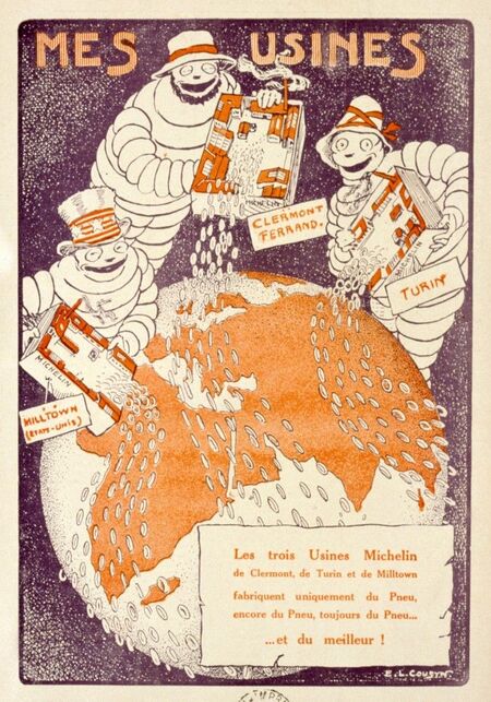
The creation of the Michelin Guide was closely tied to the company’s commercial strategy. In the early 20th century, the automotive industry was just taking shape, so one of Michelin’s primary objectives was to popularize the automobile as a means of transportation and encourage people to use their own cars more frequently.The company’s logic was quite straightforward: the more people traveled by car, the more quickly tires wore out, and the more often the need for replacement arose. Consequently, the growth of automotive tourism directly contributed to increased demand for Michelin’s products.
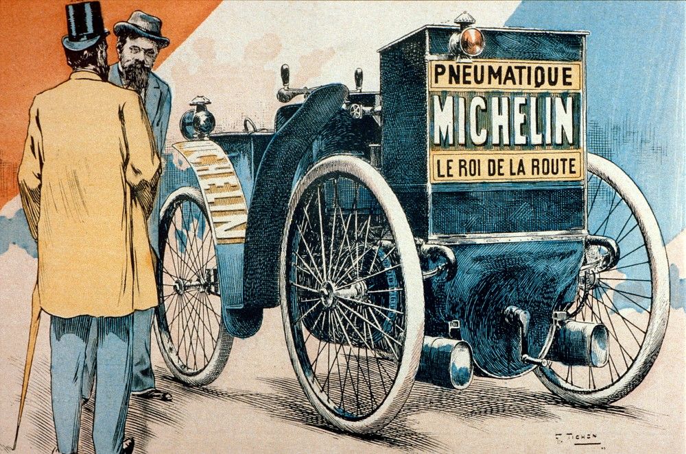
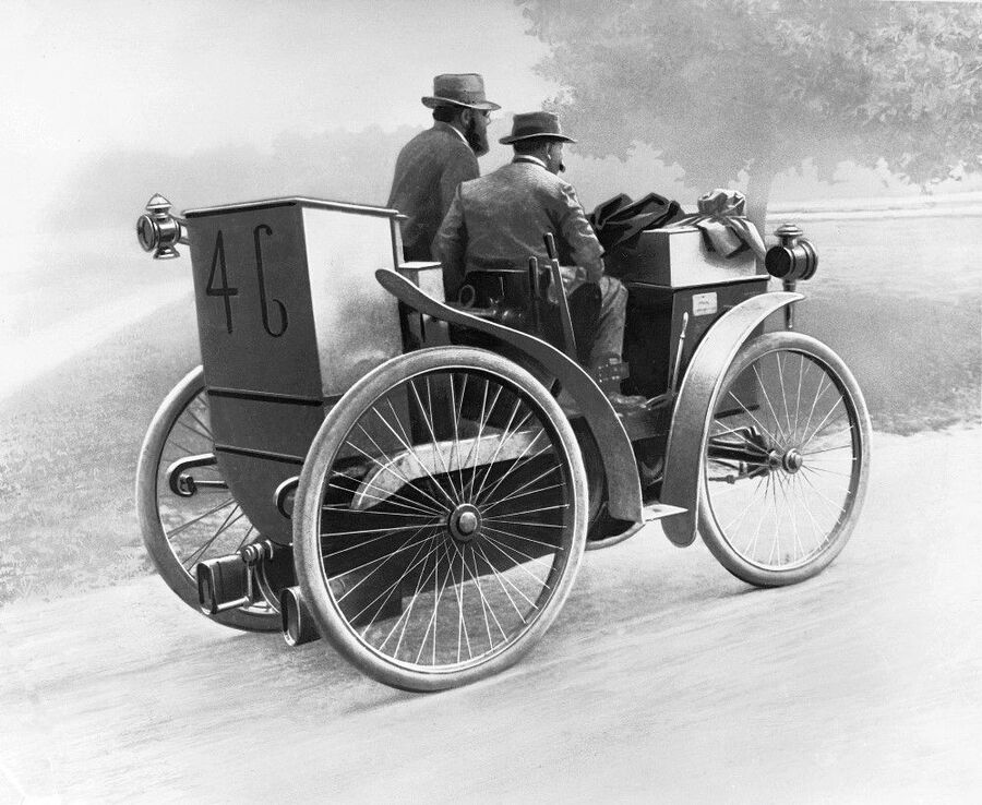
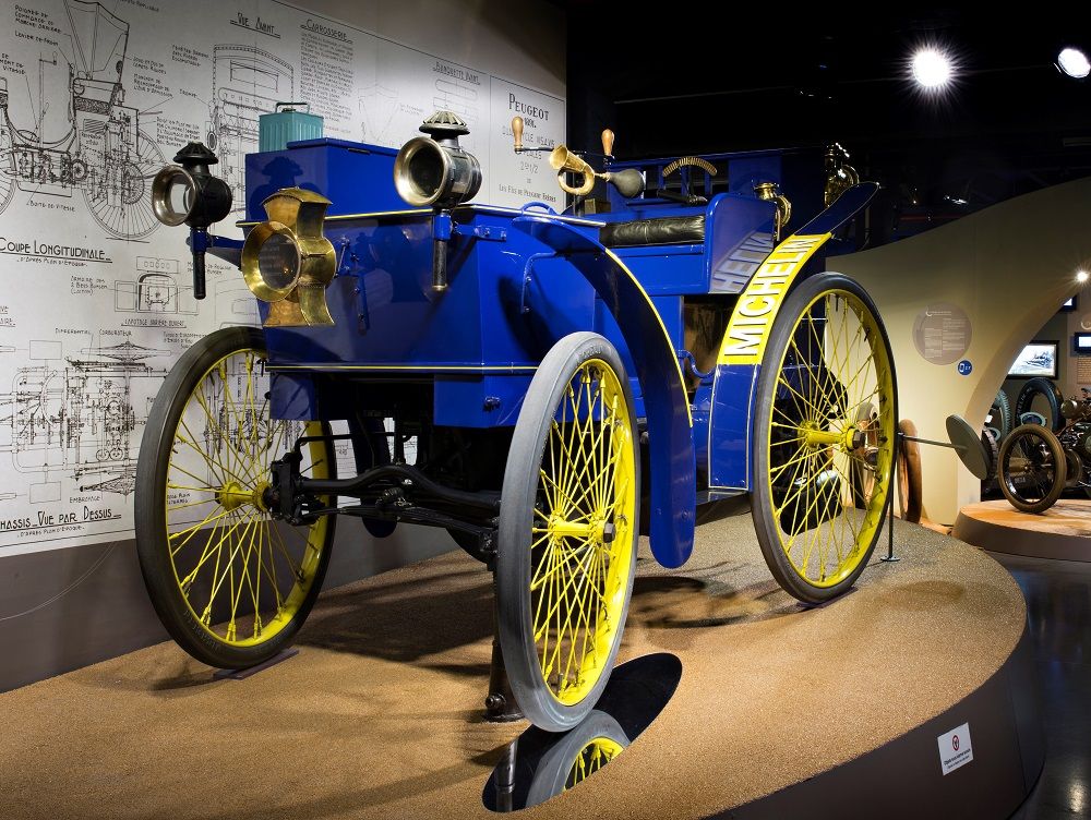
Andre Michelin driving the «Eclair» during the Paris–Bordeaux–Paris race, the world’s first automotive competition.
In this context, the Michelin Guide became an unconventional marketing tool. Instead of directly advertising tires, the company offered consumers added value—the opportunity to travel, discover new routes, and access useful information about destinations.It is particularly noteworthy that the first edition of the guide was distributed for free. Thus, Michelin utilized the principle of indirect promotion: the company did not try to constantly remind consumers of its products, but rather created a valuable product that naturally linked the brand to positive travel experiences.
«Michelin’s First Roadmap» 1910
In 1920, a significant turning point occurred in the publication’s history: the guide became a paid product. According to the well-known company history, André Michelin made this decision after seeing copies of the handbook being used in a workshop to prop up a workbench. This episode symbolized the Michelin Guide’s transition from a free promotional tool to an independent informational product.
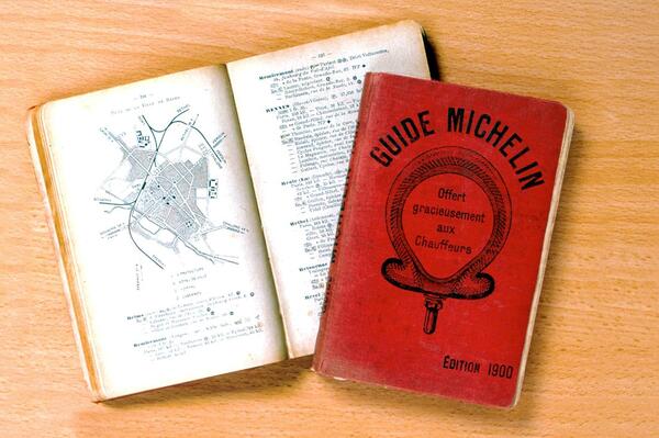
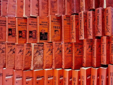
The Evolution of the Michelin Guide’s Design
In 1936, Michelin officially established the meaning of each category: — One star — a very good restaurant in its category. — Two stars — excellent cuisine worth making a detour for. — Three stars — exceptional cuisine worth undertaking a special journey for.
«Three Michelin Star Levels»
It was at this stage that the Michelin Guide began to acquire significance far beyond its initial function as a car directory. The stars became not just recommendations, but visual markers of professional acclaim, capable of influencing restaurant reputations and visitor decisions.
VISUAL ANALYSIS
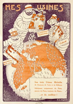
The Bibendum Character: Personification and Recognition
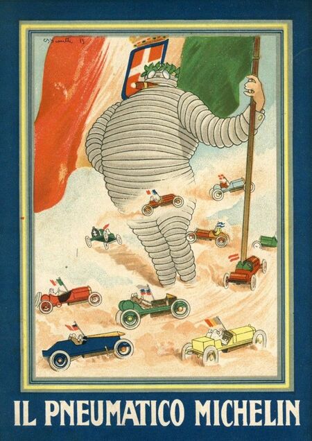
One of the most recognizable elements of Michelin’s visual identity is the character Bibendum. The idea for the character originated with the Michelin brothers after they noticed a stack of tires whose silhouette resembled a human figure. In early advertising, he was depicted holding a glass filled with nails and shards of glass. This unusual visual image was accompanied by the phrase «Nunc est Bibendum, ” which translates to „Time to drink.“ Thus, the character demonstrated the durability of Michelin tires—he seemed capable of absorbing any obstacles on the road.
«Nunc est Bibendum» 1898
From a psychological perspective, the appearance of Bibendum became an example of brand personification—transferring human characteristics onto an inanimate object. Instead of advertising the technical properties of tires solely through product features, Michelin created a character who could independently convey ideas of reliability, durability, and safety.
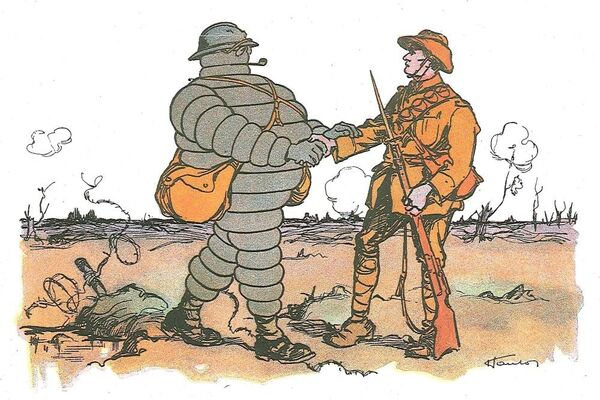
Bibendum, actor and witness of his time, provides support to the troops
Over time, Bibendum became friendlier and more accessible to a wider audience: the cigar and some attributes of a wealthy gentleman gradually disappeared from his image, and the character adopted a more modern and approachable look.
The Evolution of «Bibendum»
Red, Typography, and the Visual Identity of the Michelin Guide
Red is one of the most enduring elements of the Michelin Guide’s visual identity. Maintaining a single color over many decades has forged a strong association between that specific color choice and the Michelin Guide. Even without a direct view of the logo or brand name, the red cover can evoke recognition among audiences familiar with the publication.
Bibendum with the first edition of the «Michelin Guide»
From the perspective of perceptual psychology, color plays a vital role in forming emotional and semantic associations. Red possesses high visual salience, capable of drawing attention and making an object stand out amidst surrounding information. In the context of the Michelin Guide, this is especially important: color helps the publication remain recognizable and visually distinct from other reference guides.
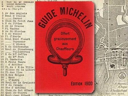

«Michelin Guide» 1900 / «Michelin Star» 2023
Typography plays an equally crucial role. The guide’s design balances the expressive typography of the MICHELIN title with the more functional typography used for informational blocks. This distinction allows the guide to maintain brand recognition while ensuring readability. The cover composition is also built around visual hierarchy: the brand name serves as the primary element, while supplementary information is placed strategically so as not to overload the image. This approach helps position the guide not merely as a collection of information, but as a distinct, branded product.