Communication theory: Tour de Verre
Rubricator 1. How Communication Theory Works in Design 2. Tour De Verre for a General Audience 3. Tour De Verre for a Professional Audience 4. How Communication Theory Shape the Strategy 5. Bibliography and list of image sources
«Tour De Verre» Danil Fursov
How Communication Theory Works in Design
In our everyday life we usually see design as something visual: posters, apps, packaging, logos. But in this project we treat design mainly as communication. A poster, a wine label or a social media post always sends a message and helps people build meanings about a product, a city or a lifestyle.
Communication theory gives us a language to describe what actually happens between a message and a person. It helps us understand why some visuals are clear and memorable, while others do not work. With theory we can explain how people read images, how media influence them and how design can persuade or engage an audience.
For example, Media Ecology tells us that the medium changes the message. The same idea will feel different on a billboard, on a phone screen or on a wine bottle. So when we design packaging or a label, we are not just decorating the bottle, we are choosing a special medium that will shape the whole experience of the brand.
Framing Theory focuses on how the form of a message influences interpretation. In design, we build frames through colour, composition, symbols and style. With only a few visual decisions we can frame a city as romantic, strict, ironic or playful. This is important for our project, because each city on the label is basically a frame.
The Narrative Paradigm says that people love to think in stories. We do not only analyse facts, we ask: «Does this story feel right to me?» For brands it means that isolated images are not enough. We need a small narrative behind them: who is the character, where are we, what kind of feeling or journey do we offer to the audience?
Uses and Gratifications Theory reminds us that the audience is not passive. People choose media and design objects to satisfy their own needs: to get information, to express identity, to relax, to feel beauty, to connect with others. When we design a brand, we should think not only about what we want to say, but also about what people want to get from it.
In social media, Digital Rhetoric becomes very visible. It studies how persuasion works through short texts, images, memes, videos and interfaces. Today designers are like modern rhetoricians: we build visual arguments, create emotional hooks and try to make content that is easy to share, like and remember.
In our project we use these ideas as a base. We see Tour De Verre as a communication case built around a series of wine labels that demonstrates how communication theory can guide specific design decisions.
Tour De Verre for a General Audience
Tour De Verre is a fictional wine brand that celebrates European cities and everyday cycling. Each bottle represents one city through a simple hand-drawn cyclist and key local symbols.
«Tour De Verre» Danil Fursov
Our mission is to turn a regular bottle of wine into a small emotional trip. When you open Tour De Verre, you do not just drink wine — you «ride» through Moscow, Paris, Amsterdam, Copenhagen, London, Barcelona or Saint Petersburg.
Tour De Verre stands for joy of movement and urban freedom, warm, honest emotions, simple, human-centred design and love for local cultures and everyday city life.
The brand addresses young urban adults who enjoy casual wine, value design and illustration, love travelling and cycling, and like to share nice objects and moments on social media.
At the same time, each label is a simple and clear visual metaphor of the wine’s unique characteristics, capturing its essence and personality through imagery.
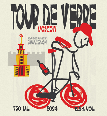
The image of Moscow, framed as energetic and slightly chaotic, mirrors the vibrant and bold character of the wine. The red wheels, resembling fast brushstrokes, evoke a sense of movement and excitement, much like the wine’s lively and dynamic flavors. The cyclist nearly losing the bottle while riding symbolizes the wine’s boldness and adventurous spirit. The Kremlin-like tower adds recognisable context and a hint of irony rather than strict monumentality.
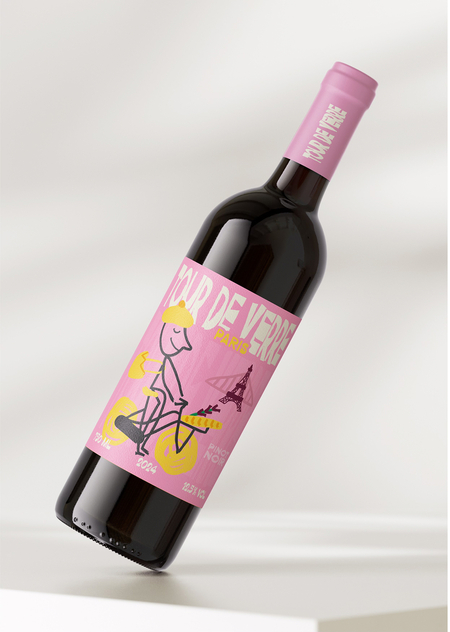
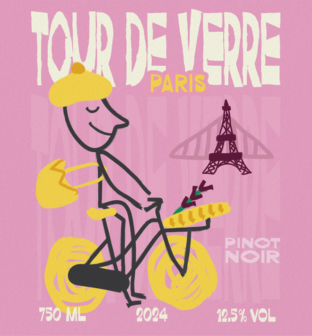
The image of Paris, framed as soft and romantic, reflects the smooth and refined character of the wine. The pink background and playful elements like the yellow beret and baguette evoke a sense of lightness and charm, just like the wine’s delicate and fragrant notes. The relaxed cyclist, eyes closed and enjoying the ride, mirrors the wine’s smooth, easy-drinking nature. The Eiffel Tower in the background adds a touch of elegance and familiarity, just as the wine offers a classic yet timeless appeal.
«Tour De Verre» Danil Fursov
Saint Petersburg, with its windy and cool atmosphere, reflects the crisp and refreshing character of the wine. The blue palette and dynamic cyclist evoke energy, while the Rostral Column adds a poetic, slightly melancholic touch, much like the wine’s balanced complexity and warmth.
«Tour De Verre» Danil Fursov
Across all labels the tone is warm, naive and optimistic. Thick hand-drawn lines and imperfect shapes make the brand feel human and approachable. This fits the general audience who want emotional comfort rather than luxury seriousness.
Tour De Verre promises a simple message: «open a bottle, enjoy a city»
It offers simple wine, honest emotions and a familiar city that suddenly becomes part of your evening.
Main channels for the general audience include supermarket shelves and wine shops, small city cafés and bars, and visual storytelling on Instagram and TikTok. Limited edition city sets work as gifts for travellers and cyclists.
Tour De Verre for a Professional Audience
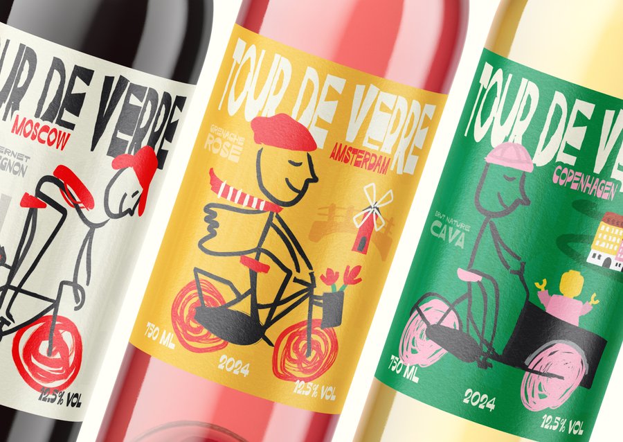
Tour De Verre is a modular visual system that connects wine typology with urban bicycle narratives. Each label is a variation on one structure: city name, wine type, cyclist, landmark, year and volume.
«Tour De Verre» Danil Fursov
Labels follow a loose but repeatable grid: logotype at the top, city name as bold secondary element, cyclist as central dynamic figure, landmark anchored on one side and technical information at the bottom. This ensures consistency while allowing expressive drawings.
Key visual characteristics are: a stick-figure cyclist as a constant character, rough brush-like wheels suggesting motion, a bold sans serif logotype with slightly irregular edges, and high-contrast colour palettes for instant recognition.
«Tour De Verre» Danil Fursov
The system uses Framing Theory deliberately. Each city is reduced to a small set of signs such as iconic architecture, typical weather or mood and local props like umbrellas, fans or tulips. This controlled simplification builds quick recognition and emotional stereotypes.
Colours are chosen to reflect both city identity and wine character: Amsterdam uses yellow and red for openness and playfulness. Berlin moves towards more muted, industrial tones. Saint Petersburg leans into cold blues, while Barcelona uses warm orange for Mediterranean energy.
«Tour De Verre» Danil Fursov
From a Media Ecology perspective, the bottle is treated as a medium equal to a poster or a screen. Tactile paper emphasises the handcrafted illustrations, and strong silhouettes and colour blocks help the label stand out on crowded shelves and in digital thumbnails.
For professionals, the brand is designed to be shared natively on social platforms. Flexible compositions that adapt to Instagram’s varying display requirements, strong outlines remain legible in small sizes, and each city label enables localized micro‑campaigns featuring short animations, city trivia and pairing tips. This reflects principles of digital rhetoric — concise, visually driven persuasion.
The system can be extended to new cities or limited editions without breaking recognisability: the same character appears with new local props and landmarks, seasonal colour changes and possible collaborations with local illustrators who follow the core grid and style.
How Communication Theory Shape the Strategy
We focus not only on visual style but also on theoretical questions: how can a bottle of wine be a communication medium, how do people read and emotionally react to city images, and why they would choose this brand instead of another similar wine.
Based on Media Ecology, we aim to treat the bottle as an environment. The label should transform the entire drinking experience. The illustration, city, and cyclist together form a small narrative world around the consumer, which leads us to focus on strong storytelling labels rather than minimalist premium aesthetics.
Framing Theory helped us accept that people already have mental frames for cities like Paris, Moscow or London. Instead of fighting stereotypes, we use them playfully: beret, baguette, red phone box or tulips. These frames are simplified but friendly, so the brand feels familiar and easy to decode.
The Narrative Paradigm frames each bottle as a story unit. We are going to continue the storytelling online through short captions and small anecdotes about places and cycling culture and also encourage our audience to share their experiences too, to become a part of the brand community filled with stories.
Overall, the project shows how theoretical concepts can become practical design decisions. Instead of using theories only in written reflection, we tried to embed them into the visual system and communication strategy, so they are visible through the brand experience.
«Tour De Verre» Danil Fursov
Bibliography and list of image sources
the text is based on materials from the course «Communication Theory: Bridging Academia and Practice»
branding by Danil Fursov
McLuhan, M. Understanding Media: The Extensions of Man [Электронный ресурс] / Marshall McLuhan. — Режим доступа: https://designopendata.wordpress.com/wp-content/uploads/2014/05/understanding-media-mcluhan.pdf (дата обращения: 01.12.2025).
Fisher, W. Narration as a Human Communication Paradigm [Электронный ресурс] / Walter Fisher. — Режим доступа: https://redmonky.net/utpa/4324/fischer.pdf (дата обращения: 01.12.2025)
Изображения: Tour De Verre Danil Fursov https://hsedesign.ru/project/f7f6612d53414b80ab4a6753a8f41839


