Navigator
- Concept
- Chapter 1. Perfumery and Cosmetics as a «Special Commodity» in the Soviet Visual Environment
- Chapter 2. Packaging as a Visual Image of Luxury
- Chapter 3. Femininity and Advertising
- Chapter 4. Soviet vs. Western: Borrowing and Adaptation of Visual Codes
- Conclusion
Concept
Soviet perfumery and cosmetics held a special place within visual culture. On the one hand, these were mass-produced goods manufactured under the state industry and integrated into the planned economy. On the other hand, their aesthetic presentation often contradicted the general utilitarian nature of the Soviet material environment: bottles, boxes, advertising spreads, and labels were designed as symbols of beauty, gifting, celebration, and desire. It is precisely this tension between mass-production and exclusivity that makes the topic significant for visual study. Perfume and cosmetic packaging allowed us to see how an image of a «special» product—one not reducible solely to its function—was created under conditions of limited choice.
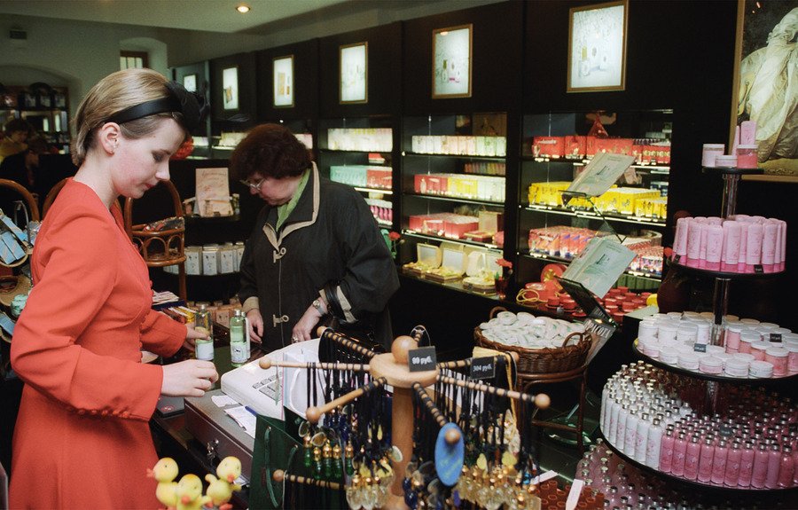
Perfume and Cosmetics Store «Novaya Zarya,» 1980s–2000s
The primary time frame of the study is the 1960s–1980s, a period when mass consumer culture existed in the USSR, yet shortages and limited choice persisted. Under these conditions, perfumery and cosmetics were perceived not merely as self-care products, but as signifiers of beauty.
Main research question: How did the packaging and advertising of Soviet perfume and cosmetics construct an image of luxury amid scarcity?
The hypothesis is that Soviet perfume and cosmetics packaging and advertising compensated for the limited consumer choice through decorative elements, allusions to elitism, and persistent codes of femininity. Luxury, in this context, was expressed not so much through brand identity, individuality, and market exclusivity—as in Western consumer culture—but through color, ornamentation, naming, the bottle’s shape, the gift box, and the advertising image. Gold, saturated hues, floral motifs, delicate typography, glass, symmetry, and romantic names conveyed the impression of a product intended for a special occasion.
Collection of vintage perfume and cologne vials, 1950s–1980s.
The research utilizes scholarly and reference materials concerning Soviet perfumery, cosmetics, consumption culture, and the visual environment of the 1960s–1980s. Specifically, M. S. Koleva examines the history and design of Soviet perfumery and cosmetic products, including bottles and packaging [1]. O. Kravets and O. Sandikchi analyze cosmetic promotion in the USSR during the 1930s and its connection to socialist ideology [6]. N. Chernysheva investigates the consumer culture of the Brezhnev era, including the influence of shortages and attitudes toward Western goods [7]. Visual materials will be selected to illustrate the diverse design approaches of Soviet perfumery and cosmetics: bottle shapes, color schemes, typography, and so forth. The study will include both packaging and advertising imagery, as well as select Western examples for comparative analysis of visual codes of luxury.
The structure of the research moves from a general visual context toward comparative analysis. The first chapter examines perfumery and cosmetics as a «special commodity» within the Soviet visual environment, showing how they differ from the more utilitarian packaging of household and pharmaceutical goods. The second chapter is devoted to packaging as an independent representation of luxury: bottle shape, box composition, color, ornament, typography, and naming conventions. The third chapter analyzes the connection between cosmetics and the image of Soviet femininity in advertising—poses, makeup, hairstyles, pastel colors, floral motifs, and the depiction of beauty as a norm of cultural everyday life. The fourth chapter compares Soviet and Western samples, identifying common visual techniques and the specific ways these were adapted within the Soviet context.
Thus, this research examines Soviet perfumery and cosmetics not as a secondary area of applied graphics, but as a vital space for the visual construction of desire.
Chapter 1. Perfumery and Cosmetics as a «Special Commodity» in the Soviet Visual Environment
1. «Milvok» laundry detergent, 1980s; 2. «Sanita» cleaning and disinfecting paste, 1980s.
Pharmaceuticals and medications in Soviet packaging, 1960s–1980s.
The utilitarian nature largely defined the visual environment of everyday Soviet goods. The packaging for household and pharmaceutical items was generally structured around clear communication: name, purpose, weight, manufacturer, and instructions [2]. Here, color and typography function not as tools of seduction, but as methods for quickly identifying function. Such a design emphasizes the practical nature of the object and its belonging to the world of necessity.
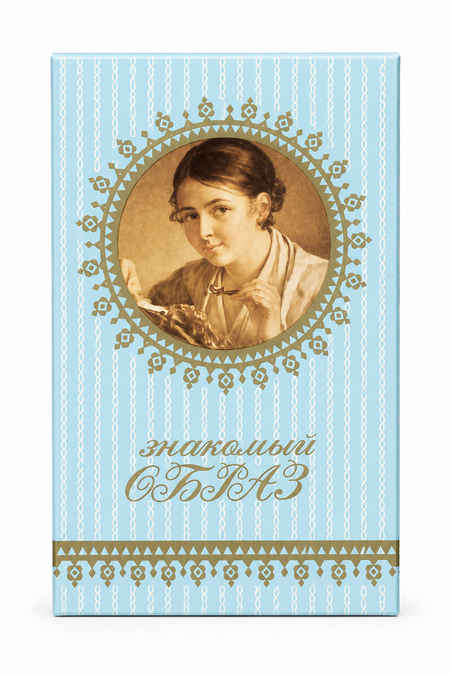
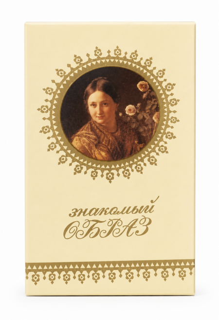
«Familiar Image,» perfume series, 1980s–1990s
«Familiar Image, ” Perfumes, 1980s–1990s
Against this backdrop, perfumery appears to be a product of a different visual order. While it too belongs to mass production, it is presented not as a simple necessity but as an object of desire [1], [5]. The bottle, the box, the name, and the color palette create an emotional field around the product: beauty, gift, celebration, femininity. What matters is not that the packaging has always been expensive or complex, but that it has strived to look more significant than the function itself.
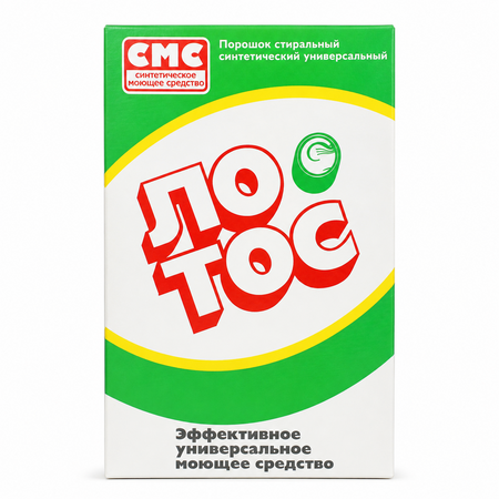
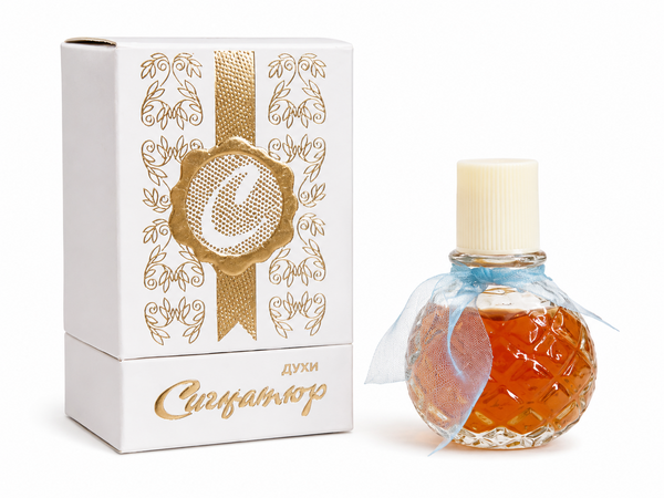
1. «Lotus, ” laundry detergent, 1980s; 2. „Signature, ” perfume, 1980s.
Direct comparison reveals the central visual tension: Soviet products could be simultaneously mass-produced and highly symbolic. While everyday packaging typically subordinates composition to utility, perfume packaging prioritizes impact. A decorative frame, a more expressive typeface, a floral motif, or a rich color transforms the object from a neutral commodity into a signifier of a special occasion. It is through this distinction that the language of «accessible luxury» [6], [7] emerges within Soviet material culture.
1. «Carmen, ” powder, 1970s; 2. „Carnation, ” powder, 1970s; 3. „Goose Down, ” powder, 1970s; 4. „Lily of the Valley, ” powder, 1970s.
Cosmetics occupy a space between everyday utility and symbolic meaning. Lipsticks, powders, and creams are designed for regular use, but their packaging employs a softer visual language: compactness, refined typography, color, and subtle decorative accents. Here, the product no longer merely serves daily needs; it participates in constructing an image of well-being. Even simple packaging begins to function as part of a personal beauty ritual.
Mass Soviet goods could be presented as objects of desire, and the image of luxury was created not through abundance, but through visual distinction from everyday life.
Chapter 2. Packaging as a Visual Image of Luxury
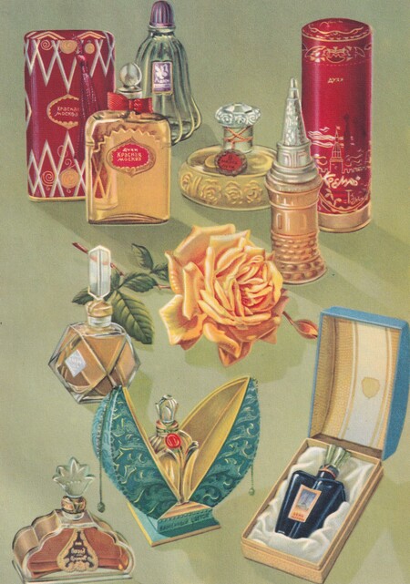
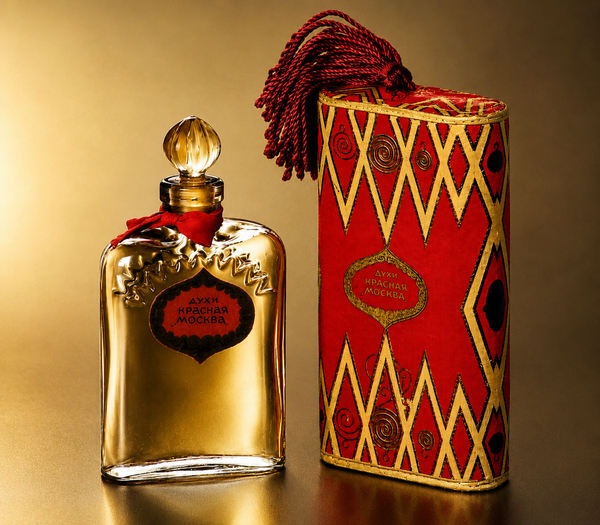
1. Advertising illustration for Soviet perfumery, 1960s; 2. «Krasnaya Moskva, ” perfume, 1950s–1960s.
Bottles of Soviet perfumes were often built on a combination of compactness and decorative quality: glass, symmetry, unusual shape, or an ornate cap created the feeling of a precious object [1], [5]. This design shifts the fragrance from being mere packaging to being an object that can be viewed, stored, and displayed on a vanity. The image of luxury arises not from the rarity of the material, but from the form that makes a mass-produced item resemble a small decorative piece.
«Cinderella,» perfume, 1970s.
Using the «Cinderella» perfume as an example, you can see how the packaging begins to function as an independent image. The bottle itself is quite simple, but the packaging lends a narrative depth to the product—the portrait, the ornamental frame, the decorative composition, and the fairy-tale name create the impression that this is not an ordinary purchase, but a small gift item. Here, the box does more than just protect the bottle; it preemptively shapes the expectation of beauty, transforming a mass-market fragrance into an object with an emotional shell.
«The Queen of Spades, ” perfume set, 1950s–1960s
The «Queen of Spades» gift set demonstrates how Soviet perfumery could be presented not just as a single bottle, but as a creative collection. The green case resembles a book or a stage prop box—the gold frame, playing card symbols, character figures, and decorative ribbon immediately tie the product to a narrative, a game, and celebration. The small bottles support this logic: the faceted glass and heart-shaped stoppers make the set look like a keepsake. In a time of scarcity, such packaging enhanced the sense of value: luxury was created not by the rarity of the brand, but by the very presentation of the item as a gift [2].