«Our typeface must possess preciousness”—how to choose a font for a brand identity
We show the process and discuss the challenges using the corporate typeface of the leather goods house Lemek as an example.
There are many excellent guides on how to select a font for a project. Nevertheless, in practice, it is rarely that straightforward. So, this time, we at the Paratype typeface studio decided not to provide a list of recommendations, but rather to visually demonstrate how one of our clients selected a font. This example does not claim to be correct or universal. Rather, it is a story about experience that might serve as one guidepost in the complex world of typography.
Step 1: The founder of Lemekh, Evgeny Bryn, defined the brand image
Lemeh — a young brand specializing in leather accessories. Lemeh’s products are easily recognizable by the namesake ornament, which has decorated objects of Russian architecture since the 15th century.
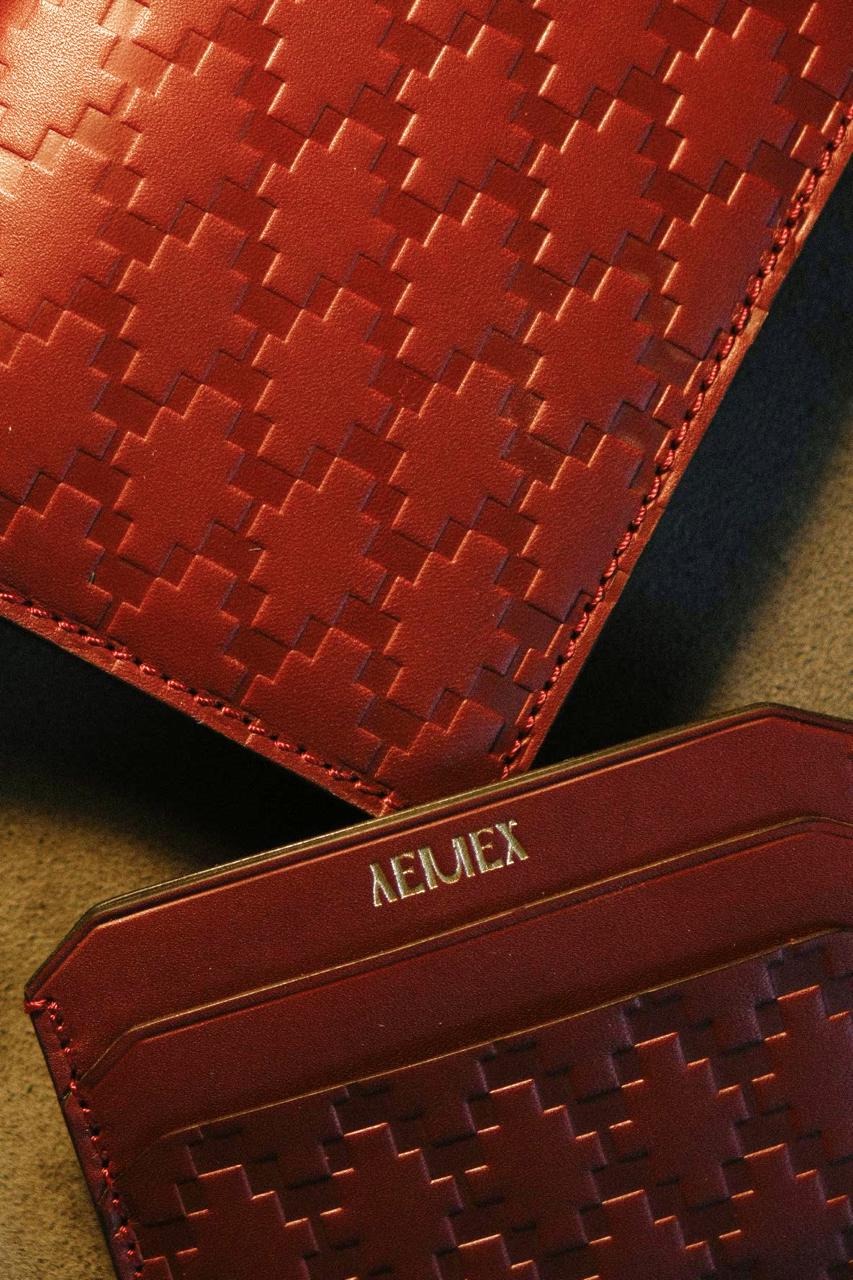
Ornament lemek gorodchatyy — the signature element of the Lemek brand
Of course, the basis of Lemek’s identity is more than just ornamentation. One of the brand’s characteristics that Lemek intended to convey in the typography was preciousness. This isn’t merely ostentation; it speaks to inner richness.
This richness is embodied in accessories as well, because haberdashery involves a specific ritual of relating to your belongings—how much importance you attribute to them. Money can simply be thrown away, placed in a bag, or put on a card. Lemek offers only one of these approaches to that relationship.
Another important condition was that the Russian style within the brand was perceived not as rustic folk art, but rather as a metropolitan style—a style that inherits the work of artists and poets. Currently, most projects still lean into rustic folk aesthetics and Russian village imagery, while overlooking the context where the foremost artists created their work.
View down Nevsky Prospect. 1908–1910. Unknown author (source)
Imperial Academy of Arts in St. Petersburg, 1912. Valentin Serov, Viktor Vasnetsov, Mikhail Vrubel, and many others studied here.
To choose a typeface, it is critically important to define the image we are striving for, because without that clarity, the typography can easily become unfocused. We are fortunate that our business design lends itself well to Antiqua, because heaven forbid it were grotesque—that would immediately lead us into millions of typefaces and weights that only a highly experienced eye could differentiate.
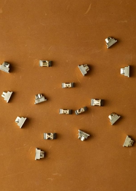
Brand founder Evgeniy Bryn is studying the original source material for 3D scanning of historical wooden tiles from the 19th and 20th centuries, drawn from the collection presented at the Teleshov House.
What is the purpose of an identity, anyway? To remove the burden of constantly figuring out what and how to communicate. Because if you don’t have a well-thought-out identity, you have to sit down and think every single time: «How should this be, and why should it be this way…?»
That’s why I aimed for a very strict definition of the image—to remove the need to constantly make choices. I am a young entrepreneur, after all, so I hold almost every position in my business :) But I have a goal to delegate the majority of tasks, and for that, I need a strict, understandable image and toolkit. Typefaces—they are an important part of that.
Step 2: Formulated the font request
Evgeny, in collaboration with Art Director Vasily Podryadchikov, with whom he frequently collaborates, developed font requirements based on the brand image:
1. Not a neutral font for reading, but a stately serif typeface; 2. Must convey a sense of heritage and quality; 3. Must work equally well in online communications (e.g., Reels) as it does on the actual leather cardholders and passport covers (meaning its legibility and character are crucial); 4. Carefully calibrated kerning, to avoid manual adjustments; 5. Broad language support; 6. High-quality Latin and Cyrillic characters are mandatory; 7. Appropriate licensing (it is essential to remember that a font always consists of the typeface and the license).
Evgeny: «When we talk about clothing, you often need many fonts because there are many carriers where you use them: from the product itself to the website, packaging, and store design. Therefore, it is important for clothing brands to know how to select fonts and work with them proficiently. Often, people use fonts like Inter everywhere, but technically, they are not very suitable. Inter is wonderful when it’s on a computer in a Google Doc, but when transferring the letters onto a t-shirt—it’s awful.»
The quality of your design will be immediately perceived—will it look amateurish or polished? This visual interpretation hinges on how well you’ve mastered proportions and composition. Furthermore, selecting the wrong typeface can inadvertently create a limitation, causing your brand—which lacks stylistic finesse—to alienate audiences with discerning taste.
Step 3: Font Search
Sometimes designers and art directors already have fonts in mind and immediately apply them to a project. But at Lemeh, they took a different approach: they browsed the websites of font shops and studios, both Russian and international, and selected from hundreds of antiqua fonts. Twenty-six fonts were selected in the final round.
Next came the testing phase. Most font studios now offer free trial versions that allow users to test a font in a mockup. Type testers on the site are also useful, but mainly during the initial selection.
ITC Garamond ultimately won the intense competition. This is an elegant antiqua—a synthesis of the Renaissance era and American 1970s design, characterized by its smooth forms and inherent freedom.
ITC Garamond offers excellent Latin and Cyrillic typefaces. The Latin version was developed by designer Tony Stan for International Typeface Corporation between 1975 and 1991, based on the fonts of the great Claude Garamond, while the Cyrillic version was created by Aleksandr Tarbeev at Paratype (ParaGraph) between 1993 and 1995.
We wanted to avoid superficiality, but we noticed that many fonts contain ornamental elements that are excessive. They draw undue attention and impede readability. «Look at me, not at the text!» Such fonts violated our principle of substance, which holds that content is more important than form.
When we examined ITC Garamond, we realized it strikes a remarkable balance between readability and beauty. Furthermore, its beauty is inherent—you discover it the longer you study the typeface.
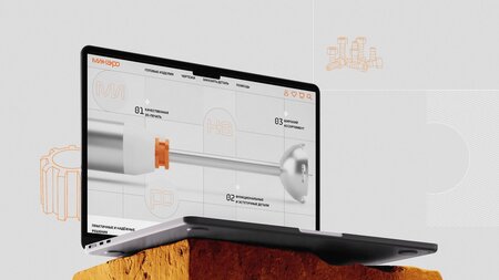
ITC Garamond is used in the title on the website. Its neutral pairing is perfectly complemented by Unica in the body text.
Furthermore, Garamond is a long-established font that has been rigorously tested, so from a technical standpoint, it does not suffer from the «illness of young fonts,» where character pairings might conflict with each other in balance.